As one of the most effective ways to promote your program, referral email marketing invites customers to earn rewards for referring their friends and family.
Referral emails are messages a business sends to its existing customers with information about its referral program. These emails are direct, personal, and a great way to establish lasting relationships with your most loyal customers. Best of all, they’re highly effective in growing your customer base.
Referral emails are a fixture in any successful referral program. Learn about all the parts of a referral email example, from the overall design to the best referral email subject lines. Then, check out our searchable list of the 35+ best referral email examples (refer-a-friend email examples) across all industries.
What should be included in a refer-a-friend email example?
Unlike most business emails, which are usually informative, a referral email contains three key parts:
- A referral email subject line enticing enough for customers to open the email
- An incentive or offer too good to pass on
- A clear call to action (CTA) that directs them to join the referral program
Take one away, and your entire referral email campaign may fall short. But cover all three parts, and you have the workings of a great referral marketing program. Read more about each part in the following sections.
1. A compelling referral email subject line
When it comes down to being clever vs. being clear, the latter is proven to get 541% more clicks. People don’t open email for random amusement – they want to know exactly what they’re opening and why they’re opening it.
For example, would you click on an email with the subject “It’s Fri-yay!” or one with “$50 for you, 50% off for your friends”? While there will definitely be a time to show off your humor and wit, referral email subject lines are intended to get customers to read the message.
Here are a few more best practices when writing your referral email subject line:
- Keep it short: Between 6-10 words, or 28-38 characters, to be specific (especially if you’re focusing on a mobile referral program)
- Make it personal: Adding the recipient’s name into the referral email subject line results in 29% higher open rates than non-personalized subject lines. Even better if you can tie into a personal event, like their recent purchase or first year of membership.
- Add a number: Digits get our attention, and are proven to increase click-throughs by 36%. Plus, numbers are a great way to break up text and easy to take in at a glance
- Add an emoji: Emojis can increase email open rates by 29%. They also add personality, save space, and fit well with a lot of modern brand identities. Use wisely.
- Avoid all caps and excessive punctuation: It looks spammy.
2. An irresistible referral incentive
Once a customer opens your email (thanks to its strong referral email subject line), it’s best to stick to the point.
Include the basics of your referral program: What you’re inviting them to do (refer others), what you’re offering (a strong incentive), and how long the offer stands (one referral, one month, ongoing?).
If there are more specifics, list them briefly as well. For example:
- Is there also a reward for the referred friend? This is known as a double-sided or two-sided referral incentive.
- Do the incentives accumulate? For example, does the customer earn greater rewards with each referral or tier?
- Are there any conditions needed to receive the reward? Does the friend need to sign up for a demo? Make a purchase?
Remember, this is only your introductory email. Keep it simple. The goal is to get your customers interested in the referral program, so it’s best to remove any friction that may cause them not to refer new customers.
You can always create a separate referral program FAQ or landing page to cover all the other details.
3. A clear call to action (CTA)
Your referral email has been opened and your customer is interested. Now what?
Take them to the next step with a clear call to action (CTA). CTAs are typically a referral link or button that brings them to more details about your referral program.
Alternatively, you can cut straight to the chase and invite them to send their unique referral code to friends and family right from the email.
No matter which you choose, a CTA should invite interaction and continue the conversation with your customer. To get readers to click a CTA, apply the following:
- Smart placement: If customers are familiar with your referral program, go ahead and place your CTA above the fold (the space seen immediately when opening the email). If you need more space to explain your referral details, then move the CTA to the very bottom of the email. CTAs in the middle of your referral letter can be easily overlooked.
- Visual cues: Draw the eye to your CTA by making the button large and in a contrasting color. You can also use images that subtly point to the CTA, such as a photo of someone looking in the direction of the button or arrows pointing to the referral link.
- Strong, actionable text: Rather than the overused “Enter” or “Click here,” use more descriptive verbs, like “Reserve your spot” or “Get my 25% discount.”
- Create a sense of urgency: Adding a time sensitive phrase, like “Refer before the weekend” or “Join now” to the end of your CTA will encourage customers to act fast.
To make sure you’re keeping track of every unique click and referral code, consider using a referral software platform or digital marketing tool that will automatically track all these interactions.
40 referral email examples to inspire your own
We’ve all likely received a referral program email before – some good, some bad. The most effective referral emails are ones with an attractive referral email subject line, exciting incentive, and a clear CTA that lets customers start referring others right away.
Below are 40 of the top refer-a-friend email examples received by customers today. Filter the referral email templates by industry, or browse through them all to inspire your own marketing campaign.
See email designs for:
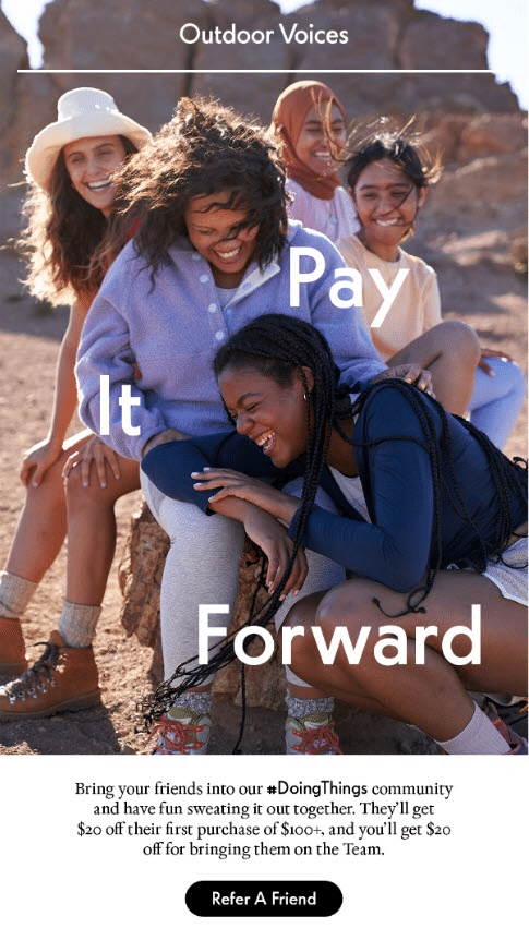
Outdoor Voices
Outdoor Voices makes activewear for women and men “Doing Things” daily.
Why this referral email example rocks:
- Clean and uncluttered design that gets right to the point
- An inviting hero image featuring friends having fun together outdoors, and ties in well to the dual-sided referral benefit ($20 for both the customer and the referred friend)
- Outdoor Voices reinforces community values, with words like “sweating it out together,” “bringing them on the Team,” and an invite to “Pay it forward”
- Includes the brand’s #DoingThings hashtag to promote user-generated content and drive even more word-of-mouth referrals
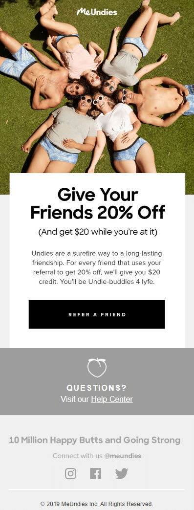
MeUndies
MeUndies sells feel good underwear, loungewear, and apparel to make the world a comfier place.
Why this referral email example rocks:
- Strong hero image highlighting the products
- Referral program email is optimized for mobile, and displays beautifully across all devices
- Positions referrals as a surefire way to be “Undie-buddies 4 lyfe,” giving 20% off to friends and earning $20 credit for yourself
- MeUndies is a master of creative copy, as shown throughout their other referral program emails
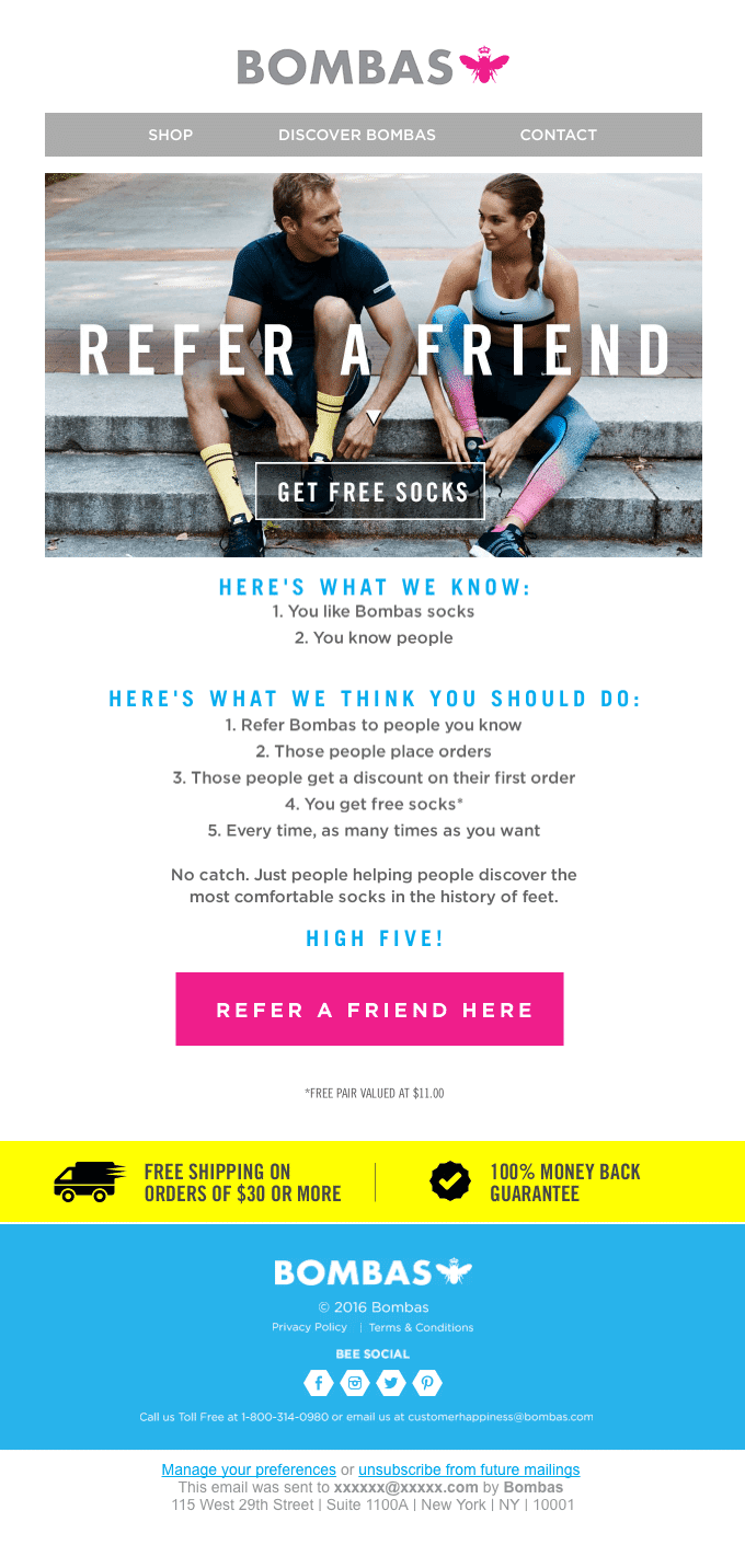
Bombas
Bombas
Bombas is a comfort-focused sock and apparel brand that donates an item to match every purchase.
Why this referral email example rocks:
- A “Refer a friend” headline is as clear as it gets
- The “get free socks” incentive is easy to spot and simple (Who doesn’t love free stuff?)
- Step-by-step instructions make the referral program easy to understand
- Two enticing call-to-action buttons: “Get free socks” and“Refer a friend here”
- Friendly on-brand copy: “Just people helping people discover the most comfortable socks in the history of feet.”
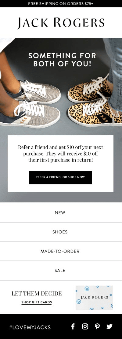
Jack Rogers
Jack Rogers is a retail women’s footwear company founded in Palm Beach, Florida and known for its signature sandals.
Why this referral email example rocks:
- Although not seen here, the referral email subject line follows best practices: “Refer a friend, get $10.” Clear, concise, and won’t get cut off on mobile.
- The large hero image shows off some of the brand’s latest shoes
- Easy-to-understand description of the referral program placed right below the hero image
- The brand’s #lovemyjacks hashtag promotes user-generated content and drives even more word of mouth
Boohoo
Boohoo originated in the UK, selling a range of trendy, affordable women’s and men’s clothing.
Why this referral email example rocks:
- The entire referral program email is a colorful collage that keeps customers scrolling down for more
- A big, bold call to action (“Refer your friends”) fills the first screen
- Never-ending incentives (£5 credit for every “bae you bring” their way) and an added larger incentive (entry to win a £1,000 beach vacation) to really motivate customers to join the referral program
- Two CTA buttons conveniently placed at the top and bottom of the referral email, increasing the chances of click through
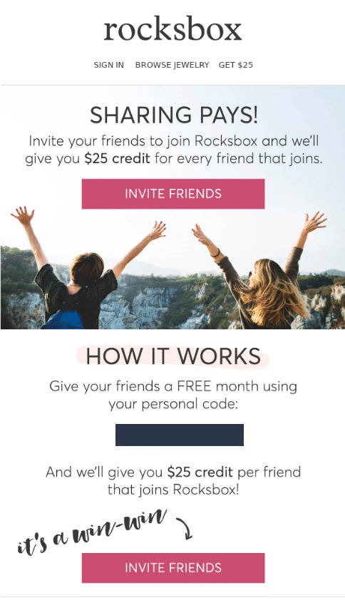
rocksbox
rocksbox is a jewelry rental membership service with the mission of transforming the way people buy accessories.
Why this referral email example rocks:
- The refer-a-friend email gets right to it and declares that “Sharing pays!”
- The copy clearly narrates the referral process
- It offers three easy ways to start referring friends: A personal referral code and two bright pink CTA buttons at the top and bottom of the referral program email
- Bold text (“It’s a win-win”) and an arrow pointing to the final CTA button
Tradesy
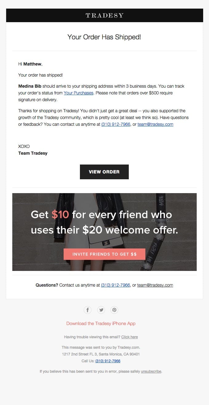
Tradesy is an online peer-to-peer resale marketplace for women’s luxury and designer fashion.
Why this referral email example rocks:
- Does a nice job of tucking a referral offer into an order shipping update (at a time when customers are most excited about the product)
- While most of the email is minimal, the referral information is highlighted with an image, large text, and bright colored CTA button
- A cash incentive, without revealing all the program details, compels customers to click for more
Stitch Fix
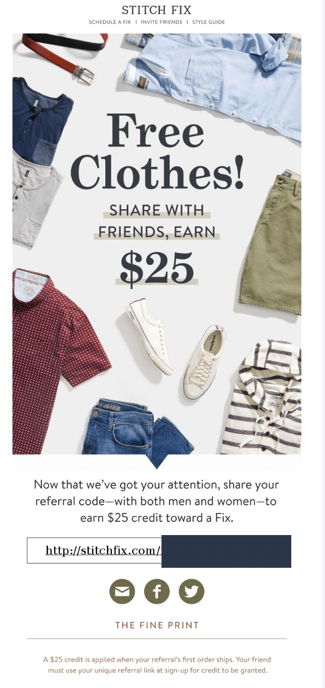
Stitch Fix is a personal style service that delivers curated clothing boxes straight to customer doors.
Why this referral email example rocks:
- It tells you exactly what you’re getting from the start (“Free clothes!”) and what you need to do (“Share with friends”)
- A strong hero image frames the referral message with well-placed products
- Smart copy below the image (“Now that we’ve got your attention…”) leads to more details about how the referral program works
- Includes a personal referral link customers can easily copy and paste right from the email
- “The Fine Print” at the end of the referral program email further clarifies the terms without taking away from the main message
Indochino
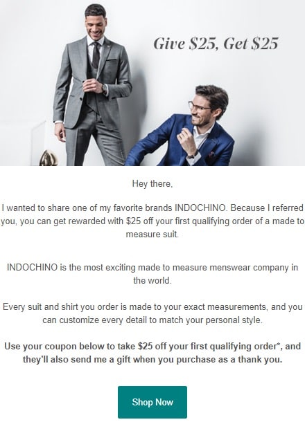
Indochino is a menswear retailer offering made-to-measure suits, shirts, and accessories at ready-to-wear prices.
Why this referral email example rocks:
- This referral program email is what a referred friend actually receives, and does a good job by writing from the point of the existing customer
- A decent double-sided incentive of $25 for each party
- The CTA button takes referred friends straight to the store so they can start shopping and avail of the referral incentives (more about Indochino’s referral program here)
Goby
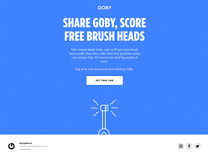
Goby offers premium oral care products at a fair price, with an electric toothbrush designed to improve oral health.
Why this referral email example rocks:
- Simple, uncluttered layout with one color and all text in the center
- Clear referral details right from the start
- The incentive of free brush heads is targeted toward Goby’s regular customers
- The on-brand copy works well with its referral program: “It’s time to use that big mouth of yours.”
Harry’s
Harry’s sells men’s shaving and personal care products through subscription and online.
Why this referral email example rocks:
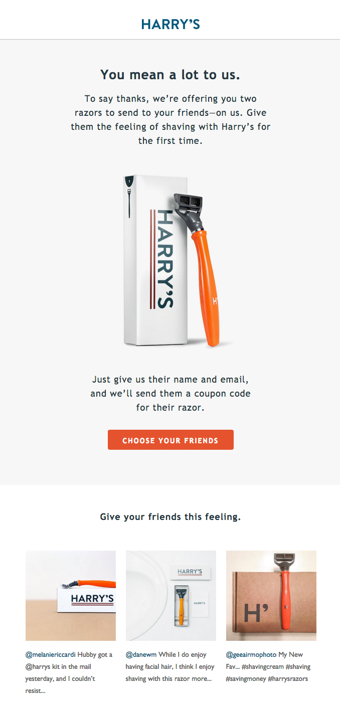
- Starts with strong line of copy (“You mean a lot to us”) and speaks to customers in a relatable tone (“Just give us their name”)
- Rather than offering the incentive to the current customer, the company takes a more altruistic approach and sends two free razors to the referred friend
- It elevates the products with subtle copy (“Give them the feeling of shaving with Harry’s”)
- A catchy, action-oriented CTA in bright orange (“Choose your friends”)
Brooklinen
Brooklinen is a direct-to-consumer brand that delivers quality beddings at a reasonable price.
Why this referral email example rocks:
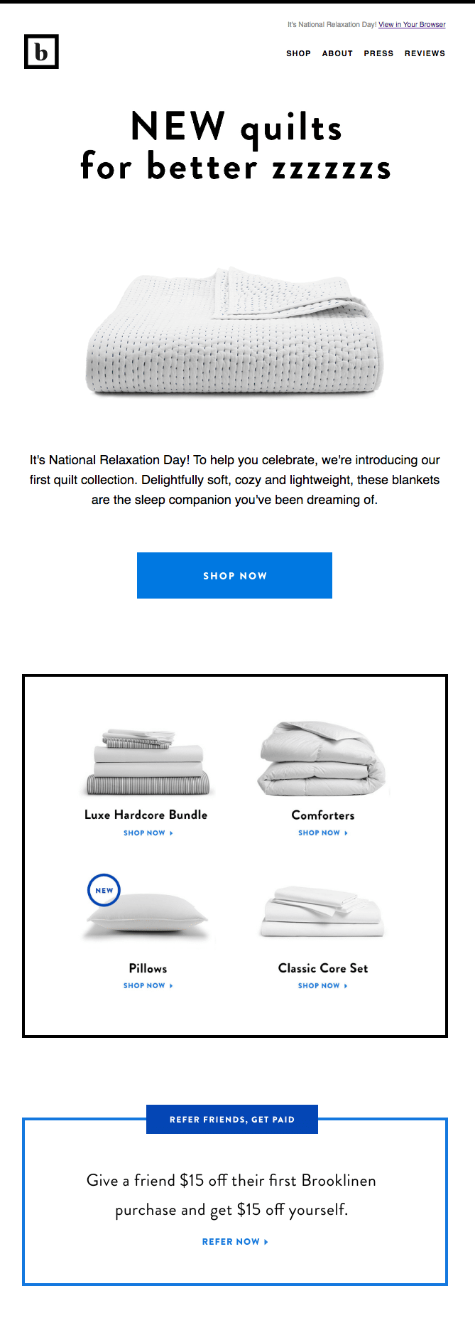
- The multipurpose email celebrates National Relaxation Day, the brand’s new collection, and a compelling referral program
- A straightforward “Refer friends, get paid” lets customers know about the offer
- The actual referral area is very clear – all text, with an enticing double-sided offer ($15 for your friend, and $15 for you)
Equal Parts
Equal Parts is a new cookware brand that also helps you cook with a text-based cooking coach service.
Why this referral email example rocks:
- The prelaunch referral program email sticks to a simple letter-type layout
- Effective, heartfelt copy (“our mission to help our generation enjoy home cooking” and “a small gesture before launch”)
- It offers three ways to share: a personal referral link, an “Invite friends” button, and “Invite friends” link
- A simple, colorful graphic breaks down all the potential referral rewards
Casper
Casper is an ecommerce company known for selling a bed-in-a-box straight to customers.
Why this referral email example rocks:
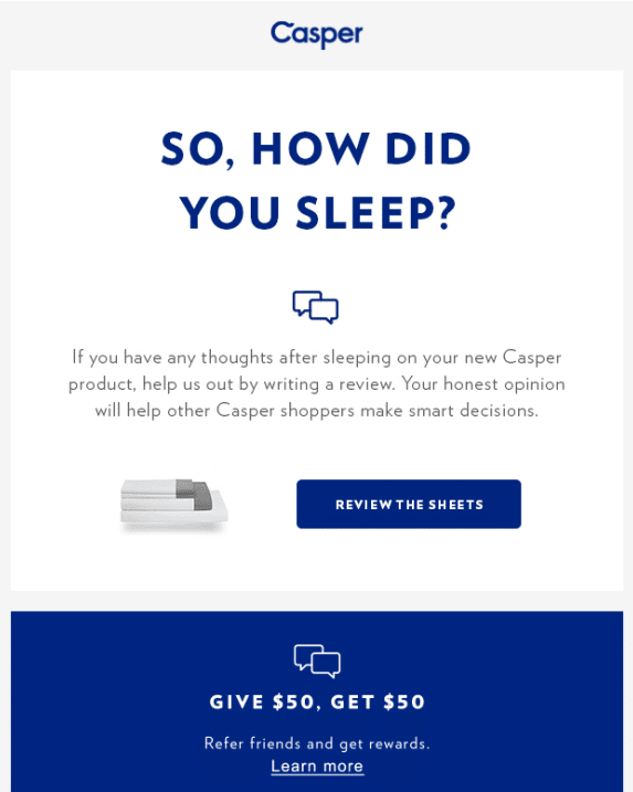
- The post-purchase email engages customers with a casual, yet caring, question (“So, how did you sleep?”)
- It offers a simple, high-value referral incentive to “Give $50, Get $50”
- While the email shares only the basics of the customer referral program, it offers good value and is sent at a time customers are highly invested in the brand
Saje Natural Wellness
Saje Natural Wellness is a Canadian retailer of private-label essential oils and all natural skin care products.
Why this referral email example rocks:
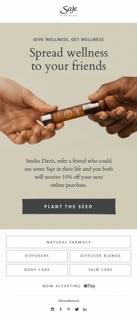
- Hard-to-resist copy that invites customers to “Spread wellness to their friends” – specifically “a friend who could use some Saje in their life”
- A double-sided offer to get 10% off the next online purchase for both the customer and the referred friend
- The simple hero image includes a strong reference to the intent of the email (to share)
- A catchy CTA button invites customers to “Plant the seed”
- It includes a branded #spreadwellness hashtag for users to use on any posts and drive even more engagement
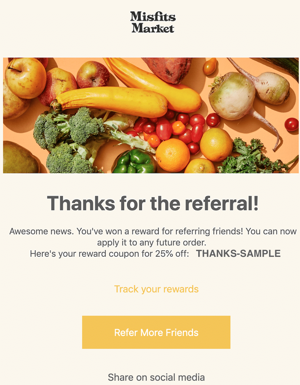
Misfits Market
Misfits Market delivers ugly, but still delicious and even more affordable fruits and vegetables right to your door.
Why this referral email example rocks:
- This thank you email comes after a successful referral, acknowledging and rewarding the customer’s efforts with 25% off
- A simply link allows customers to redeem their coupon with one click
- The email includes a CTA to refer even more friends and “track their rewards” (where they can see their progress and savings)
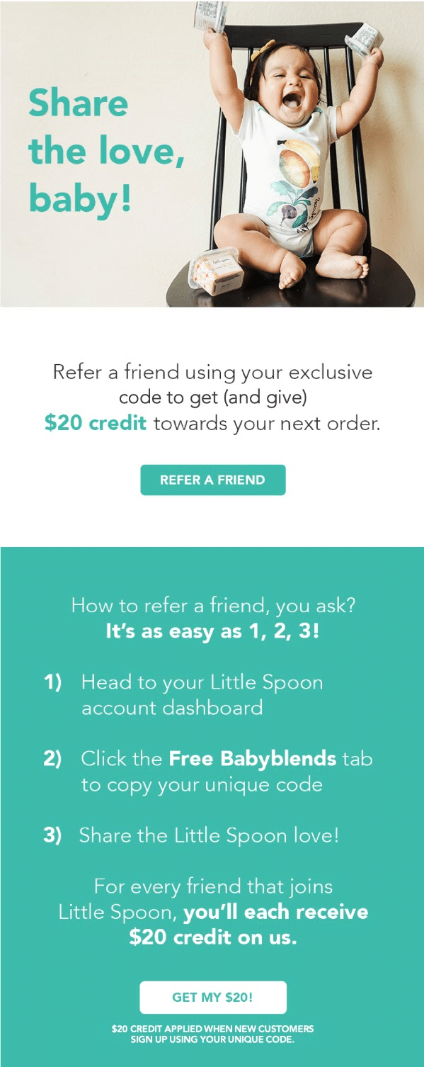
Little Spoon
Little Spoon delivers homemade, organic baby food that’s pediatrician-recommended and personalized to your baby’s nutritional needs.
Why this referral email example rocks:
- It grabs your attention by featuring an exuberant baby holding the brand products a hero image
- The copy aligns perfectly with the brand and referral program (“Share the love, baby!”)
- It breaks down the referral process in three easy steps
- There are two CTA buttons: “Refer a friend” and “Get my $20!”
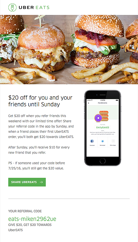
Uber Eats
Uber Eats is an online food ordering and delivery platform launched by ride-hailing company Uber.
Why this referral email example rocks:
- The refer-a-friend email opens with the image of a nice juicy burger
- The referral incentive of “$20 off for you and your friends” offers significant savings on the average food bill
- Offering the incentive only until the weekend (after which the incentive halves to only $10) prompts customers to act now
- There are two ways to share the referral: a button to “Share Uber Eats” and a unique referral code
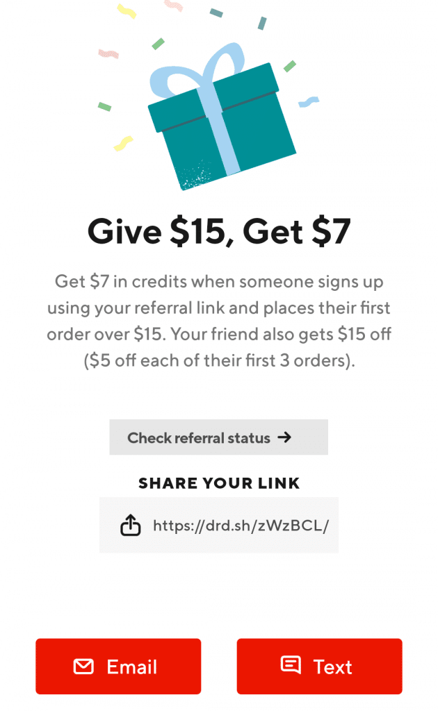
Doordash
DoorDash is an on-demand prepared food delivery service that operates primarily as a logistics company between restaurants and customers.
Why this referral email example rocks:
- Although not technically an email (the referral message is shown in-app), the message is actually more effective as most users interact with DoorDash through its app
- It offers three convenient referral sharing methods: email (it auto-connects to existing users), a referral link, and text message
- An attractive dual-sided referral incentive: $7 for every order over $15 placed by the referred friend (the friend also gets $5 off each of their first three orders)
Pay with GasBuddy
Pay with GasBuddy is a gasoline savings program giving U.S. drivers a discount on every gallon of gas.
Why this referral email example rocks:
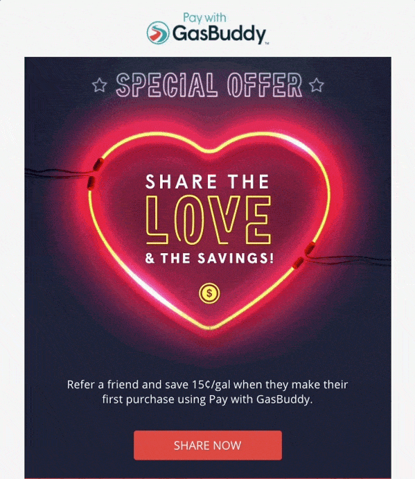
- A neon heart GIF captures attention and frames the refer-a-friend email offer (“Share the love & the savings”)
- The feel-good referral program email invites customers to share their love for GasBuddy – and earn savings for both themselves and their friend
- A “Special Offer” at the top of email prompts urgency and hints at exclusivity
- There is very little text – just enough for customers to know what the referral program is about
- Clear incentive to “save 15 cents/gal”
Square Cash (now Cash App)
Square Cash (now known as Cash App) allows users to send, save, and invest money using their phone.
Why this referral email example rocks:
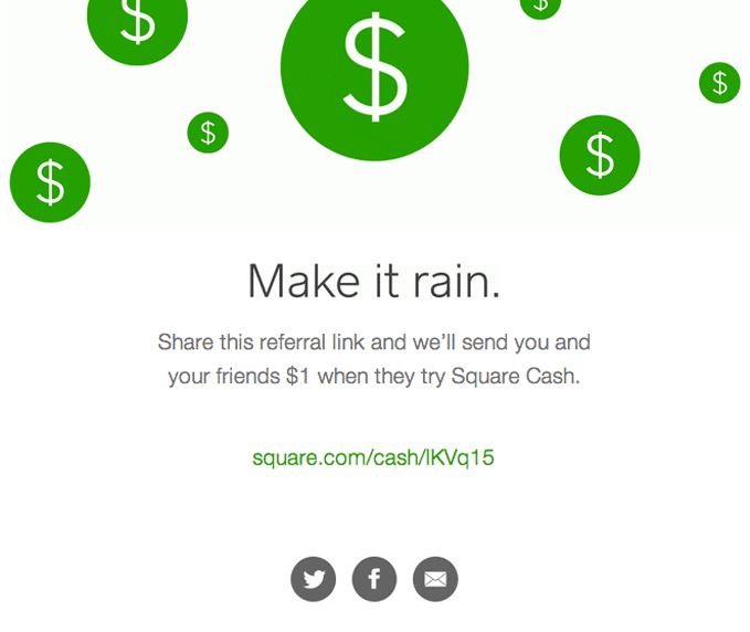
- A minimal two color layout goes well with clean copy
- The green dollars falling from the sky (free money!) is a guaranteed way to grab attention
- It has an appropriate header (“Make it rain.”) – ideally, a referral would be more specific, but this works because it connotes cash, draws the eye, and invites the reader to learn more
- The refer-a-friend email copy is very concise, using only one sentence to tell users about its referral program
Betterment
Betterment is a robo investing platform for everyday cash management, online retirement advice, and personal investing.
Why this referral email example rocks:
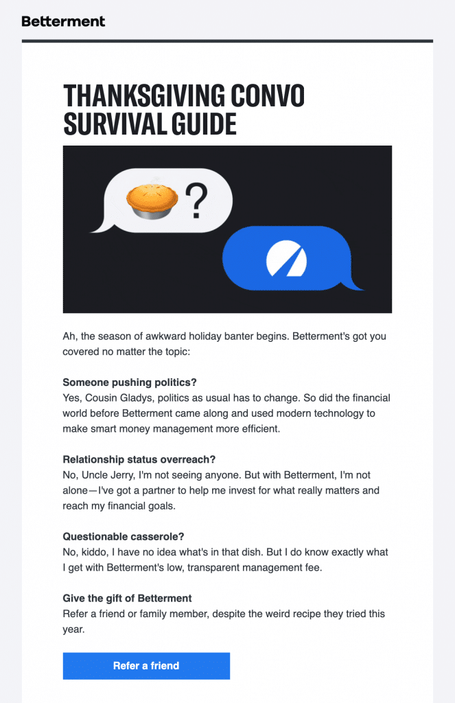
- It talks about finance through a fun and common experience – awkward holiday banter
- The strong hero image features mobile messaging (relevant for a tech platform) and a pie emoji (to symbolize Thanksgiving)
- It’s a smart way to tie in the platform’s benefits into common Thanksgiving convo (“pushing politics” and “questionable casserole”)
- It uses great copy to invite users to refer a friend (“Refer a family member or friend, despite the weird recipe they tried this year”)
ibotta
Ibotta enables users to earn cash back on a number of purchases made in-store, in-app, or online.
Why this referral email example rocks:
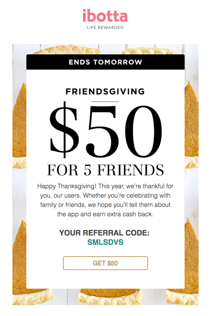
- It rides on the Thanksgiving holiday – giving thanks for its users – but adds its own spin with a “Friendsgiving” referral campaign
- It offers an appealing $50 to refer five friends (similar to Ibotta’s other refer-a-friend programs)
- There is a very limited time offer (only until the next day), which motivates customers to act now
- There are two immediate ways to refer friends: a unique referral code and a CTA button to “Get $50”
Digit
Digit is a mobile app that analyzes your spending and automatically sets aside a certain amount each day to make saving as passive as possible.
Why this referral email example rocks:
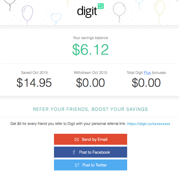
- Details of the refer-a-friend program are neatly tucked into an account update, where customers are likely open to hearing more about the company (especially after seeing how it saves them money)
- It offers clear referral details (“Refer your friends, boost your savings”) that speak straight to budget-conscious users
- It offers a flat $5 for every friend referred, which they can invite through a personal referral link, email, Facebook, or Twitter
Postable
Postable makes addressing and mailing real designer greeting cards and invitations as easy as sending a referral program email.
Why this referral email example rocks:
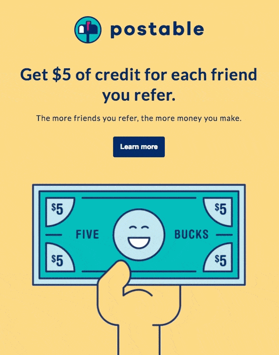
- A yellow palette catches the eye, but doesn’t overwhelm
- It’s clean, concise, and displays very little text (22 words total, including the company name), but readers can still easily understand what they get
- A fun and happy GIF showcases the incentive
- An above-the-fold CTA button brings them to more details
Remote.com
Remote.com is a platform that helps people and organizations work together anywhere in the world.
Why this referral email example rocks:
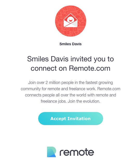
- This referral program email is sent to friends, and starts with a personalized email greeting from the existing customer
- Its compelling invitation to join “over 2 million people in the fastest growing community for remote and freelance work”
- While there’s no explicit referral incentive, an invitation to “join the evolution” can be enough, especially if the friend is freelancer interested in open work
- A quick CTA allows readers to “Accept the invitation”
The Skimm
The Skimm is a subscription-only newsletter delivering a digest of the latest news stories in a simple, easy-to-read format.
Why this referral email example rocks:
- After marking its fifth anniversary, this personalized email highlights specific subscriber details (e.g., the date you signed up, number of emails sent, and number of referred readers)
- It invites subscribers to “give that share button another go” in exchange for the chance for $1,000 and $15,000 at the end of the week
- A CTA button at the end of the long email is highlighted by two distinct arrows
Intercom
Intercom offers a messaging platform enabling businesses to communicate with customers through their app, website, social media, or email.
Why this referral email example rocks:
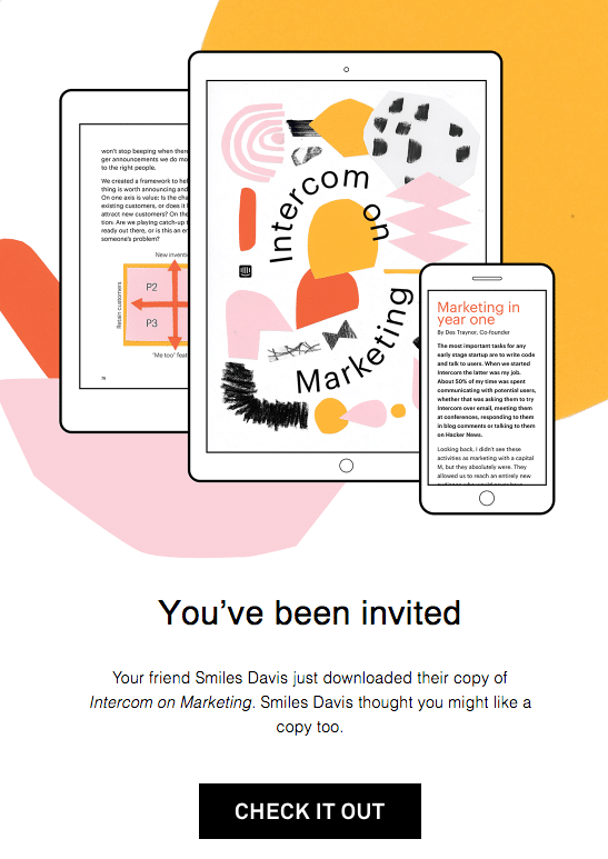
- The fun email design and personal invitation from their friend immediately grabs attention
- It puts the product (an ebook) in context, by mentioning a friend just downloaded a copy and is sharing one with them
- The referral incentive is baked right in, with a direct download to the ebook
- The strong CTA leads readers to “Check it out”
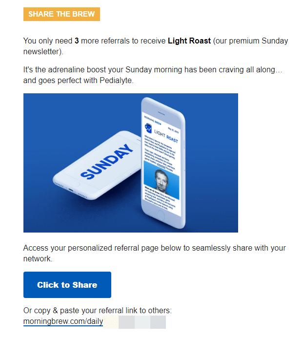
Morning Brew
Morning Brew is a daily email newsletter delivering the latest news from Wall St. to Silicon Valley straight to your inbox.
Why this referral email example rocks:
- Existing primarily through email, Morning Brew uses every opportunity (daily or weekly) to promote its referral program.
- The referral details (at the bottom of each email) count how many more referrals are needed to receive the incentive, which range from stickers, mugs, or premium newsletters
- It includes two available CTA: A “Click to Share” button and a referral link you can send to others directly
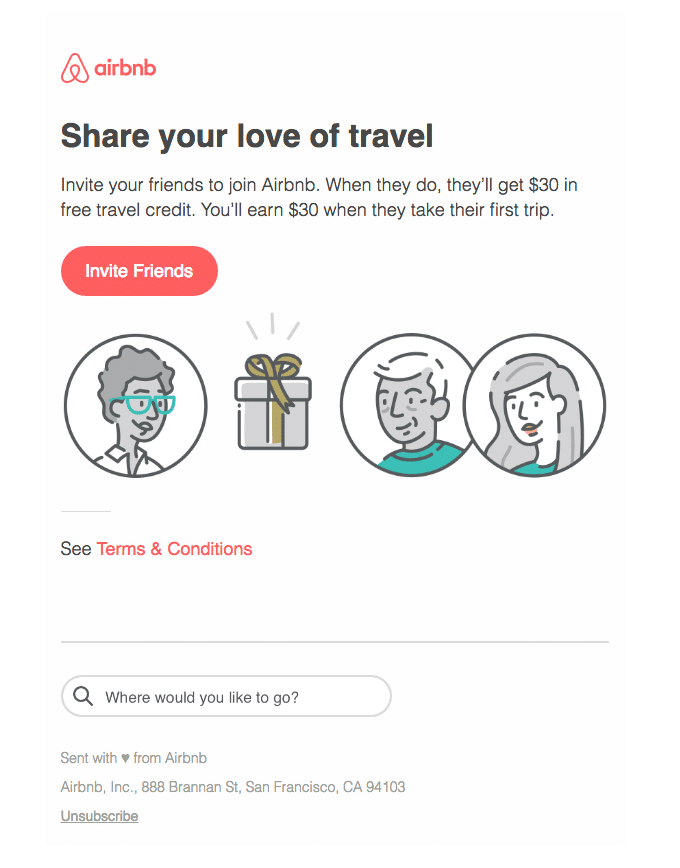
Airbnb
Airbnb is an online marketplace offering shared accommodations, homestays, and tourism experiences.
Why this referral email example rocks:
- Three sentences of clear copy are enough to explain the referral offer
- It starts with intrinsic value (sharing love of travel with friends), and offers extrinsic reward ($30 for each party)
- The CTA button uses its brand color to stand out from the rest of the email
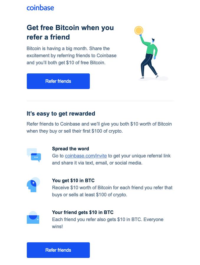
Coinbase
Coinbase is a secure platform that makes it easy to buy, sell, and store cryptocurrency.
Why this referral email example rocks:
- It jumps straight to the referral offer of free Bitcoin
- The copy draws readers with the news of Bitcoin “having a big month” and invites them to “share the excitement”
- The referral process is broken down into three simple steps, with attractive icons and easy-to-read copy
- There are two CTA buttons with the same “Refer friends” message
HotelTonight
HotelTonight is an online travel app that allows users to find discounted hotel accommodations.
Why this referral email example rocks:
- The entire refer-a-friend email is focused on sharing and invites users to share their hotel pics
- It has a catchy #picsoritdidnthappen hashtag and a step-by-step guide to get your pics published
- The email ends with the “Friends with benefits” referral offer that rewards $35 you and your friend
- It has a link to learn more and a referral code right in the email
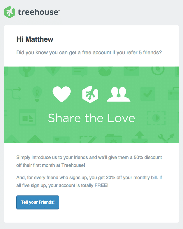
Treehouse
Treehouse is an online technology school that provides accessible education and apprenticeship in web design, web development, mobile development and game development.
Why this referral email example rocks:
- A personalized greeting addresses each customer
- The intro starts with an engaging “Did you know…” and an offer for a free account
- The “Share the Love” copy appeals to the intrinsic value of sharing something with friends, which is especially useful for an education platform
- It offers an attractive cumulative reward to motivate multiple referrals: Customers get 20% off per referral, which means a free account after five successful referrals (plus a 50% discount for their friends)
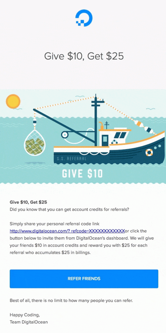
Digital Ocean
DigitalOcean is a cloud infrastructure provider that helps developers easily build, test, scale, and manage applications of any size.
Why this referral email example rocks:
- It grabs the customer’s attention right away with an on-brand, ocean-centric GIF that further highlights the referral offer
- There is an attractive double-sided incentive (“Give $10, Get $25”)
- It includes two easy referral options: a unique referral link and a CTA button to learn more
- The referral email gets right to the point with a clear, uncluttered offer
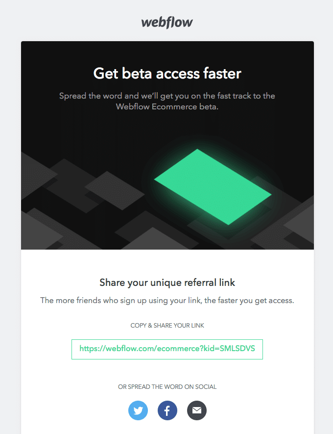
Webflow
Webflow builds tools enabling everyone to create for the web, without the need to write code.
Why this referral email example rocks:
- This referral email was actually sent prelaunch, with the intention of ramping up an excited customer base before the service even goes live.
- It offers early access to Webflow’s beta for every referral, which adds a sense of exclusivity to the program.
- The copy gets right to the point
- A referral link is included right in the email, enabling customers to share without any added steps
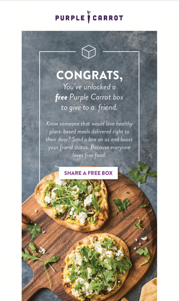
Purple Carrot
Purple Carrot is a food delivery service dedicated to plant-based meal boxes.
Why this referral email example rocks:
- Purple Carrot both shows off the product – food – and tells the customer they’ve unlocked a reward
- The email highlights exactly what kind of friend would love the service, and emphasizes how the gift of a free box might strengthen a friendship
- The “congrats” and “unlocked” wording makes customers feel like they’ve got access to an exclusive offer
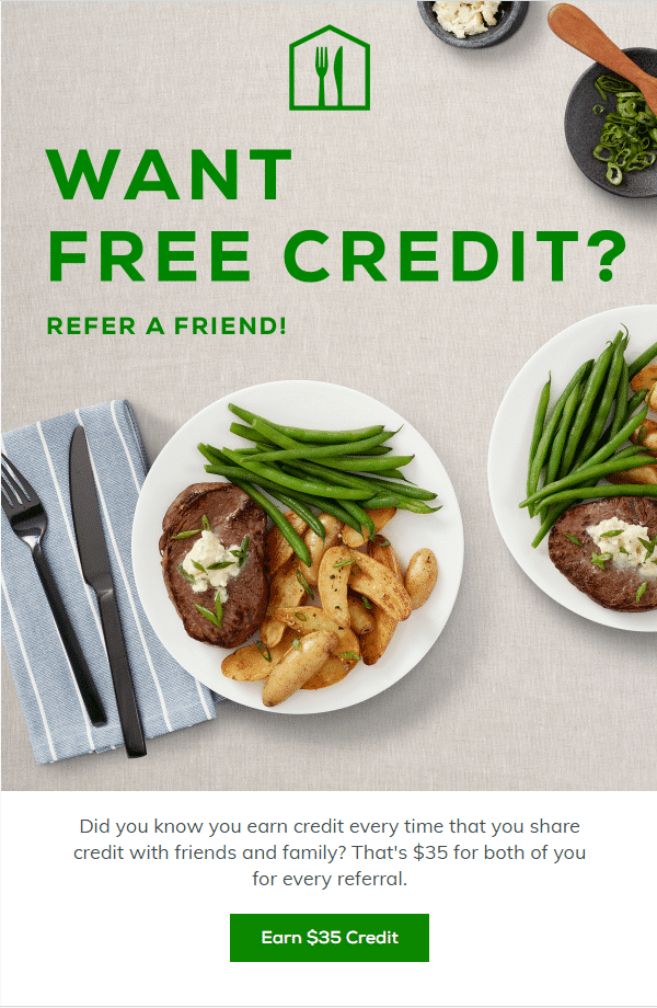
Home Chef
Weekly meal kit Home Chef lets people skip the grocery store with fresh ingredients and preplanned recipes.
Why this referral email example rocks:
- Leads with the question “Want free credit?” to catch the eye (who doesn’t want something for free?)
- Uncluttered top of the email lets the headline and hero image do the talking
- Short, informative description of the program gets to the point quickly
- CTA entices with the referral offer
Omsom
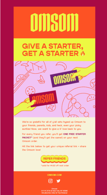
Omsom serves up authentic starter packets for creating proud, loud, authentic Asian dishes.
Why this referral email example rocks:
- Fiery headline (check out that emoji!) draws customers in
- Graphic that shows two parties getting and receiving keeps eyes on the email and appeals to friendship
- Quick thank you note introduces the program, then explains what everyone can receive after referring
- Clear CTA ends the messages, encouraging all to one click location.
Brain.fm
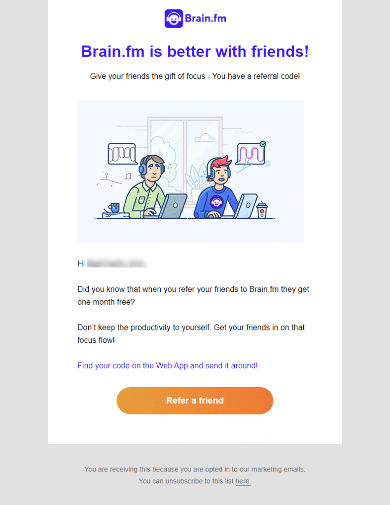
Brain.fm provides curated music for focusing on tasks.
Why this referral email example rocks:
- “Don’t let your friends miss out” – style email encourages customers to share the benefits of Brain.fm with their peers
- Highly friendship-focused email all around, with emphasis that sharing the product is “the gift of focus”
- Uncluttered email with just the right amount of text
Primary
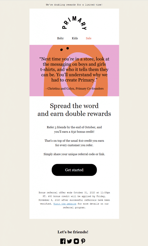
Primary offers vibrant gender-neutral clothing for children.
Why this referral email example rocks:
- Advertises a limited-time offer of double the rewards, with lots of urgency
- Leads with a message from the cofounders reminding customers of the product’s value (and why they should share)
- Still emphasises the referral offer that’s available all the time
How to write a referral email
Now that you’ve been inspired by the refer-a-friend email examples, it’s time to write one of your own. As you sit down to create your referral email (or any email, for that matter), it’s best to keep three things in mind:
- Who is reading the referral email
- When is the best time to send a referral email
- What to include in a referral email
1. Who is reading the referral email (your target reader)
At the heart of every successful marketing strategy is a focus on the customer (i.e., their pain points, needs, values). A referral email takes this a step further by directly communicating with their best customers.
Referral emails are sent to people who already use and love your brand. Who are these people? Would they prefer a no-nonsense refer-a-friend email, or a little fun in the message?
Knowing who you’re writing for helps set the tone for your referral email.
2. When is the best time to send a referral email
Another key factor of a successful referral email is timing. While emails are sent all hours of the day, you want to choose the best time when your customer is most likely to engage in your referral program.
While this is different for everyone, there are a few key points when customers look forward to hearing from you:
- Right after they’ve made a purchase
- After a successful customer support call or chat
These are when a customer has been able to spend some time with your brand and is (hopefully!) happy with the experience. You’re at the top of their mind.
Make the most of this by reaching out with a timely refer-a-friend email that offers even more incentives and value.
You could even combine your referral email with an after sales message, such as an email thanking them for their order or notifying them about a delivery update.
3. What to include in a referral email
We already know a referral email is supposed to tell customers about your referral program. But what exactly should they know?
There are two main points you want to include in your referral email:
- What you want them to do (“Share this product with five friends” or “Invite friends to subscribe”)
- What you offer in return (25% off their next purchase, a free t-shirt, 25 reward points)
The idea is to keep your first referral email short, but tell enough to grab their attention.
Promote your program with compelling referral emails
A referral program helps grow your business through targeted word of mouth, and a referral email serves as one of the best ways to tell customers about your program. After all, your program won’t be successful if your customers don’t know about it!
Emails are more personal and can capture your customer’s focus more than a billboard or mass advertising. But they’re also easy to customize for your brand and share more content than a quick text or direct message.
So, what are you waiting for? Take inspiration from the referral emails above, and get your customers excited about sharing!
Looking for more referral program promotion resources? We recommend these articles:
