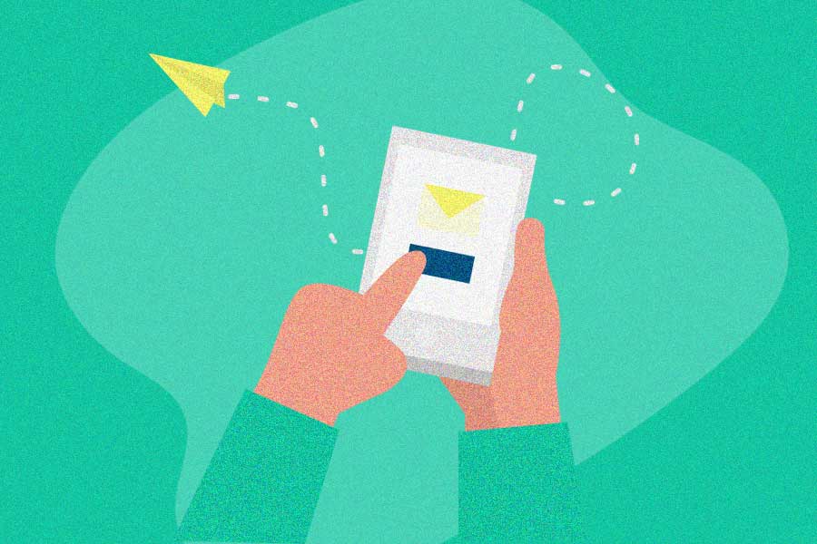
Most of your customers’ relationship with your brand happens on their phones. Their contacts, group chats, and social accounts are all a few taps away. A referral program built for mobile puts sharing right where the conversations already happen.
But the best mobile referral programs aren’t just well-designed apps. They get the fundamentals right: making sharing feel like a gift, keeping access open so anyone can participate, and promoting the program continuously instead of hoping people stumble into it.
Below, we’ll cover the principles that separate great mobile referral programs from forgettable ones, plus 12 examples that put them into practice.
What is a mobile referral program?
A mobile referral program makes it easy for customers to share your brand with friends directly from their phones, and rewards them for doing it.
These programs are usually built into a brand’s existing app, putting referral opportunities right in the customer’s hands. Every successful referral draws another user into your app, creating a growth loop. Even without a brand app, you can optimize your referral program for mobile with a responsive web experience and the right referral software.
Note: Mobile referral programs are different from affiliate programs. Both use links designed for referral tracking, but affiliates promote products to their audience and don’t need to be customers. Referral marketing relies on personal recommendations from satisfied customers to their friends. It’s the difference between a billboard and your best friend saying “you have to try this.”
Why referral programs work so well on mobile
Your customers spend over five hours a day on their phones, and 70% of web traffic comes from mobile devices. That’s where the conversations happen. A mobile referral program puts sharing right inside those conversations.
The mechanics are simple: a customer taps a referral link or code, picks a contact or social platform, and shares. A few taps, and they’ve just invited someone into your brand. No switching devices, no copying URLs to email later.
Google estimates that people have twice the number of brand experiences on mobile compared to all other mediums. And 89% of people recommend a brand after a positive mobile experience. Mobile doesn’t just make sharing easier. It makes people more likely to share in the first place.
Before you launch a mobile referral program
If you already have a brand app and a referral marketing strategy, you’ve done most of the heavy lifting. Before going mobile, get these fundamentals right. They matter more than the app design.
Keep access open instead of picking who can join
A common instinct is to gate your referral program. Run an NPS survey first. Only invite your most loyal customers. Roll it out slowly to a select group.
This kills programs before they start.
You never know who your biggest promoters are. The customer who bought once and loved the experience might refer ten friends. The “loyal” customer you carefully selected might never share at all. Gating based on assumptions means you miss the people who would have promoted you most.
Instead, give everyone access by default. Every customer gets a referral link or code, no signup form required. The best referral programs have no join button.
This sounds risky, but it’s not. You can handle bad actors progressively (flag suspicious activity as it happens) rather than preemptively punishing your entire customer base with hoops and gates. Operate from abundance, not scarcity.
Promote continuously, not just at the “perfect moment”
The other common mistake is obsessing over timing. “Ask after the wow moment.” “Don’t interrupt the browsing experience.” “Find the referable moment.”
This leads to either paralysis (you never find the right time) or a single touchpoint that most customers never see.
Referral programs aren’t a campaign you launch and hope sticks. They’re ongoing operations. Build referral touchpoints into multiple parts of the customer journey:
- Where people expect to find it: Your app menu, your website, your social profiles
- After great experiences: On receipts, in order confirmations, after service is completed
- In regular communication: Email signatures, newsletters, social posts
A contact list goes stale in 2-3 months. Continuous promotion keeps fresh customers flowing into the program. The right time to promote your referral program isn’t a single golden moment. It’s all the time, in multiple ways.
Make sure your operations can back it up
Before launching any new program, honestly assess whether your business can handle the growth. Can you accommodate your current customers and new ones? Is your support team briefed on the program terms and how to troubleshoot issues?
This matters because a referral program amplifies word-of-mouth marketing, both positive and negative. If customers aren’t getting proper support, they won’t recommend you. As many as 70% of U.S. consumers spend more money with companies that deliver great service, according to Forbes. A referral program doesn’t create word of mouth. It captures and amplifies what’s already there. Make sure what’s already there is worth amplifying.
Best practices for a mobile referral program
With the fundamentals in place, here’s how to optimize the mobile experience itself.
Make navigation simple
Your referral program is an additional feature inside your app, not the main event. Place the link and CTA where customers can find it without hunting. Above the fold, in the main menu, accessible in two taps or fewer.
The examples below that do this best (Uber’s “Free Rides” in the menu, Instacart’s green dollar icon, HelloFresh’s “Free Food” button) make the program impossible to miss without being intrusive.
Keep messaging clear
Your referral program needs to tell customers two things: what to do and what they get. If you can’t explain it in one sentence, simplify it. Phrases like “Give $25, Get $25” work because they communicate the entire program in four words.
On mobile, screen space is limited. A clear referral message and a single CTA button will outperform a page full of terms and conditions.
Frame rewards around the friend, not the referrer
Most referral programs focus on what the referrer earns. “Refer a friend, get $20.” This makes sharing feel transactional. The referrer feels like they’re using their friend to get a discount.
Flip it. Frame the referral as a gift the sharer is giving their friend. “Give your friend $25 off their first order” changes the entire dynamic. The sharer feels generous, not mercenary. The friend feels welcomed, not targeted.
The best examples in this article do exactly this. Hotel Tonight’s “Give $25, Get $25” leads with the friend’s benefit. HelloFresh says “Choose a treat for a friend.” PayPal’s “Send a penny to a friend” makes the action feel personal, not promotional.
When designing your reward incentives, lead with what the friend gets. Make the referrer’s reward secondary. And consider gifts over cash. A free product, a discount on first purchase, or store credit feels more like a gift than a $10 payout.
Enable social sharing with pre-filled messages
Your customers’ entire social circle is on their phone. Make it easy to reach them. Include sharing options for the platforms your audience actually uses (SMS, email, Facebook, Instagram, WhatsApp) and pre-fill the referral message so sharing takes a single tap.
Pre-filled messages should sound natural, not salesy. And always let customers customize the message. A personal note from a friend converts better than a template.
For instant, in-person sharing, QR codes work well (Octane Coffee and Hopper both use them effectively). For text-based sharing, make sure referral links copy with a single tap.
Remove every unnecessary step
Every extra step kills conversion. Can you pre-populate customer information so they don’t re-enter their email? Can the referral link copy with one tap instead of requiring the user to highlight a text string? Does the referred friend need to fill out a form, or can they get started immediately?
As with any referral marketing program, friction is the enemy. On mobile, where screens are small and attention spans are shorter, this matters even more. Step back and count the taps. If it’s more than three from menu to share, cut something.
What are the best app referral program examples?
We bring you 12 of the best app referral programs out there, and explain exactly what makes each successful referral program work so well. Our list includes ecommerce brands, food brands, services, and more. Use these as templates for your own refer-a-friend program!
1. RobinHood
 1")
RobinHood’s commission-free stock trading app turned its referral program into a game. Both the referrer and their friend receive a free mystery stock when the friend joins. The stock could be worth $2 or $200.
Referral CTA: “Get Free Stock” (image pop-up), “Invite Friends” (CTA button)
Reward: One free share of stock for each friend who joins. The company is random, creating a slot-machine dynamic.
What makes it work:
- The mystery element makes referring addictive. As CBInsights explained, the small but consistent wins keep people referring, much like a slot machine.
- RobinHood’s program went viral on Reddit, where users gathered to share which stocks they received. People who got high-value stocks shared publicly, driving others to keep referring.
- The reward (a free stock) is perfectly on-brand for a stock trading app. It introduces the friend to the core product immediately.
2. Fetch Rewards
 2")
Fetch Rewards gives grocery shoppers points for scanning receipts. Their referral program is clean and simple: both sides earn 2,000 points when a friend scans their first receipt.
Referral CTA: “Referral Code” (easy to find in menu)
Reward: Double-sided. 2,000 points each for the referrer and the friend. Points can go toward gift cards, sweepstakes, or charity donations.
What makes it work:
- Two taps to access the referral page. The code copies automatically when you tap it.
- Equal, double-sided rewards. Both parties get the same thing instantly.
- The points structure gives customers their choice of rewards, which adds flexibility without complicating the share.
3. Hotel Tonight
 3")
Hotel Tonight’s last-minute hotel booking app leads with friend-first messaging. The referral CTA is a simple gift box icon, immediately visible on the main screen.
Referral CTA: Gift box icon (no menu needed), “Give $25, Get $25”
Reward: $25 off for the friend’s first booking. $25 off for the referrer once the friend books.
What makes it work:
- “Give $25, Get $25” is a perfect friend-first frame. The friend’s benefit comes first, even in the CTA.
- The gift box icon is accessible without opening a menu. One tap to the referral page.
- Clean black-and-white design with a purple CTA that pops. No clutter, no confusion.
4. Uber / Uber Eats
 4")
 5")
Uber’s referral program helped fuel the company’s explosive growth. The “Free Rides” link sits in the main menu, visible to every user. Since customers keep the app open while waiting for rides, they naturally discover the program.
Referral CTA: “Free Rides” (menu), “Want more Uber for less?” (referral page)
Reward: $5 ride credit per referral (cumulative). Friends get $5 off their first four rides. Uber Eats uses a similar system, extending the program across both services with $5 off for referrers and $15 off for friends’ first orders.
What makes it work:
- The program is always visible. It’s in the menu, not buried three screens deep. This is continuous promotion built into the app.
- Cumulative rewards keep referrers going. There’s a cap per timeframe, but the stacking credits create momentum.
- Sharing the same structure across Uber and Uber Eats doubles the referral marketing surface area without adding complexity.
5. Airbnb
 6")
Airbnb’s referral program works across desktop and mobile, but the mobile version is particularly clean. One tap copies your referral link. The program rewards at multiple levels.
Referral CTA: “Earn travel credit,” “Invite Friends” (CTA button)
Reward: $25 when a friend travels, $75 when a friend rents out their place. The friend gets $25 toward their first trip.
What makes it work:
- Multi-level rewards. Referrers earn at two different trigger points, which increases the total value per referral.
- The friend-first messaging (“Give each friend $25 towards their first trip”) frames the referral as generosity.
- One-tap link copying and sharing through Facebook and email keeps friction low.
6. TaskRabbit
 7")
TaskRabbit connects people with freelancers for home tasks. Their mobile referral program is a strong example of optimizing an existing desktop program for mobile.
Referral CTA: “Refer friends to TaskRabbit”
Reward: $20 for the referrer (after the friend pays for a task), $20 for the friend on their first task.
What makes it work:
- Equal double-sided rewards. Both parties get the same $20 credit.
- The referral link copies with one tap, and customers can share via Facebook, Twitter, SMS, or email.
- Clean layout with easy-to-understand text. No unnecessary steps.
7. Instacart
 8")
Instacart’s grocery delivery app makes their referral program impossible to miss. An eye-catching green dollar illustration sits in the menu, and the “Send $10, Get $10” messaging is clear as day.
Referral CTA: “Refer your friends” (menu button), “Send $10, Get $10”
Reward: $10 credit for both the referrer and friend.
What makes it work:
- “Send $10, Get $10” leads with the giving action. You’re sending your friend something, not just earning something for yourself.
- The banner with the dollar sign draws customers in from the menu. One tap to reach the referral screen.
- A second “Invite” button in the menu creates multiple paths to the program, increasing discovery.
8. HelloFresh
 9")
 10")
HelloFresh’s meal kit delivery service nails the friend-first approach. The referral page says “Choose a treat for a friend” and the “Free Food” button in the menu is always visible.
Referral CTA: “Free Food” (menu), “Choose a treat for a friend,” “Give $40. Get $25.”
Reward: The friend gets $40 off their first delivery. The referrer gets $25 after the friend orders.
What makes it work:
- “Choose a treat for a friend” is pure gift framing. The referrer isn’t earning a reward. They’re picking a gift.
- The reward is weighted toward the friend ($40 vs. $25), which reinforces the giving dynamic and motivates new signups.
- A built-in “How It Works” FAQ pop-up answers questions without cluttering the main referral screen.
9. Hopper
 11")
Travel deal app Hopper offers one of the most sharing-friendly mobile referral experiences. Multiple channels, including QR codes for in-person sharing.
Referral CTA: “Invite” (menu), “Earn travel credits by sharing your code”
Reward: Travel credits (amount varies).
What makes it work:
- More sharing options than almost any other program: SMS, email, Instagram, TikTok, Snapchat, QR code.
- The QR code is perfect for sharing with someone standing right next to you. No need to spell out a referral code or even go through the extra clicks to send an email.
- A 4-step visual explainer makes the process clear for anyone who needs it.
10. Central Bank
 12")
 13")
Central Bank knows that banking increasingly happens on phones, so they’ve made their referral program a mobile-first experience (with desktop as a backup).
Referral CTA: “Refer a friend” (menu), “Refer a friend and get $50”
Reward: $50 account credit for each friend who opens a personal checking account.
What makes it work:
- Easy to access from the app menu. No clicking through multiple screens.
- The $50 reward ties directly back to the banking service, keeping the referral on-brand.
- A walkthrough GIF on the mobile site helps referrers understand the process visually.
11. Octane Coffee
 14")
Octane Coffee ties their referral program directly into the mobile ordering experience. The QR-centric design is perfect for in-person sharing at the coffee shop.
Referral CTA: Share your code for a free drink
Reward: Free drink for the referrer and a free drink for the friend after the friend’s first order.
What makes it work:
- The QR code is front and center (and massive). If you’re standing in line with a friend, you can share in seconds.
- The reward is simple and immediate: a free coffee for both of you. No points systems, no complicated tiers.
- Friend-first messaging: “Share your code to give your friend an extra free drink.” The friend’s benefit leads.
12. PayPal
 15")
 16")
PayPal was one of the first companies to achieve viral growth through referrals, and the program is still going strong. The mobile experience ties into what people already do with PayPal: send money to friends.
Referral CTA: “Get $10 for referring a friend,” “Invite a friend. Get $10.”
Reward: $10 PayPal credit to both referrer and friend once the friend spends $5.
What makes it work:
- “Send a penny to a friend” is brilliant. It turns the referral into a natural PayPal action (sending money) rather than a marketing ask. Anyone can refer with virtually no expense.
- Equal $10 rewards for both sides make it fair and simple.
- PayPal’s years of referral experience show in the polish. The mobile sharing flow feels like a natural extension of the app, not a bolted-on feature.
Build a mobile referral program that rolls
The examples above share a common thread: they make sharing feel natural, not transactional. They keep access open, promote continuously, and put the friend’s experience first.
That’s what separates a referral program that generates steady growth from one that spikes and fades. The app experience matters, but the program design matters more. Get the fundamentals right, and the mobile experience amplifies everything.
Ready to build a referral program that keeps rolling? Start with Referral Rock and see how it works.