When you’re browsing a website and a pop-up appears out of nowhere, you might think it’s a bit annoying. But that pop-up captured your attention, right?
On your own website, attention-grabbing pop-ups can help increase the number of your customers who refer their friends after making a purchase – and thus help you increase your customer base.
But is using a referral program pop-up effective enough to be worth it? And what types of pop-up messages are best for driving referrals? Let’s dive in and find out.
What is a pop-up and are pop-ups effective?
A pop-up is a window that suddenly appears over the main webpage content, made to look like its own window or like its own page on the screen. It always asks the visitor to perform an action. For example, to refer a friend to your brand.
Don’t be afraid to use pop-ups because you’re concerned about what your website visitors will think. What people do is always more important. And well-executed pop-ups drive customers to sign up for newsletters, make purchases before they leave the site, refer friends, and take other actions your brand wants them to take.
To give you an idea, of what people do…
- According to CrazyEgg, one blogger found that an email list pop-up helped her convert 1,375% more subscribers than a traditional sidebar form.
- As Web Presence Solutions reports, exit intent pop-ups can drive a 600% increase in sign-ups.
- In addition, only “0.25% of new visitors to the average website will make a purchase.” But “when they are encouraged to visit again,” such as through an email they signed up for via a pop-up, ”the chances of making a sale increase by nine times.” (Web Presence Solutions)
Types of pop-ups
There are many reasons to use pop-ups on your brand’s website. Here’s a list of the most common pop-ups businesses use:
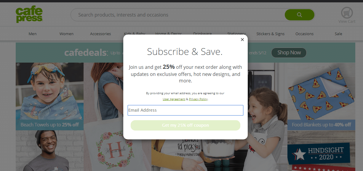
Email pop-ups
This common pop-up encourages website visitors to subscribe to an email list, such as a newsletter or regular updates on promotions. And receiving an incentive in their email sharply increases the odds that someone will visit your website again – and the odds that they’ll make a purchase.
Some email pop-ups detail the value the user will receive from signing up for the list (for example, the types of tips they’ll receive in the newsletter).
Others offer email discount codes, free shipping codes, first access to sales, exclusive access to promotions throughout the year, and/or free items (like ebooks or access to exclusive articles) in exchange for an email address.
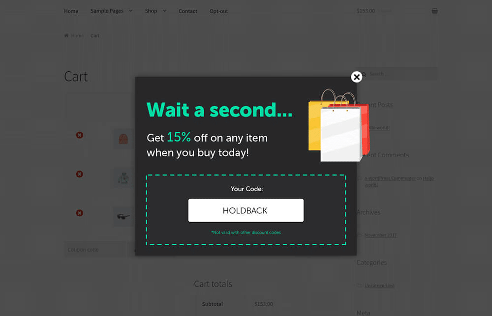
Exit intent pop-ups
Exit intent pop-ups appear when a user tries to close out of a website, to encourage them to perform an action before they leave.
Often, businesses use exit intent pop-ups on product pages, to convince on-the-fence visitors to make a purchase by offering a discount (or free trial!) in return for their email address.
- Discounts are hard to resist, and even if the person does not make a purchase, they did add their name to your email list.
Other brands use a “don’t abandon your cart” exit intent popup.
- If a prospective shopper has unpurchased items in their cart and tries to exit, brands will use this type of popup to encourage them to purchase the items and gain closure.
Welcome pop-ups
When a visitor enters a webpage, this pop-up appears almost immediately, to inform them of an active sale, discount, or offer. The visitor won’t be able to engage with the page until they engage with the pop-up, but the pop-up presents a valuable offer, so it doesn’t seem “annoying.”
Sometimes, the pop-up will display a discount code, and sometimes, website visitors can click on the pop-up to have a discount applied to their cart immediately. Other welcome pop-ups work just like email list pop-ups.
Urgency pop-ups
Some welcome and exit intent pop-ups fall into the urgency category because they inform visitors about a limited-time offer. Here are some examples:
- “Free gift for the first 100 customers!”
- “Sale ends in 3 days!”
- “Your items are selling out fast—complete your purchase now with 10% off!”
Timed pop-ups
Rather than appearing almost immediately after a user enters a certain webpage, a timed pop-up appears 30 or more seconds after a visitor has started reading a webpage. So, these pop-ups only appear to people who seem like they’re interested in what you have to offer. Timed pop-ups can include discount offers, exclusive content, or any other offer that your business thinks would lead an interested customer to convert.
Scroll pop-ups
Scroll pop-ups appear after a visitor has scrolled through a certain percentage of a webpage (rather than after a certain number of seconds). Like timed pop-ups, scroll pop-ups are a great way to target those visitors who genuinely seem interested in your brand.
Click pop-ups
These pop-ups appear over a webpage when a website visitor clicks on a specific prompt (such as an action button or link somewhere on the page). They are the only pop-ups that website users actively trigger on their own. Often, these pop-ups will contain offers, or prompt visitors to enter their email before they can access exclusive content.
Social Media pop-ups
These pop-ups encourage website visitors to follow or share your brand on social media. The best social media pop-ups offer a compelling reason for visitors to check out your social accounts— or use their own social media muscle to talk about your brand.
Referral Program pop-ups
And of course, there are referral pop-ups, which encourage your customers to refer friends to your brand. Often, these pop-ups will also fall into other categories listed above— they could be exit intent, email, click, timed, social media, or scroll pop-ups, depending on when and where they appear on your website. But why should you use pop-ups to promote a referral program? What messages work best on referral pop-ups, and what types of referral pop-ups are the most effective? Time to find out.
Reasons to use referral program pop-ups
Referral program pop-ups combine the attention-grabbing referral message of a pop-up with the power of trusted referrals:
- Nielsen reports that 84% of consumers from various markets trust recommendations from people they know.
- 76% of consumers are more likely to trust content shared by “normal” people (such as friends who refer them) than content directly shared by brands. (Adweek)
- People are 4 times more likely to buy when referred by a friend. (Nielsen)
- 83% of Americans say that recommendations from friends or family members make them more likely to purchase that product or service. (Referral Rock)
- Referred customers are more likely to stay loyal to your brand than other customers (Referral Rock).
And regardless of how people generally feel about pop-ups, they love sharing products they use and enjoy with friends.
(Learn more about why you should start a referral program here, and if you’re still not convinced there are more compelling referral program statistics.)
What features make referral pop-ups most successful?
Now, you’ll need to choose the type, location, and text of your referral pop-up.
For any pop-up to be effective, they must be carefully crafted for the purpose you want them to carry out. You’ll need to convince your customer to refer, and you’ll want to make sure that they aren’t inclined to label the pop-up as a nuisance.
Follow these rules and guidelines to design effective pop-ups that will convince customers to refer their friends. All are based on successful referral pop-up examples.
6 necessities for all referral pop-ups:
On top of these, you’ll have to remember that too many pop-ups can become annoying. But, if you aren’t loaded with too many other pop-ups you’re in the clear. Here are some things you need for a successful referral pop-up.
1. Make sure your referral program pop-ups always offer something of value to a customer or prospective customer
- Give your customer incentive to refer, whether it’s a percentage discount, money off of a purchase, or a free gift.
- If you choose not to offer an incentive, word your pop-up so your customer sees the act of sharing itself as valuable.
2. Make your goals clear
- Customers should be able to recognize immediately that the pop-up is prompting them to refer.
3. Make your offer, and its conditions, clear
- Specify exactly what your customer will receive if they refer a friend (and/or what their friend will receive).
- Also, specify what conditions must be met for the person making the referral to be rewarded.
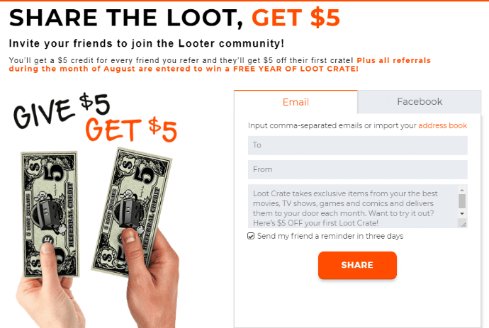
4. Use a compelling call to action (CTA) headline
- On a pop-up, the CTA is the most prominently displayed text.
- Often, your offer will be in your CTA.
- In the example below, the CTA is “Share the Loot, Get $5” —displaying part of the offer.
5. Make sure it’s easy to find your offer (or a simplified version)
- Your offer (or simplified version) should either be in your CTA or under your CTA.
- For example: “Give $25, Get $25″ (as a CTA) or “Free pair of socks when you refer a friend” (under a CTA that says “Spread the Love”).
6. Simplify the referral process
- The easier it is to refer, the more likely it is that your customers will take action.
- Giving customers multiple ways to refer (ex. email, Facebook, Twitter) allows customers to choose the most convenient and easiest option for them.
6 helpful, but optional, tips
If you want to take your pop-up up a notch, you may want to also consider these things.
1. Include an option for users to customize their message
- If you add space for customers to write their own referral message, the referral will feel more personal, and the friend will be more likely to trust it. Customization increases authenticity!
2. Add your brand’s personality
- Injecting personality makes a pop-up capture more attention, and keeps it on brand.
3. Add social sharing options
- Options to share a referral link on Facebook, Twitter, and other social media allow a customer’s referral to reach many friends at once.
4. Include a reminder feature for referral emails
- If this option is enabled, the friend will receive a second email if they have not claimed the friend offer within a certain number of days.
- Keep this option checked by default.
5. Don’t underestimate the click pop-up
- Display a refer-a-friend button or link; users can click it and trigger a pop-up.
- Remember: click pop-ups are the only one’s website visitors trigger actively—they don’t appear on their own. So make sure the button or link is easy to find!
- Most businesses choose this option for their referral pop-ups.
6. Think about setting up a pop-up to appear after a customer makes a purchase
- You may want to add timed or exit intent pop-ups for returning users and recent purchasers, so more of the right people see your pop-up no matter where they click.
- People who have already purchased your products, and who are satisfied with them, are more likely to refer.
- It’s fine to use more than one pop-up, but choose carefully—you don’t want your visitors to feel inundated with pop-ups.
Examples of successful referral pop-ups
Let’s look at three examples of successful referral program pop-up strategies, and review why they are so successful. These businesses have carefully chosen their pop-up type, location, and text for the maximum impact.
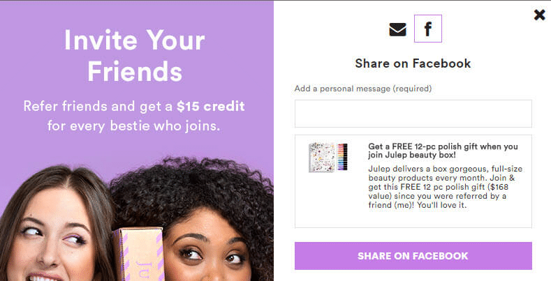
Julep
Julep has discontinued its beauty box program, but this previous pop-up of theirs is still an awesome example!
Besides referral, what type(s) of pop-up is this? Social media
Why it’s successful:
- Concise CTA (“Invite your friends.”)
- Offer is easy to find (under CTA) and shows a bit of brand personality (“Refer friends and get a $15 credit for every bestie who joins.”)
- Multiple options to refer, including email and Facebook sharing
- Clear referral offer and conditions: It’s easy to see that the customer will receive a $15 credit for every friend they refer who joins the program.
- Clear friend offer: The pop-up displays exactly what text and image the customer’s friends will see on Facebook, including the friend gift of a free 12-piece polish set.
- Option for customers to customize their email message to their friends; can send emails to multiple friends at once
- Customizing Facebook offer text is actually required so every Julep referral offer that customers share will feel authentic.
American Apparel
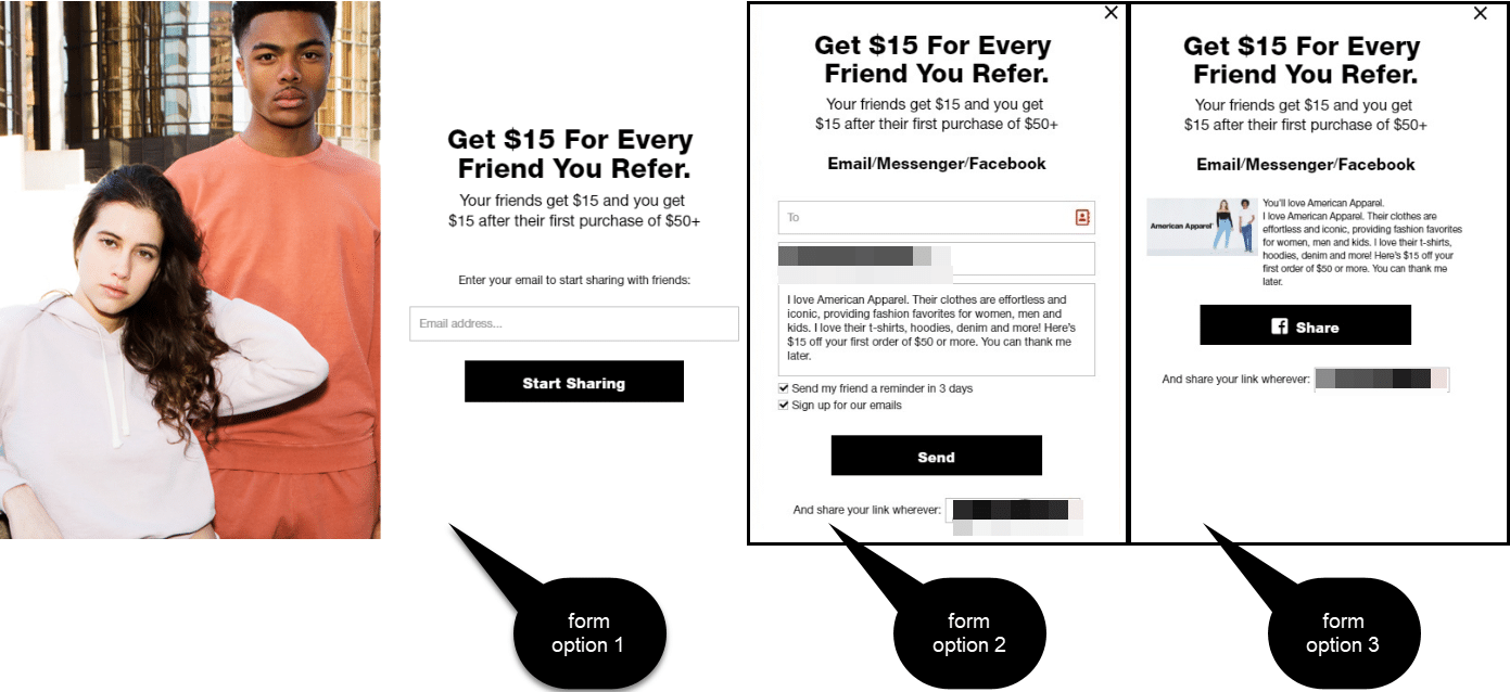
This clean pop-up from American Apparel gets straight to the point—and doubles as an email list pop-up. After users enter their email, they can choose from 3 sharing options.
Besides referral, what type(s) of pop-up is this? : Social media, email, click
Why it’s successful:
- Concise CTA with offer inside: “Get $15 for every friend you refer.”
- Clear offer and conditions: “Your friends get $15 and you get $15 after their first purchase of $50+”
- The clean format lets CTA stand out, makes goals clear, and makes offer easy to understand.
- Click pop-up with an easy-to-find “trigger” link displayed above the fold of the website’s landing page
- Multiple sharing options (email, Facebook, Messenger, friend link to share anywhere)
- The pop-up displays exactly what text and image the customer’s friends will see on Facebook, including the friend gift
- Also serves as an email list pop-up (email is required, even if a customer chooses the social media sharing options)
- Reminder option for the email referral (reminds friend if the offer isn’t claimed in 3 days; checked off by default)
- Customers can customize their email message to their friends
Indochino
Besides referral, what type(s) of pop-up is this? : Email, social media, click
Why it’s successful:
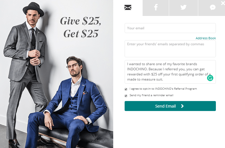
- Concise CTA that displays the offer: “Give $25, Get $25”
- Multiple sharing options (email, Facebook, Twitter, Messenger)
- The pop-up displays exactly what text and image the customer’s friends will see on Facebook, including the friend gift
- Reminder option for the email referral (reminds friend if the offer isn’t claimed in a certain number of days; checked off by default)
- Customers can customize their email message to their friends
- Option to send emails to multiple friends at once (with the same message for each)
Key takeaways
Referral program pop-ups are an awesome way to catch customers’ attention and harness the power of referrals. Although many referral pop-ups are click pop-ups (the ones users trigger themselves), don’t be afraid to create pop-ups that appear on their own after a customer makes a purchase (like an exit intent pop-up).
Whichever type of referral program pop-up you choose, though, make sure that you offer something of value to your customer, that you write a clear call to action, that the incentives you offer are easy to understand, and that you simplify the referral process as much as possible. And think about adding social sharing options, to increase your program’s reach, and opportunities for customers to customize their message, for increased authenticity.
Learn more about starting a referral program.
Or, check out some of our other related referral program resources:

