Your referral page is where interest turns into action. Whether it’s an existing customer deciding to share or a friend deciding whether to trust a recommendation, the page either earns the moment or loses it. Get it right and your referral program runs. Get it wrong and even the best reward offer won’t save you.
This post covers what a referral page actually needs to do — for both referrers and their friends — along with 15 real examples showing what great pages get right (and where some fall short).
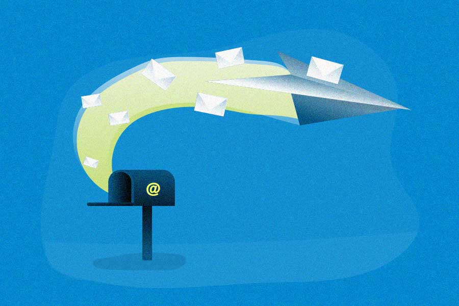
What is a referral page?
There are actually two types of pages that get called “the referral page.”
Both form the core of your referral program and are the motivating factor in getting people to take action. But each page is aimed at a different audience.
- Referral program landing page. This is the page used to motivate existing customers to refer.
- Friend landing page. This page is aimed at motivating the referred friend to purchase or sign up.
In either case, the referral page should clearly define your program’s referral incentives, relay how to participate, and function as the first source of program information for either the customer or their referred friend.
Think of it like this: a referral page acts as the product page for your entire program. It convinces the people involved to take action. Let’s look at each one.
The referral program landing page
This page is for your existing customers. It’s where they land to start referring. The link to this page could surface on a thank-you page, an exit pop-up, within the customer’s account, or via email.
Some call it the “referral program sign-up page.” We’d push back on that framing — and we’ll cover why in the best practices section below.
This referral program landing page needs to accomplish three things:
- Be convincing. Use the reward as the motivator, but frame it well (more on that below).
- Explain the process. What steps must the customer complete to earn the reward?
- Prime for sharing. Give customers a referral link or form to share — and multiple options if possible.

Some people also refer to the landing page as the “referral program sign-up page” because it’s where existing customers can sign up, then start sharing.
The friend landing page
The friend landing page is the page a referred friend lands on after clicking a referral link. This may be the first impression they ever have of your business.
It needs to accomplish three things too: inform the friend about your brand, explain the reward they’ve been sent, and prime them to become your new customer. It’s all about proving why the referred friend should further engage with you.

What makes a great referral program landing page?

A great referral page doesn’t need to be complex. It needs to be clear, frictionless, and feel more like an invitation than a transaction. Here are the best practices that separate high-converting pages from ones that lose people before they ever share.
Begin with an inviting headline. Your headline does the heaviest lifting. If it doesn’t catch attention, the rest of the page won’t get read. Draw people in — mention the reward, the friend, or both.
Make the reward visible. Whether you mention the reward in the headline or not, it needs to be easy to spot. The reward is what moves people from “maybe” to “yes.”
Use imagery — but keep it focused. A strong image can make the reward feel tangible, break up text, and keep attention on the page. Don’t overdo it. One compelling visual beats a cluttered layout.
Frame the reward as a gift, not a transaction. Most referral pages focus entirely on what the referrer earns. That’s a mistake. The most effective framing shifts the focus: this isn’t about you getting a payout — it’s about you giving your friend something valuable. When messaging centers on the friend (“Give your friend $20 off”) rather than the referrer (“Get $20 when you refer”), the whole thing feels less like selling out your network and more like doing someone a favor. That’s when people actually share. Adjust your headline, your CTA, and your reward language to reflect this.
Explain the process. Walk through how the program works, step by step. A simple three-step or four-step breakdown removes confusion and sets clear expectations. Even if your program is simple, showing the steps builds confidence.
Make sharing frictionless — and include a clear CTA. Provide a short referral form or easy-to-copy referral link. Make the act of sharing fast. If it can be done in a few taps, you’re in good shape. Give people multiple sharing options — email, social, direct link. And include a CTA button that tells people exactly what to do: “Invite a friend,” “Share now,” or “Send your link.”
Give customers a message to send, but let them personalize it too. If you include a pre-written share message, give customers the option to edit it. A personal touch increases the chance their friend actually opens it.
Keep it clear and concise. State the goal, show the reward, explain the process. If additional detail is needed, put it below the fold or link to a terms page. Don’t make people work to understand what you’re asking them to do.
Don’t make people sign up. Asking customers to fill out a form before they can start referring is a friction point you don’t need. Your best approach: everyone is already a member. Import your customer list, give everyone a referral link or code automatically, and skip the join button entirely. You never know who your most enthusiastic sharers are — gating access preemptively means you’ll never find out. Keep the program open, assume good intent, and use fraud detection tools to handle exceptions rather than punishing everyone upfront.
What makes a great friend landing page?

Now that you have a referral page for existing customers, it’s time to focus on the friend landing page. This may be the first time this person encounters your business — so make it count.
Mention the referrer. Include the referrer’s name on the page. It creates familiarity, reminds the friend why they’re here, and separates this experience from a generic promotion. “Taylor thinks you’d love this” lands differently than “You’ve been invited.”
Explain who you are. If this page lives outside your main website, include your name, logo, and a brief description. This is their first impression — give them enough to trust what they’re looking at.
Be convincing — specifically. Show off your product or service, and why it should matter to the friend. If you have strong reviews or notable credibility, this is the place for it. Keep it brief and tied to what would matter to someone who’s never heard of you.
Make the reward obvious. This is the reason the friend is here. Present the reward clearly — what it is, how to redeem it, and whether it’s been applied automatically or requires a code.
Include a clear CTA. Direct the friend to the next step — a product page, a sign-up form, checkout. Make the path obvious.
Best referral page examples: Referral program landing pages
The best practices above can be combined in dozens of ways. Here are eight examples that show how they come together — and where there’s still room to improve.
GetResponse (email marketing software)

Visually, this page works well. The full-frame background image gives it presence without distraction. The headline makes the ask clear and gives a reason to act. Below the fold, they walk through the reward steps (including bonus tiers) and add a referral program FAQ section — a nice touch for anyone who wants to understand the program before committing.
What works: All the information someone needs is visible upfront. If they want more, it’s a scroll away — no link-chasing required.
Suggestions: The CTA blends in too much. The bold blue shape above it looks more clickable than the actual button. A quick visual fix — making the button the most prominent element on the page — would help conversion.
Google Workspace

Simple and functional. The headline leads with “rewards,” which is enough to get people to explore. Multiple CTAs all point to the same action — no ambiguity about what to do. Below the fold: reward details and a FAQ section.
What works: The imagery is actually a GIF, which adds movement without visual clutter. It balances the simplicity of everything else on the page.
Suggestions: The white space feels a bit unstructured. Placing the top section on a color block would give the page more visual definition without adding complexity.
Zenni (eyewear brand)

Clean and visually balanced. The headline tells you exactly what to do to get a reward. The yellow accent adds energy without overwhelming. The imagery of the $5 reward makes the offer feel tangible.
What works: The animated cat GIF creates a natural visual zig-zag — headline, cat, description — that keeps the eye moving through the page.
Suggestions: The cat is fun but has nothing to do with eyewear. For an existing customer who already knows Zenni, it’s fine. But adding glasses to the cat would tie the visual back to the brand without losing the personality.
Levi’s Granfondo (mass bicycle ride)

The headline calls out rewards for both the referrer and friend — a smart move that makes the sharing feel mutual rather than one-sided. The body copy leans into the community angle (“spreading the love”), which is the right instinct for an event like this.
What works: Clean, well-organized, and it makes someone want to read further. All the key information is present without visual overload.
Suggestions: The cause behind the ride — helping at-risk youth — is more compelling than the reward. Putting that front and center in the headline (“Get your friends involved: ride for at-risk youth”) could pull stronger emotional weight. Also, the current flow asks customers to fill out a form, then wait for a code, then share manually. Adding a direct referral form to the page cuts several steps and reduces drop-off.
Samsung

A strong example of everything working together. Big background image, clear headline, prominent CTA, and all the program details below the fold. Nothing competes for attention.
What works: The page is convincing, explains the process, and primes for the share — the three things a referral page needs to do. The CTA pops clearly against the background.
Suggestions: The page includes instructions for both the referrer and the referred friend — on the same page. That’s likely to confuse people. These should be separate pages. If there’s concern that a friend might land here by mistake, a link to the correct page handles it cleanly.
Cricut (cutting machines for crafting)

Simple and effective. Inviting headline, visible reward, relevant imagery, clear and concise copy. It doesn’t try to do too much, and it covers all the fundamentals.
What works: Every best practice is touched without overloading the page. The form sits in a natural position and the path forward is obvious.
Suggestions: The referral form could move above the fold. Right now, someone who glances at the page without scrolling might not immediately know how to participate. A CTA above the fold that anchors down to the form is a quick fix.
Milk Bar

Fun without being overdone. The hero image of their cake does the selling — it reminds the referrer that more of this could be their friend’s (without the full price). The headline is short and direct. The form sits front and center, so there’s no guessing what to do.
What works: Neutral background colors let the image do the heavy lifting. The CTA is a bright color that stands out. The sharing method is as simple as it gets — enter an email, hit send. Social sharing options are also available for those who prefer them.
Suggestions: The simplicity of “just enter an email” means there’s no space for a personal message. That’s a reasonable trade-off, but offering an optional message field would let people add a personal touch without complicating the flow.
Shoott (photo service)


Shoott’s landing page is well-designed — strong headline, good imagery, clear program description. Once a customer opts in, they’re taken to their dashboard to start referring, where they get a pre-filled email template and referral stats.
What works: The landing page doubles as a portfolio showcase — you see the quality of their work while learning about the program.
Suggestions: The join step is unnecessary friction. If someone has landed on this page and is reading about the program, they’ve already decided they’re interested. Putting the referral form directly on this page — or skipping the join flow entirely and giving every customer a link by default — would convert more people into active referrers. The dashboard experience also loses the brand context (no header), which is disorienting. Keep people grounded in the brand throughout.
Best referral page examples: Friend landing pages
The friend landing page has a harder job. It needs to make a strong first impression on someone who may never have heard of your business, and get them to act on a recommendation from someone they trust. Here are seven examples.
Samsung

Samsung keeps this page light. The friend knows they’re getting a discount and that it’s already been applied to their cart — which removes a step and eliminates friction at checkout.
What works: Skipping the manual code entry is a smart move. Telling people the code is already in their cart removes a step they might otherwise fumble.
Suggestions: There’s no mention of who sent the referral. Adding the referrer’s name creates a sense of connection and makes it feel personal rather than promotional. If the friend closes the tab and comes back later on a different device, there’s also no way to retrieve their code — worth surfacing it on the page for that scenario.
Vegamour (hair growth products)

Clicking the referral link drops the friend directly onto the Vegamour homepage, where a pop-up immediately surfaces with the referral code and the reward. The homepage handles brand introduction; the pop-up handles the referral.
What works: The friend gets a taste of the brand before committing to anything. The pop-up gives them the code and the context without pulling them away from the shopping experience.
Suggestions: An “x” to close the pop-up feels like an exit. A “Let’s shop” CTA keeps the momentum going and removes the psychological stop point.
Milk Bar

Another strong execution from Milk Bar. The product image explains the brand without any copy. The referral code is prominently displayed, the reward is described clearly, and there’s a direct CTA to start shopping.
What works: The code is in a clean box (easy to copy), the reward is clear, and the call to action is immediate.
Suggestions: The page uses “someone” instead of the referrer’s name. A small change — “Taylor sent you this” — goes a long way toward making the experience feel personal and tied to a real relationship rather than a generic promotion.
EveryPlate

Visually strong. The reward is presented like a gift card, which creates a tangible mental image of what the friend is getting. Bold colors and an eye-catching layout make it hard to scroll past. Below the fold, more detail on how the program works.
What works: Nearly every best practice is in play here. The “gift” framing of the reward is particularly effective — it feels like something a friend sent you, not a coupon you found.
Suggestions: After clicking the CTA, the friend lands directly on the order page with no mention that their discount has been applied — and no clarification that the $105 “gift” is split across three orders. That’s a trust problem. Being upfront about how the reward works (three discounted boxes, not one lump sum) sets accurate expectations and prevents the friend from feeling misled at checkout.
Hulu

Clean, balanced, and well-executed. The “Feel the love” headline is a smart move — it adds warmth and offsets the techy black-and-green color scheme. The offer is clear, the CTA is easy to spot, and the page looks polished.
What works: The emotional language in the headline (“Feel the love”) does exactly what good referral page copy should — it ties the reward to the relationship that created it, rather than making it feel like a random discount.
Suggestions: There’s no mention of who sent the referral. On a page that leads with “Feel the love,” that’s a missed opportunity. Including the referrer’s name would deepen the personal connection and make it clear this isn’t just a standard Hulu promotion.
DoorDash

Mobile-optimized, minimal, and it works — largely because DoorDash doesn’t need to explain who they are. The relevant referral information is present and the steps are clear.
What works: The reward breakdown is honest. Rather than saying “$30 credit,” they explain it’s split across three orders. That level of transparency builds trust and sets the right expectation going in.
Suggestions: Text-only on mobile is a missed opportunity. A food image — even something simple — would add visual warmth and make the page feel like DoorDash, not just a terms-and-conditions sheet.
First Day

Like Vegamour, First Day drops the referred friend onto the main homepage and triggers a pop-up with the referral details. The friend gets to explore the brand before committing, and the pop-up handles the program context.
What works: Landing on the homepage means the friend gets a real sense of the brand — what it is, what it looks like, what they’re being invited into. The pop-up then gives them the nudge to act on the referral code.
Suggestions: Since it’s a pop-up on the main homepage, some friends might mistake it for a generic site promotion rather than something sent by a specific person. Adding the referrer’s name — or a line like “your friend Taylor sent you this” — makes the referral connection explicit and draws a clear line between this experience and a standard discount campaign.
How referral software helps you build better pages
You’ll need the right referral software to build and optimize referral pages quickly. Good software makes it straightforward to build both page types, test different messaging and layouts, track which versions convert, and apply those learnings without a development cycle. It also handles the mechanics that make open-access programs work — bulk member imports, automatic link generation, fraud detection — so you’re not choosing between accessibility and control.
Your referral page is the program’s first impression
A referral page isn’t just a design exercise. It’s how your program communicates: what you’re offering, who it’s for, and whether the whole thing is worth anyone’s time. The pages that work don’t overthink it — they make sharing feel like doing a friend a favor, and they don’t make anyone jump through hoops to participate.
Use the examples here as a gut check on your own pages. What’s the first thing someone sees? Is the reward framed as a gift to their friend, or as a personal payout? Is there a form to fill out before anyone can start referring? Small changes to those elements can move the needle more than a complete redesign.
Looking for more inspiration? Browse our list of the best referral program examples or dive into the ultimate guide to referral marketing strategies.