Want to find out the secrets of other top-notch referral programs? Check out our other deep dives:
The Harry’s Shave Club pre-launch program went viral because of its innovative referral marketing strategy. While they were still a startup, they were able to leverage the power of social proof and incentivize customers to share their excitement about the grooming brand with their friends and family.
Harry’s offered a high-quality shaving product at a lower price point than many of its competitors, making it an attractive option for customers. This only helped solidify why someone would want to refer in the first place. So, there was a clear and compelling value proposition from the get go.
This allowed them to create an innovative and engaging referral program for their launch. Harry’s incentivized customers with a reward system that offered free products for successful referrals. And it worked – Harry’s proved that their pre launch was a well-executed referral marketing strategy.
- Over 1300 people had at least five successful referrals.
- 200 people that had over 50 successful referrals.
- 77% of their sign ups during their pre launch came from referrals.
To this day, the Harry’s referral program (specifically, their pre-launch one) is one of the most discussed programs in the referral world. It only took them one week to collect over 100k emails for their email list (and over 85k of those emails were legitimate).
Let’s discuss what aspects of this program may have led to its success, and what takeaways you can steal for your ecommerce referral program (or any referral program).
Harry’s referral program: How it began
Harry’s is a simple, yet high quality, razor brand that is famous for its razor shave club subscription. In fact, Harry’s is one of the most successful razor subscription brands on the market (alongside their competitors, Dollar Shave Club).
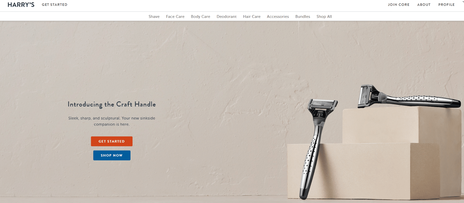
Harry’s has since become a household brand, and since it falls in a very niche market, it seems to be quite popular when compared to what’s in the mass market. The bright orange handle (though it’s not the only option available) is recognizable by even people who aren’t using the brand. Their team of 600 engineers, chemists, and designers really seem to have knocked this one out of the park. They have since expanded to a variety of care products, like deodorants, skincare, soaps, and shampoos.
Aside from their signature look, many consumers choose Harry’s because they give back to the community. 1% of all sales gets donated to nonprofit organizations that offer mental health services to men. They are set to reach $12 million in donations (helping about 1.5 million men) by 2024.
But, how did they get to this point? Their prelaunch really helped set them off. They managed to receive over 100,000 emails in just one week of this prelaunch campaign.
Their prelaunch was set up to focus specifically on valid referrals. So, the founders Jeff and Andy, took it upon themselves to meet up with friends and other entrepreneurs they knew to get help sharing their product. About 200 people later, they were ready to focus on using these contacts to spread the word via their referral campaign.
This campaign proved to be a success. 77% of all emails collected were from referrals. Around 20,000 people sent about 65,000 referrals.
Let’s take a deeper look into their prelaunch and referral campaign.
How does the Harry’s referral program work?
The Harry’s referral program used a milestone – or tiered – prelaunch program structure. At certain tiers a new reward would be up for grabs.
For the initial push, the program was promoted by all employees. At the time, employees were encouraged to send the product announcement to their friends, family, and anyone else they knew (referrals started from the very start!)
The email sent was personalized and friendly – plus, who wouldn’t open an email from a friend? This email would provide a link to the Harry’s 2-page microsite, where the referral would find a splash page (to sign up), and then the referral page (the viral loop).
The referral page included easy sharing options and a progress bar to track referrals and reward status. Each tier was laid out so that a free product was awarded. The lowest tier, 5 referrals, awarded a less expensive Harry’s product (free shave cream), and the value went up at each tier. Ultimately, the reward at the fourth tier, 50 successful referrals, was an entire free year of shaving blades.
The Harry’s referral engine: Driving viral growth
What’s insane about the Harry’s referral program is that it saw massive success before their product was even launched. We’re talking about 100,000 emails in just one week.
65,000 referrals were sent from about 20,000 people (on average, people referred 3 or more friends). And actually, more than 200 people referred 50 people or more!
Let’s reiterate the success of Harry’s referral engine.
- Referrals accounted for more than half of all signups! 77% of the 100,000 emails collected came from referrals.
- 20,000 people sent a referral. There were roughly 65K referrals sent.
- 200 people sent more than 50 referrals. Meaning, 200 people actually made it to the highest tier.
By relying on their employees – and interested fans – to share, they were able to reach people in a more personal way. This meant they did not need to rely on press or traditional advertisements as much – and in the end this proved to be a successful approach.
The Harry’s viral loop
A viral loop is when people share a brand with friends, who in turn share with their own friends and so on (continuous cycle that feeds itself). Harry’s used this method and created a viral loop to continuously drive sharing and to get new leads.
Why did this viral loop work? It allowed Harry’s to utilize the trust of friends to generate new leads. And this was done from the network they already had. In the case of Harry’s, it started with their employees and worked its way out. This type of acquisition is free or nearly free (the only money that is spent is when a referral actually converts.)
It was also the execution of how Harry’s used the free product rewards that helped to drive a continuous loop of sharing. This is because…
- Referrals could refer immediately. Harry’s immediately offered referred leads the chance to share with their own networks and get rewards of their own.
- The more referrals sent , the higher the reward tiers they could reach. This had a multiplying effect as many referred more than one friend.
Harry’s encouraged customer acquisition and retention at the same time by investing in their existing network (starting at their homebase – employees). Then used their product to get people to want to actually participate. Together, these allowed Harry’s to experience viral growth.
A deep dive into Harry’s referral program: What made it so successful?
How did their program create such a frenzy that thousands of people wanted the product before they had ever tried it?
Let’s get into each element of Harry’s prelaunch and referral program that allowed it to reach 100,000 subscribers within just one week. We’ve got plenty of pointers for your own referral program that you can steal.
Strategic first invitations
The Harry’s pre-launch program used a strategic invitation approach to build buzz and generate excitement for their product launch. In addition to having employees share, they offered an exclusive sneak peek to a select group of influential individuals, and encouraged them to share the news with their audiences. (This included fellow CEOs.)
By targeting this group, Harry’s was able to leverage their social influence and credibility to reach a wider audience and generate interest in their brand. They also made it easy for these individuals to share the news by providing them with pre-written templates.
The emails used to announce the impending launch were created very strategically by:
- Relying on employees. Employees personally invited the recipients to share with their own peers, in a conversational, friend-to-friend way. People trust those they know – so it made sense to go this route.
- All invites had email signatures with a direct link to the program.
- Providing personalized messages. All emails sent were personal invites and used a conversational tone.
- Very tailored content. Messages to each invitee was based on how much they knew (or didn’t know) about Harry’s.
- People with a direct influence. Special strategic emails were sent to people like CEOs. This encouraged recipients to share with a wide audience (such as their entire employee network).
This approach helped Harry’s to build anticipation for their launch and generate a sense of exclusivity and urgency among their target audience. By tapping into their networks, they were able to create a snowball effect, with the news spreading rapidly and organically among their audience.
Harry’s prelaunch program was a strategic and effective way to build buzz and generate excitement for their brand. Between the personal invites and the tailored content, referrals were introduced to Harry’s in a conversational and friendly way.
What strategies can you steal?
Make your product seem exclusive. This can create a buzz and people will want to join partly out of curiosity, but also because someone they know (and likely trust) invited them to this ‘exclusive’ thing.
Harry’s exclusive list and first people to know about the referral program were:
- People the founders talked to, and who were interested in Harry’s story.
- Friends of the Harry’s employees, invited by the employees they knew personally.
These two groups worked really well as CEOs would have a great influence on their network and employees. And their employee group was able to share with individuals they knew really well (who better to trust than a friend who also works for the company being discussed).
Streamlined design
Harry’s wanted to build a campaign that relied on credible referrals. One way they achieved this was by creating a dedicated page to referrals during their prelaunch. In fact, the prelaunch program was made up of two pages. They included page 1: the sign-up page (splash page), and page 2: the referral page.
The sign-up page only showed a teaser of the product and invited people to sign up to find out more. This was beneficial in that it piqued people’s curiosity (be the first to know) about something new. Another thing they did was prevent distraction. On this page, there were no links out, and no other distracting information. The person could only enter the email or leave completely.

Then, once they signed up and confirmed they were interested, they were directed right to the referral program. This worked well because it was placed after a high interest point. The person was obviously interested as they gave their email. After that confirmation, it’s prime time to offer free products. Not only would the person be one of the first to try it, but they could potentially get the product without having to buy it (just because they sent a referral).
What strategies can you steal?
Harry’s had all avenues end at the referral program. By limiting page options during this launch, they were able to both focus on attracting sign-ups and referrals. You should also keep these pages simple. Harry’s splash page was very simple, and only used 1 strong CTA.
Element of exclusivity
This prelaunch also allowed Harry’s to add an element of exclusivity to their product. Because it was new, and you basically had to be invited to learn about it, it led to people taking action.
It was also the messaging used that made this an exclusive club. The sign-up page struck a chord with the messaging “be the first to know.” Essentially, this email grants exclusive access to insider information. This helped give them a sense of prestige, as owning or experiencing something that is not available to everyone else can be seen as a symbol of status.
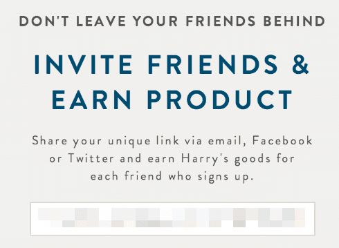
Then once they sign up, the message on the referral page was “don’t leave your friends behind.” This provoked referrals because people love sharing insider access with their peers. Why? It boosts their social currency and makes them the reason someone learns about a good product. In this case, referrers were among the first to receive access to Harry’s product.
This tactic also led to FOMO. As we all know, Fear of Missing Out (FOMO) is a powerful motivator for many consumers. By creating this feeling with a sense of exclusivity, Harry’s was able tap into this fear and motivate consumers to take action before they miss out on a unique opportunity.
What strategies can you steal?
Try to create exclusivity. This worked well for Harry’s for several reasons. It created a sense of prestige and FOMO. Which led people to sign up and continue referring.
By creating an exclusive product or service, Harry’s was able to differentiate themselves from their competitors and make their brand stand out.
Clear, uncluttered landing page
There are serious perks to keeping landing pages simple. A landing page with a clear message and a single call-to-action (CTA) is more likely to convert users than a cluttered page with multiple CTAs. By removing distractions and focusing on the primary goal, a clear and uncluttered landing page can increase conversion rates.
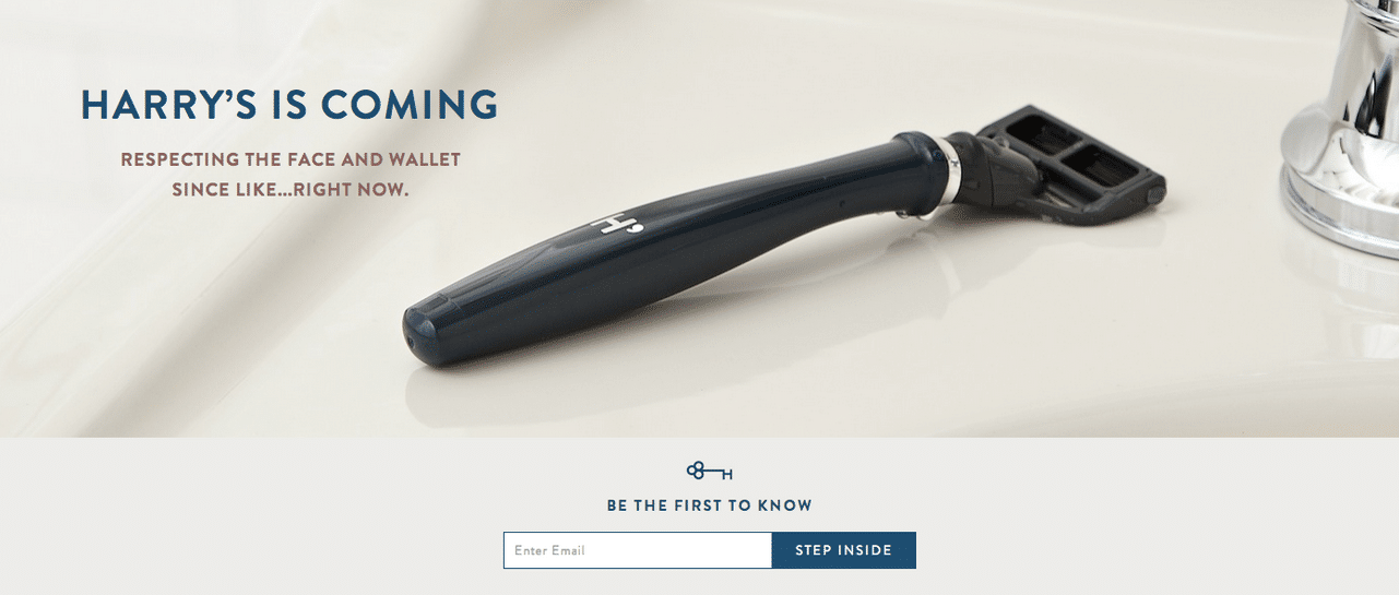
Harry’s made it very clear on what people should do and how they should navigate the page. This really helped lead to higher engagement and a higher conversion rate.
What their landing page did well:
- Headline gets right to the point. Harry’s is coming, Be the first to know, and invite friends & earn product, are simple, but let the user know exactly what the page is all about with just a quick glance.
- It’s followed by an explanation.Harry’s did not choose to be too wordy. Instead, a brief explanation was able to help them get viral signups.
- They added visual appeal. Strategically chosen imagery draws in the eye and keeps people interested. They used an image of their razor for the initial page, and then added an image of a wooly mammoth on their referral page (great choice to get the referrer to ingrain their logo into their head).
What strategies can you steal?
Like Harry’s, you’ll want to keep landing pages short and concise (which is true for all types of landing pages). It’s even better if you are able to focus on one goal per page. By having the sign up and referral pages separate – they were able to get people to do both. If they would have asked for a referral on the splash page – it likely would not have been as successful.
Easy sharing
If sharing the referral program is too complicated or time-consuming, users are less likely to do it. By providing easy sharing options, such as social media buttons or pre-written emails, users can quickly and easily share the program with their network. This is exactly why Harry’s did it this way.
Harry’s made their referral page easy by:
- Giving multiple sharing options. Multiple sharing button options, all easy to find and access. Harry’s seems to have added even more options as they went along. At one point they offered the referral link, Facebook, and Twitter. Eventually they even added in an email button.
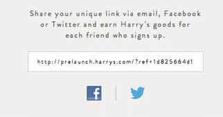
- Displaying a pronounced referral link. The individual referral link is one of the first things someone will see.
- Providing preset messages. Social media messages were preset so referrers didn’t have to figure out what to say.
What strategies can you steal?
With any type of referral program you run, easy sharing is key to its success. Harry’s made this easy for users by providing preset messages for social sharing, and made the referral link easy to find for quick sharing.
The referral landing page in the scenario acts as the referrer dashboard as well. Upon signing up on the splash page, the user is automatically eligible to start referring. So, there is no need for signing up or entering your email again. The user can simply click a button to share, or snag their link and go.
Motivating tiered referral rewards

Harry’s got the reward right. At the time of the launch, no one had actually tried the product. But, because of the buzz, people were excited for it to start selling. Because of this, Harry’s was smart to use the product as the referral reward. People were able to actually try the product for free, if they referred enough people. So really, if people wanted to sample the product without spending anything, they could – all for the cheap ‘fee’ of sending someone an invite.
The reward was also set up as a tiered system. So, for different amounts of referrals, a new reward (or a different Harry’s product, in this case) was given.
Harry’s referral program rewards worked well because…
- They were motivating. Rewards were not only motivating, they were also attainable (making them even more appealing).
- The more referrals made, the bigger the reward.
- Rewards were given at 5, 10, 25 and 50 referrals, making the reward tiers easily attainable and giving off natural encouragement.
- They thought about offering a lifetime of free razor blades for 1,000 referrals, but ultimately didn’t because they wanted to keep all rewards attainable during the prelaunch period.
- They led to multiple invites. Tiers encouraged referrers to send even more invites (get to the next level!).
- The most difficult tier was actually worth it. High-value top reward at 50 referrals (a whole year of free blades!) Over 200 people reached this tier, creating super advocates.
- Rewards acted as product samples. Free products mean referrers got the first taste of what Harry’s had to offer, at no cost.
What strategies can you steal?
Sometimes, a reward is the tipping point in getting someone to refer. If the reward isn’t worth it, or if it seems unachievable, no one will participate. Harry’s offered multiple tiers, so even after just a few referrals a reward was given.
Harry’s also chose to use their product as the reward. This worked really well for them, as it gave people the opportunity to try the product first, and hook them to come back to purchase later on. Plus, with enough referrals, a person can have the whole shaving system to start off.
Gamified experience through a progress bar

Adding an element of referral gamification can also be a motivating factor in a referral program. Harry’s referral program used a progress bar that showed participants how close they were to the next reward. When referrals went through, the progress bar was shaded in to reflect the amount of referrals. Plus, the number was tracked underneath as well.
These visuals encouraged referrers to compare what rewards they reached, and how many referrals they had. All of which helps to gamify this program.
What strategies can you steal?
Adding elements of gamification to a referral program can make the program even more interesting to users. When users can see these visuals, it can motivate them to keep going. “Oh, I only need ‘x’ more to get to the next tier.”
By adding game-like elements to your referral program, such as points, badges, levels, or leaderboards, you can tap into your happy customers’ intrinsic motivation and make referring more fun and rewarding. People are more likely to engage in an activity that they find enjoyable, and the prospect of earning rewards and recognition can further fuel their motivation. This may be why the Harry’s program chose to use both a progress bar and the number tracker.
Compelling referral message

The last aspect that worked well in the Harry’s program was that it utilized premade messages. In this case, the message that friends saw on social media really piqued friends’ interest and encouraged them to click the referral link (“Can’t wait for @harrys to launch. I’m going to be shaving for free!”). Shaving for free? What does that mean? Do you see how that could make someone curious?
Why did Harry’s messages work well?
- They were convenient. By providing a pre-written message, the person referring can simply click a button to share the message, rather than having to write out their own message or copy and paste information from a website. In this case, it was particularly helpful for social media posts.
- They kept messaging consistent. By providing a pre-written message, Harry’s could ensure that the message being shared would accurately reflect the key benefits of the product.
- They helped with tracking. These prefilled messages included a unique referral link or within the message. Making it one less step for the referrer to do.
What strategies can you steal?
Harry’s made sharing their product easy. By giving users a prefilled message, they kept the referral process as simple as possible. You can also use a similar message on an email form for the users. By allowing the user to click and share, without having to come up with a message on their own, you can increase your chances of getting a referral.
How to design a program page like the Harry’s referral program
Part of the reason Harry’s program worked so well is because it had a highly converting referral program page. Fortunately, a good referral software that handles tiered programs, like Referral Rock, will be able to help with this key aspect of the program. It will also help you with other goals, like referral tracking, reward management, and reporting.
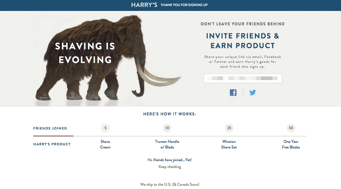
Harry’s referral page was successful because it…
- Provided eye-catching imagery. This may not seem as important as other aspects of the page. But the truth is, imagery can help keep people on the page longer. A well-designed referral program page should feature clear and engaging visuals that help to communicate your message and make the page more visually appealing. This might include images, infographics, or videos that highlight the benefits of your program. Or at least be able to build that connection between your brand and users (a fun version of your logo – like Harry’s did).
- Use a compelling headline. People need to know what they have to do. The referral program page should feature a clear description of what they should do and it should drive them to your call-to-action.
- Used social currency. Harry’s added an element that showed the intrinsic benefits of sharing “don’t leave your friends behind”. This type of message can make someone feel good for sharing something.
- Provided explanation. Harry’s provided a simple explanation of how the program works. It’s important to clearly communicate how to share along with the benefits of doing so. This might include rewards or incentives that are available for successful referrals, as well as the benefits that the referred person will receive.
- Provided multiple sharing options. They encouraged visitors to share with their friends and contacts, by making it as easy as possible to do so. They included social media sharing buttons with pre-filled messages that visitors can easily share with their networks.
- Referral links were easy to find. A copyable referral link that referrers can share anywhere was up front and center. They did not make anyone go digging for their link.
- Utilized gamifying objects. Harry’s provided a motivating progress bar with how many referrals were needed for each reward, plus pictures of the rewards. This helped encourage users to refer multiple times.
- Provided a prefilled and compelling message. This message is vital because it’s what is sent to friends. When it’s done right, it should make friends want to click and learn more.
What to keep in mind for your own program?
Harry’s was able to do what most people want their referral program to do – create crazy growth. While not everyone goes viral, a good referral program can bring in many new customers.
However, there are a few things you need to consider if you want your program to be successful.
- Is your product worth it? This one may be difficult to answer, as everyone typically thinks highly of their own product. But you really do need to make sure there’s interest in your product or service before you start a program.
- Harry’s talked about what made their upcoming products great and found interested people to start the cycle of sharing through the program.
- How will you host a program? If you have the time and knowledge to code your own program, that’s great. But, this isn’t usually the case. You don’t have to try to code your referral program on your own. You’ll have a much easier time using software like Referral Rock.
- Referral software can automate many aspects of the program, saving you a lot of time and effort. Software can automate the sending of rewards, including free products like Harry’s sent. This way, you’ll keep your customers or subscribers happy, as you can focus on the actual product.
- In addition, referral software has safeguards that help prevent referral fraud – especially important in a prelaunch program that relies on gathering real emails. You’ll be able to stop people from self-referring to make it easier to get to the next tier, for example.
- Are you going to try a tiered program? If you want to run a tiered program like the Harry’s one, not all referral software has that capability to run one. Referral Rock, however, lets you run a tiered program with ease!
- When will rewards be given? The Harry’s program started rewards at 5 referrals – this is good for a free email program. But if referred friends are required to make a purchase, you might want to set the advocate’s first tiered reward at one referral, making this more achievable and thus more motivating to make a purchase.
- How will rewards tie into the customer experience? Harry’s rewards were coupons, so referrers had to visit the full launched site to redeem them – a good strategy for a prelaunch program.
- Who will be receiving a reward in the program? Harry’s only rewarded the referring customer because new email subscribers weren’t making a purchase (the launch hadn’t happened yet, so they couldn’t yet buy). But if your company currently sells products or services, it’s best to reward both the referrer and new customer when the new customer makes their first purchase.
- The current Harry’s program gives Shave Plan subscribers $5 off and their friend $5 off when the friend first signs up for a subscription – making it a solid double-sided reward.
- How long will the program run? Harry’s had a prelaunch referral program but didn’t continue it after launch. While they did eventually restart their program, the gap meant that they were likely missing out on trackable referrals.
- It’s best to start a lasting program, even if you have to revamp the structure after a launch.
- Will it go viral? Your company likely won’t have a program that is as viral as the Harry’s program, but referral programs are still an effective way to drive customer acquisition and retention.
Conclusion
The Harry’s shaving prelaunch program is widely considered to be a successful example of a referral marketing campaign. By leveraging the power of social proof and word-of-mouth marketing, Harry’s was able to generate significant buzz and attract a large number of early adopters to their brand.
Overall, the success of the Harry’s prelaunch program highlights the importance of a clear value proposition, an engaging referral program, and a well-executed marketing strategy in driving early adoption and generating buzz of their new product.
Inspired and ready for more referral marketing ideas and tips? We’ve got you covered.
