 Zach Goldie is a specialist in landing page optimization, specializing in helping B2B tech companies (including Referral Rock). He is an expert at helping companies nail the underlying pitch behind the page. Today, Zach shares his tips and insights on creating high-converting B2B landing pages.
1. Essentials for high-converting landing pages
Q. What’s the one essential all B2B landing pages need to be high-converting?
The advice of “don’t sell the drill, sell the hole” isn’t always true. You’ll need a different approach if you’re talking to a carpenter who already owns an array of drills, compared to a homeowner who hasn’t considered the need for a hole.
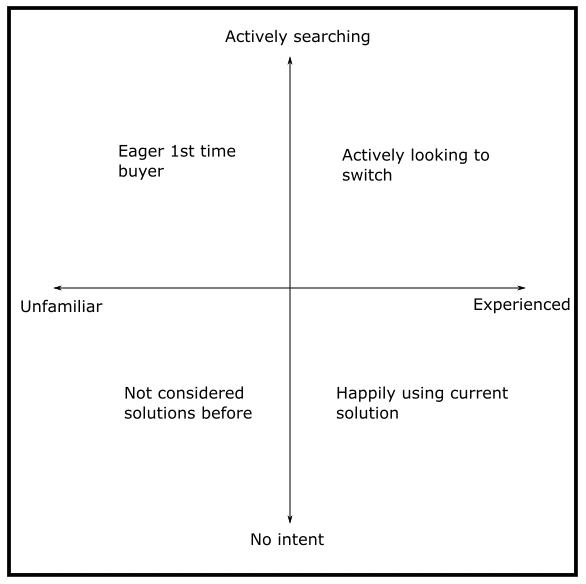
That’s why you need to aim your landing page at the right buying quadrant.
Every page already aims at one of these without even realizing it (or in the worst cases, tries to talk to two). Taking a step back to refocus the copy and imagery is a key step that’s usually missed. Here are the four buying quadrants:

Hint: if you’re aiming at enterprises, they’re probably in the top right
Eager 1st-time buyers
I find companies usually write for this group by default. The page will talk about all the joys of adopting this kind of service. A typical example is a marketing agency describing the benefits of PPC as if the prospect hasn’t considered it before.
Actively looking to switch
If you’re after bigger companies, your page should probably address the headaches they’re having with their current solution. With the marketing agency example, the page would now be more about how they will avoid the issues that prospects have probably come up against with other agencies or freelancers.
Have not considered solutions before
This is the least common in the B2B space, to the point where I’d say be careful choosing it. You may not want to admit it, but you’re probably competing with an existing solution such as Excel.
Happily using current solution
This doesn’t just mean a competing product. It could be tracking a process in Excel, organizing something with pen and paper, or just getting an intern to do it.
The key is to frame why your offer is worth the uncertainty of changing from their current way of doing things. Have a think about your ideal prospects and which of these quadrants they fit in, then check your landing pages to see if they are relevant or if they are talking to a different type of prospect.
2. Deciding on your audience and pain points
Q. What steps should a B2B go through when deciding on the audience and pain point(s) to optimize a landing page for? How should a business apply these audience findings?
First, think about the traffic source. It is possible that your visitors from different sources fit into different buying quadrants, so think through which one this landing page is for.
For example, search traffic from high-intent keywords might be actively looking to switch, while visitors to a general blog post could be happily using their current solution. That means they will require completely different sales points.
If you are writing for a low-intent audience, then it is important to think through whether they’re even aware of the problem or if they’re blissfully ignorant.
Let’s say they’re currently using an open source software to handle a task. They might not realize how much easier things would be if they used a premium product with robust integrations, and the amount of work this would save them. So, start by planning out how you’ll take them through those decision stages, with the questions they might be asking themselves and the relevant info to lead them to your point of view.
3. Other research for landing page optimization
Q. What other research should a brand conduct before optimizing a landing page?
My go-to is to talk to the sales team. Ideally, listen to some of the sales calls with actual prospects. Heat maps might look pretty, but they won’t have the same depth of insight as actual humans who have spent hours talking to your prospects.
I would recommend having a sit down with a member of your sales team to discuss questions such as:
- How are prospects dealing with the issue before they look at us?
- Is there a typical sparking incident that makes solving it a priority?
- What are their biggest objections you need to address before they’ll buy?
- Why do they pick us over competitors and other solutions?
This conversation can turn up so many gems and ideas for how to improve the page. Be sure to gently nudge for details at any stage instead of accepting broad answers.
4. Selecting the best lead magnet
Q. How can a brand make sure they select the best lead magnet to advertise on a landing page?
Think about the journey that your prospects are on and what headaches they are dealing with. The lead magnet should be suited to what they’re dealing with, especially in terms of how advanced the content is.
I once had to point out to a marketing agency that their Beginner’s Guide to SEO wasn’t going to appeal to the CMOs that they wanted to attract. Instead, they started creating lead magnets about topics relevant to veteran marketers, such as proving long-term ROI and integrating with Salesforce.
Part of it is about accepting that an ideal lead magnet might bring in fewer leads than a broad one. But, those leads should be of higher quality.
5. Zach’s biggest learning in landing page optimization
Q. Based on your years of experience, what would you say is your biggest learning/finding in the area of landing page optimization?
So much effort is often put into the design. Days are spent building out clever parallax scrolling or playing with whitespace.
Yet, so long as the design looks vaguely attractive and easy to look through…changing it doesn’t seem to matter.
I’m now used to companies coming to me saying they have tried redesigning the page several times, but it hasn’t improved the performance. We then overhaul the copy and images, and their conversion rates finally go up.
I can understand why design is prioritized. It’s more obviously difficult than writing copy and fast-moving trends mean a page can quickly look dated.
But unfortunately, I’ve learned that a redesign might bring small lifts, but won’t fix a struggling page.
6. Landing page copywriting vs. other copywriting
Q. What makes landing page copywriting different from copywriting for other web pages?
Landing pages should be highly targeted in who they’re talking to and the funnel step they’re aimed at.
Homepages, on the other hand, are a different challenge. While they are also an entrance page, they have to be more multi-purpose in who they’re talking to. If you serve different industries or company sizes, then the homepage will be watered down by having to be relevant to all of them
I think of them more as a starting point, guiding them to the content that is most relevant for them. It can be links to specific features or industry pages, but the key is to get them discovering the details that will move them closer to becoming buyers.
7. Concisely covering key points that will lead to conversions
Q. How can a brand make sure it covers the points that would best convince a prospect to convert, without making a landing page text-heavy?
As a priority, make your subheadings almost able to stand alone. A visitor should be able to skim down the subheadings and get a sense for what you do and who you’re for without reading any of the body copy.
It might mean swapping questions like “Who is it for?” with the equivalent answer such as “Designed for enterprise”.
Next, think of the body copy in each section as reinforcing the subheading. It should give proof or details to reinforce the claim, such as what about you makes you suitable for enterprise.
It can be tempting to squeeze in semi-relevant details that you want to be on the page somewhere, but that will dilute the impact of that paragraph and make it harder to read. In truth, I think the issue is usually that the copy is hard to digest and not that the word count is too high, so stirring together different sales points into one section is a quick way to confuse things.
8. Avoiding landing page optimization mistakes
Q. What are the biggest mistakes people tend to make when optimizing landing pages for their business? How can they avoid these mistakes?
You can try rewording things, but if you’re still trying to sell bacon to a vegetarian, then it’s not going to work.
The industry advice is to test one change at a time, which is usually interpreted as changing one small detail.
I see lots of A/B tests where they have tested a different way of saying the same thing. Maybe they focus the headline on a different selling point, but it is still generally aimed at the same audience facing the same problems.
If your conversion rate is already decent and you’re only looking for small improvements, then that’s ok. But if your campaign is struggling, then you’ll need to test a double-or-nothing style overhaul.
An overhaul can still be a test of a single hypothesis. It can test an idea such as, “would a landing page aimed at open source users perform better?” Every element might need to change, but all in support of that one idea.
So, don’t be scared to think big in your split tests, as big lifts in your optimization will only come from testing big changes.
9. Using complementary images on your B2B landing page
Q. What other tips do you have for B2B landing page optimization?
As a final tip, plan out how each image can build on the corresponding subheading. I often see things like dashboard screenshots that have nothing to do with the text alongside them.
The pictures shouldn’t just be there to stop the landing page from being too text-heavy. They should be working with the sales material. If you’ve written “set it up in a few clicks,” then illustrate what those clicks are, instead of showing me a shot of the UI.
To learn more about Zach, check out his website.


