At Referral Rock, we’ve been experimenting with different landing pages throughout our site. Like others, our goal is to get conversions. Thus, we know how important landing page conversion rates are.
(For most landing pages, the conversion is lead capture: convincing prospects to give you their information by offering them something valuable in exchange. However, other landing pages aim to direct prospects to a purchase page, or convince them to make a purchase.)
Though we’ve tried a few techniques, we thought it’d be best to ask about the experience other marketers have had with landing pages. So we reached out to see which elements and fields others have seen success with.
We developed a survey with six short-form questions and one long-form question, and 55 marketers shared their insights. We’ll share their tips and tricks for increasing conversions later in the article. First, let’s check out the compelling statistics we gathered.
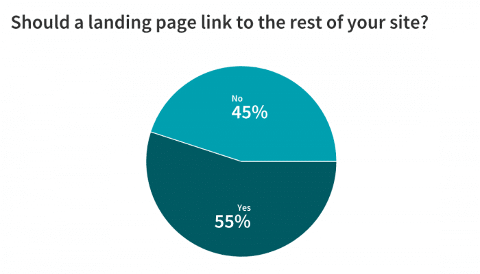
Should a landing page link to the rest of your site? Maybe.
Our marketers were divided on whether a landing page should link to the rest of a company website. 45% said a landing page should not link out to the rest of the site, while 55% said it should link out. So, choose whichever option you think will work best for your brand.
Reasons in favor of linking out include giving non-converting individuals the ability to explore the site (which can increase the odds that they will purchase later). Reasons against linking include that the links distract prospects from your call-to-action and clutter your landing page.
The average lead generation campaign converts 5% to 20% of leads
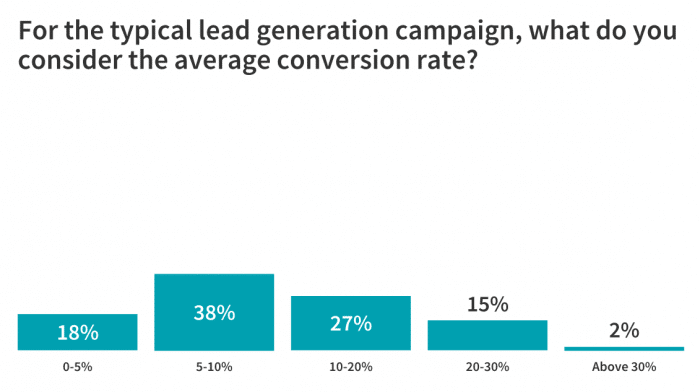
Our next question focused on the most popular type of landing page: the lead capture page. We asked our marketers what their average conversion rate was for typical lead generation campaigns.
65% said that their average conversion rate was between 5% and 20% (38% had average conversion rates between 5-10%, and 27% had average conversion rates between 10-20%). 18% said their average conversion rate was 5% or under, and 15% reported averages between 20-30%. Only one marketer reported average conversion rates of above 30%.
Number of form fields on a landing page: Less is more
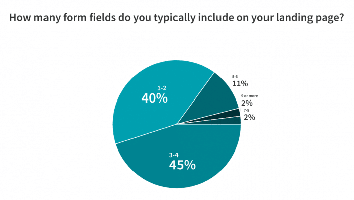
Most of our marketers recommend asking for minimal information through a lead capture form, so the conversion process takes less time and is much less overwhelming. 85% use between 1 and 4 form fields on their landing page’s lead capture form (40% use 1-2, and 45% use 3-4). So, decide what information is the highest priority to capture from a lead—some marketers ask only for an email address.
Perform frequent A/B testing of landing pages
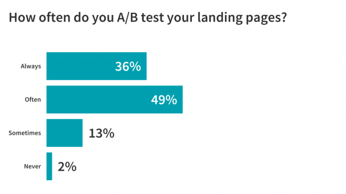
Then, we asked marketers how often they A/B test their landing pages; the vast majority make this testing a habit. 85% of marketers “always” or “often” perform A/B testing (36% answered “always,” and nearly half answered “often”).
So, the advice is clear: A/B test different elements of your landing pages, and test often, to make important decisions based on data.
Most frequently tested elements of landing pages: Copy and design
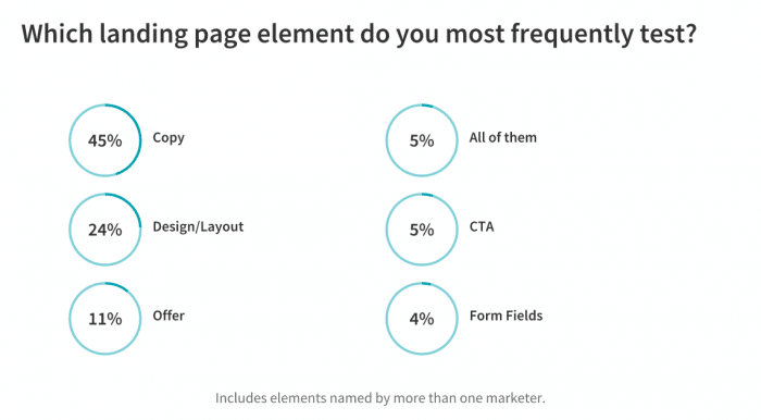
We followed up by asking which elements of a landing page marketers test most. Copy was tested most frequently at 45%, followed by design at 24%.
Among elements named by more than one marketer, the offer came third at 11%, followed by “all elements” at 5%, CTA at 5%, and form fields at 4%.
This makes sense because copy is what convinces prospects to accept (or decline) your offer—one small change in wording can drastically affect conversion rate. Design, meanwhile, impacts how easy elements like the CTA and form fields are to find, and whether a landing page looks clear or cluttered.
Copy and design have the greatest impact on conversion rate
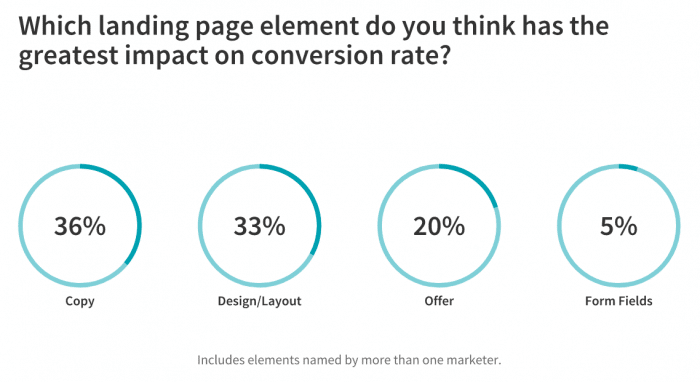
Unsurprisingly, the two most tested elements (copy and design) were also the two believed to have the greatest impact on a landing page’s conversion rates. After all, copy is what convinces prospects of your offer’s merits. It must be concise, but it also must be enticing.
Meanwhile, design impacts how easy it is to navigate a landing page (and thus, how easy it is for a prospect to convert). 36% of marketers said copy has the greatest impact on conversion rate, while 33% named design.
The offer itself came third at 20% (which is also not surprising: copy won’t convince prospects to buy in if they don’t like the offer itself!)
Tips and tricks for increasing landing page conversions
We then asked our marketers to explain a tactic (or tactics) that they use to help their landing pages convert better. They shared a wide variety of tips and tricks, but the tactics named most often were simplicity (conciseness) and targeting their landing page to their company’s audience.
Let’s dive into their insights, which we’ve divided by category.
Simplicity is key
Many of our marketers agreed: keep your landing page simple for the greatest success. Lisamarie Monaco of PinnacleQuote Life Insurance Specialists shares, “A special tactic that helps make your landing page convert better is simplicity. Do not have anything distracting. Subtle colors, along with a form field and some meaningful copy, are all you need. Be direct, and give your clients what they are looking for.”
Will Hatton of Hotel Jules says, “Tests have shown us that simple is successful. The page needs to match what people clicked on and what they are looking for. If they can’t see what you are offering and what you do within the first 2 seconds, then you will have lost their interest. Whenever we audit or optimize our landing page, we always make sure we stick to this rule – be clear, not clever.”
Says David Alexander from Mazepress, “One of the biggest mistakes I see people making with their landing pages is when people overcomplicate things and end up with an over-produced landing page. This usually leaves your visitor overwhelmed and unsure of the next clear step. The mantra for a good landing page designer should be ‘less is more’. Focus on the areas that are mission-critical, and cut the fat. Give your audience a clear journey to progress to the next step of your funnel, and you will not only end up with higher converting web pages, but you will also save a lot of time in the process. I also find that prioritizing the benefits rather than the features leads to a better conversion rate as benefits resonate better with consumers.”
Jasmine Bou-Nassif from Stark / Raving Branding + Digital Marketing suggests applying simplicity to your offer: “The best tactic is to include one sole offer. You want the user to be directed to your main call to action and not distracted by other links to download more content or to even navigate the pages of your website. A landing page should feel separate from your website, but carry your look and feel. Instead of focusing on the landing page as the only way to get a user to take action, consider your thank you page. Once the user completes the offer, the thank you page that appears after is a great way to redirect the user to your website, resources you offer or even the ability to contact you. Overall, it’s all about creating a page that is direct and tells the user exactly what to do.”
Limiting the form fields you require can also help you increase conversions in the long run, as Mark Andre from Vital Dollar attests: “For landing pages where the goal is simply to get an email subscriber, I almost always include only one field – the email address. Having a first name can be helpful for personalizing your emails, but with each field you add, you’ll decrease the conversion rate. I would rather have a higher conversion rate and get only an email address without a first name.”
Jason Yao of CanvasPeople agrees: “The form on your landing page needs to be clear and simple in order to optimize your lead generation. There should be very minimal work required from the reader in order to capture their information. If possible, only ask for one piece of information such as their email or phone number. If more details are required, consider making the form fields drop-down choices when possible.”
James Pollard of The Advisor Coach recommends, “Eliminate all distractions. Make it very clear what you want the prospect to do. The worst-converting landing pages I’ve ever seen had a bunch of elements on them. The best-converting landing pages were very clear and to-the-point. They had a clear headline, a description of what was being offered, and a way to opt-in. That’s it. Simplicity is key.”
Eckhard Ortwein from Lean Case told us, “It’s essential to optimize forms on your landing pages to boost lead generation. Lead generation forms can help move visitors through the buyer’s journey, but they won’t help at all if nobody fills them out. Long forms with a lot of fields create barriers. If your visitors see that they need to provide several different pieces of information, they might bounce away because they don’t want to spend time on that. Keep your forms short and ask for the bare minimum of information – if you’re not targeting an enterprise client, stick to asking for the customer’s email address. If necessary, you can always make visitors do the rest of the form later. Make sure your forms are clear, easy-to-complete, and responsive by design.”
Third-party platforms can also help you simplify your prospects’ landing page experience. Says David Peterson of HealthMarkets, “We sometimes use 3rd party digital platforms to advertise and send traffic to our landing pages. In those instances, we have some base information on the prospect that we pass through URL parameters and auto/pre-fill the form so that it minimizes their effort.”
Use concise headlines to increase landing page conversion rates
One crucial part of your landing page that must be concise is your headline, so prospects immediately know what’s on offer. Ollie Smith of ExpertSure says, “I always simplify my headlines so that they are clear and concise. When redirected to your landing page, visitors are looking to solve an issue, so it is critical that the aforementioned headlines communicate how you will solve that issue quickly and clearly. Employing this approach will improve your landing page performance – users will remain on your page longer and it is much easier to A/B test this type of change!”
Garrett Seevers from Azuga shares, “A strong headline is going to make your landing page convert better. Your headline is the first piece of content your website visitors are going to read when they land on your page. It needs to be compelling and attention-grabbing all while still being concise. Your visitors should feel some sort of emotion such as a sense of belonging or exclusivity.”
Target your landing page to your audience
Gearing your landing page towards your audience is vital if you want other tactics, including simplicity, to increase conversions. Says Nathan Wade from WealthFit, “Know who your audience is going to be. Before you go into tactics and implementing strategy, you’ll need to take the time to know who’s going to be visiting your page. If your content isn’t tailored to the right audience, you won’t see it convert even if you know the best tactics. Your strategy is going to determine the overall success of your conversion rate.”
Stephanie Tilton shares similar thoughts: “One of the biggest tactics to improve conversion rates is to make sure your message speaks to the intended buyer. Market research is key when it comes to writing a landing page. You need to understand why the person you’re targeting buys products/services like yours. Once you understand their needs, wants, and thought processes, you can create a message that entices them to buy. Or, whatever you’re wanting them to do.”
Maksym Podsolonko of Magic Day says, “Correct copy makes the biggest difference. The copy of our landing pages answers the main questions that the target audience has and creates exceptional results. The bounce rate is just 7% while the average session duration is over 13 minutes. This leads to conversion rate which is calculated as inquiries received of between 10 and 20% depending on the season.”
Djordje Milicevic of StableWP advocates for designing landing page offers based on where your prospective customers are within their journey towards a purchase. Says Milicevic, “The key to high-converting landing pages is to align the offer with the search intent (buyer’s journey stage). Someone Googling, let’s say ‘get rid of mice’ is in research mode (ice cold prospects). This person might be looking for a mousetrap, poison or a pest control service. If you’re running a pest control business, and try to get people to book your service or call you from your landing page, it’s not going to convert well. If you offer an e-book or a whitepaper, you stand a much better chance of converting and pulling the lead deeper into your sales funnel. On the opposite side, those searching for your exact brand are the hottest prospects, and you can hit them with your core offer (i.e. phone call) on your landing page.”
Jeff Arnett from Arnett Credentials’ approach combines careful targeting with conciseness: “To increase your conversion rate, there must be a relevant and valuable offer geared towards your audience and a clear CTA on-page. A vague offer, lengthy form fields or overcomplicated design are a few things to steer clear of, as they can easily dissuade potential customers from leaving their contact info.”
Arnett continues, “Your offer should be clear and concise, using language that will be understood and resonate with your target audience. Appeal to their emotions and highlight a problem they have that your business offers a solution for so that subscribing to your product or service feels like a natural next step.”
Craft a clear CTA button
A concise, easy-to-find CTA grabs your prospects’ attention and gets them to perform the action you desire. Pulkit Gera of IMobsession offers tips for crafting a CTA button: “Include a big bold CTA button. To create an effective button, follow these simple rules:
1. Use a contrasting color that’s opposite to the main colors of your landing page. This will help the button stand out.
2. Write the text on the button in the form of a benefit.
3. Use easy to read text on the button and ensure that the font, its size, and its color are chosen so that the text on the button is easily visible.
4. Place the button above the fold and just below the pricing table. If you have a long-form landing page, then you might want to add the button a few more times to your page.
5. If you have a (floating or fixed) countdown timer on your page, place the button next to the timer as well.”
Demonstrate expertise
Making sure that your prospects see you as an authority will pay off. Says Kevin Begola of Titanium Buzz: “It’s crucial to build the perception of expertise and trustworthiness on your site, and one of the best ways to do that is to show your visitors social proof. When people research products and services, they are looking for testimonials, recommendations, and social validation, which play a significant role in their purchasing decisions.
Begola continues with tips to apply to your landing page (including the use of testimonials): “You can use the following strategies to demonstrate social proof on your landing pages: Display on the number of likes, shares, tweets, subscribers your company has. Cite or show the logos of news media that have featured, reviewed or mentioned your products. Finally, include testimonials of your real customers who are most relevant to your target audience. Testimonials should be specific and backed by real numbers and particular applications.”
Build trust
Along with building expertise, you must convince your potential customers to trust you. Says Illia Termeno from Extrabrains: “Your landing pages need to be persuasive and demonstrate that your business is legit. Add contact information that will provide assurance that you are a real company. You should include multiple methods of contact – a physical address, a phone number, an email address, a contact form which makes it easy to get in touch with a company with any concerns or questions, and a chat with a Customer Service operator. It’s better to use personalized chat tools that send different messages to first-time browsers and repeated visitors. Besides, you should show that you have a transparent return policy and a quality guarantee to improve the likelihood of conversion. Place your guarantee statement closer to CTA to help your customers feel reassured and ready to convert.”
Tap into testimonials – existing customer advocacy
Your prospective customers trust the recommendations of people who already have experience with your brand. Positive reviews and customer testimonials are powerful tools for your business, no matter where you share them, so why not share them on your landing page to convince customers to convert?
John Thomas Lang of G2 says, “Persuasive, personalized content is the most important tactic in increasing landing page conversion. I have always found that testimonial content specifically addressing key pain points or outcomes helps to drive conversion rates the most. Pages that include testimonials have converted two to three times higher than landing pages without them. Including a diverse mix of quotes that speak to each pain point or outcome in detail always helps to drive home key messages.”
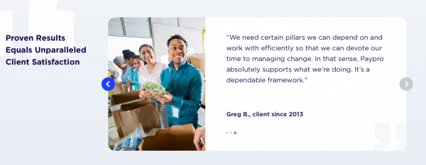
Kayla Kelly of Paypro shares: “I’m a huge fan of the slideshow customer testimonials right by the CTA. There is something about the movement that catches the eye, an engaging photo of the customer at their place of business, and a genuine quote reflecting the power of our software. It’s a huge boon to the click-through rate.”
An example of a slideshow testimonial, as provided by Kelly.
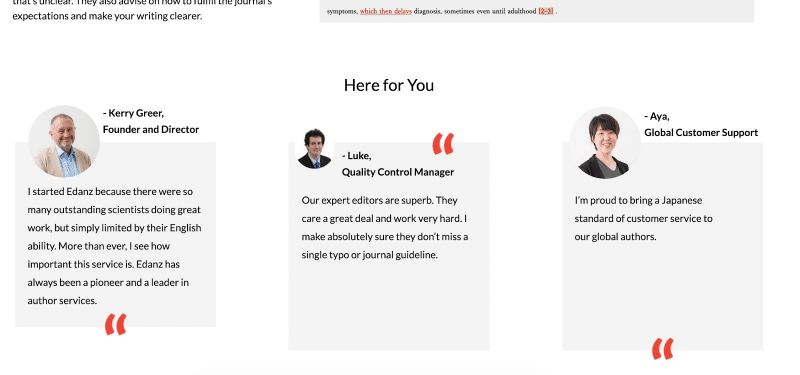
Display authentic images, credentials, and quotes from customers
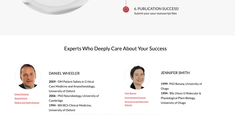
Authenticity is key to trust, so use authentic images of people associated with your brand, says Adam Goulston from Tsujiru. “I mainly deal with scientific companies and B2B, rather than B2C. My tip is to use real human faces, not stock images,” shares Goulston. “Readers are burnt out on stock photography, and the free stuff especially is repeated across literally thousands of sites. It offers no advantage. Instead, I ask my client for photos of staff and customers and use them in the landing page. I try and get quotes from them too, and either quote them verbatim or use the information they offer. This builds trust and a human connection with the company. Also, if the client doesn’t have photos, I’ll go to where they are and do my own photoshoot.”
Some of the authentic images, credentials, and quotes that Goulston has gathered from client customers.
Keep consistency in messaging
Think about how your landing page relates to your marketing efforts that lead your prospects to the landing page (such as emails and social media posts). Then, ensure consistent messaging across these platforms, as Shakun Bansal of Mercer | Mettl recommends: “Maintain consistency in messaging through any campaign…from the first communication with the clients via emails or different channels to their arrival on the landing page. You can achieve particularly quick lead generation by keeping the subject line of the email similar to the headline of the landing page- simple and without confusing the end-user. Nothing could be better than your system picking up the crucial details from emails of the clients and auto-filling them in the lead gen form. It’s a matter of fractions before the end-user clicks submit because they are getting to avoid filling up the form and getting something important free of cost.”
Guide users through the sales funnel, step-by-step
Remember that your prospective buyer is on a journey of many steps. If your landing page is focused on lead generation, convincing the prospect to accept the landing page offer and become a lead (the immediate conversion you want from the landing page) often comes several steps before the point of purchase (the ultimate conversion). Sean Kirby shares, “The best way to improve conversion rates is to sell the offer. Too often, companies get caught up trying to sell all the features and benefits of their product too early. For lead generation, you don’t have to convince someone to purchase. You just need to convince them to take the next step.”
Josh Jennings of Geek Powered Studios recommends breaking the lead form into several steps: “Using a multi-step form instead of a single form is a phenomenal way to reduce the user’s cognitive load. Users don’t want to think, but they also want a very personal experience that a longer form can help provide. We’ve been able to increase conversion rates up to 5% by A/B testing multi-step forms. A multi-step form has a plethora of design capabilities that a standard form does not, allowing it to focus user’s attention much more effectively. But most importantly, any form must provide value to the user on the landing page.”
Think about sales psychology
According to Rio Rocket, “The psychology of a landing page is everything. Focus on 2 components to increase conversions:
1. The offer, in the form of a lead magnet. We make sure it’s a ‘godfather’ offer—one that is so good the customer just simply can’t refuse. This is a deep discounted or free item, stacked with other bonuses of high value, and offered for a limited time which conveys some downside of not being purchased right now.
2. The psychology of the entire sales sequence/email follow-up that converts the traffic into a lead and places the lead on a buyer’s journey. 3% immediate conversion on cold traffic is good. The other 97% can be brought back with retargeting. Of the 97%, 50% who inquire will buy within 2 years. 7.5% will buy within 90 days. 42.5% will buy within 91 days – 2 years.”
Alistair Dodds from Ever Increasing Circles also recommends appealing to the urgency in your offer: “A special tactic we like to employ is to always split test our Fear Of Missing Out (FOMO) play. We typically do this by split testing 3rd party countdown clocks vs. availability, i.e. only four places remaining. The copy and video/hero image will always reflect the FOMO test involved to ensure continuity in messaging and build on that fear. Also, when we start running campaigns for new clients, one of the things we see most often when analyzing their past tests are repeated interruptions and changes in traffic allocation mid-test. These changes can significantly alter the validity of the test outcome. We seriously advise clients against doing this. Instead, let the campaign see its course so you have a stable test run with a statistically relevant data source.”
And don’t forget about the psychology of color. Scott Crumrine from Guava Family says, “Color scheme is an important factor to consider when creating landing pages, as colors may unconsciously evoke certain emotions in consumers and influence their decision-making. As a family-oriented company, we integrate the color blue into landing pages and marketing, as our customers are seeking trustworthy, dependable, and secure products for their children.”
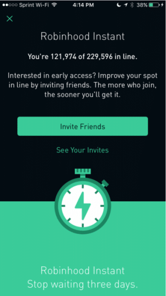
Steven Schwartz of Varfaj Partners uses exclusivity and gamification techniques to keep users interested. And often, he combines these techniques with the power of referral marketing. Says Schwartz, “We use a tactic of referring friends for a prize with an interactive chart showing how many you have referred.” (In the example Schwartz provided below, the pre-launch landing page appeals to exclusivity by showing how close a prospect is to access the service and invites them to refer friends for faster access.)
“In addition to that,” continues Schwartz, “we use incredibly out of the box tactics to entertain the user. This could include a game or something that looks very interesting in order to keep them on the landing page.”
Gather data with heat mapping
Exactly where should your lead form go on your landing page to maximize conversions? How should you arrange your copy and CTA button? Heat mapping can help you gather data to make informed decisions. After all, it shows you the areas of a page that people view most, as well as the order in which people view areas of a page.
Says Mark Whitlock of Golden Spiral Marketing, “In regards to forms, it’s helpful to use heat map technology — software that shows the most and least popular areas of your site — to determine the best locations for them on your landing pages. For A/B testing, what we test depends on the category we’re considering. We not only test variables of pages, ads, layouts, etc., but also our audience.”
Derrick Rehn from Integritive shares similar thoughts: “The use of heatmaps can be an efficient method for optimizing A/B testing on a landing page. Coupling this with Google Analytics data can take much of the guesswork out of landing pages. What’s important is not to guess about CTA button color or body copy, but instead back up these assertions with data.”
Consider exit-intent pop-ups
Don’t fear that people will view exit intent pop-ups as annoying. As our marketers attest, these pop-ups work— they redirect the prospect who tries to leave your landing page and increase the likelihood that they will convert. Matthew Ross of The Slumber Yard tells us, “One tip for creating an effective landing page would be to include a cross-sell pop-up once the viewer attempts to exit the page. In simple terms, this means have a popup appear once the individual’s cursor gets close to either the back button or exit button.”
Continues Ross, “By having a pop-up suddenly appear, you’ll grab the reader’s attention and hopefully daisy chain them to another related piece of content before they exit. Ultimately, this will help you retain the reader you worked so hard to get to your site. For the pop-up, I’d recommend using bright colors for the design and promoting content that is directly related to the page the viewer is currently looking at.”
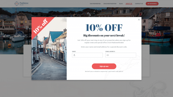
Sam Orchard from Edge of the Web also recommends exit intent pop-ups: “Exit modals (or exit intent pop-ups) have time and time again proven to increase conversions. The idea is that as soon as the user shows exit-intent (e.g. moving their cursor up past the top of the page towards the tabs), we display a prominent modal – sometimes full screen – with a clear CTA. The benefit of an exit modal over a regular popup is you’re less likely to annoy the user. You’re not preventing them from reading the content they came for, and by this point, they’ve already signaled that they’re about to leave the page. You literally have nothing to lose, as the exit modal doesn’t prevent them from carrying out their desired action – but it may change their mind and instead provide an extra opt-in.”
An example of a successful exit intent pop-up, provided by Orchard.
Gael Breton of Judgment Media Ltd sings the praises of these pop-ups as well: “Exit-intent pop-ups are underused on sales pages but are a great way to retain a fair percentage of people who are about to leave without converting. We have tried both offering a coupon and just linking to the checkout page from these. Surprisingly, the coupon did not add much more conversions over simply sending people to the checkout. So give it a shot, a simple pop up with headline ‘You are about to miss out’ and a button that says ‘claim the offer’ tends to do the trick.”
Keep experimenting to create high-converting landing pages
Don’t leave conversions to chance. Continually experiment with individual changes to your landing page to see which types of elements perform best. Cassidy Barney from Epic Marketing tells us, “One thing that we focus on is constantly experimenting. Just because we’ve tested one thing on a landing page doesn’t mean it’ll be universally impactful for all clients and industries. We are constantly testing and changing different elements and because of that, we see significant increases in our conversions.”
Ricardo Velez of Fundera shares, “A tactic I always incorporate when improving landing pages is to A/B test my CTA. This allows you to experiment with copy, colors, and overall design of one of the most critical pieces of a landing page.”
Zach Hendrix of GreenPal says, “We rigorously test our CTAs and what we have noticed is our best CTA copy makes a promise to the user. (Ex. Do this, get this) What am I getting for the click? Tell me this on the CTA! For instance, in our case, we noticed our original CTA ‘Get Started’ was beaten by 38% click-through by our new CTA ‘Get my lawn mowed.’ Make a promise to your users with your CTA copy and you will most certainly get more users to click for your offer.”
Use multiple elements
Several marketers offered multiple tips for increasing landing page conversions, in comprehensive plans. Says Jakub Kliszczak of CrazyCall, “There are many factors that make a landing page win new leads or plummet. Yet, the ones that are easy to implement but have a high ROI would be 1) One, clear CTA. Oftentimes marketers go for many different copies of their CTA to make it more contextual. My tip is to make all your CTAs’ copy the same but also contextual. Less friction, more conversion. 2) Close the landing page. If you want to close a visitor on that one, specific page you have to cut all of the possible distractions. Make it crystal clear what action should he or she take and guide them through with your copy, visuals, and CTA.”
Nathan van Zyl from Uku Inbound tells us: “Generally, we try to tick a couple of boxes when we create a landing page. The most important element is the copy. We try and make sure we answer a number of important questions that visitors will be trying to answer when they browse the page. The higher the level of commitment required from the visitor, the more information we provide. Your copy should also clearly define the value proposition and the benefits visitors will be getting if they convert.”
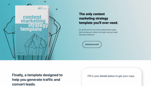
Continues van Zyl, “The second element is having a clear, focused call-to-action. The copy needs to be enticing and the color should stand out on the page. Lastly, we always include social proof and other forms of validations. Quotes from happy customers go a long way to building trust, while adding statistics help to confirm that importance of your offer.”
Van Zyl’s landing page example provides a strong, clear value proposition.
Travis Lodolinski from Traventures Media lists off his tips: “To start, contrasting colors is a critical aspect of simple legibility. If you can’t read the copy, whether in the page, graphics, or video your efforts are shot down just as soon as they got started. Secondly, if your landing page is NOT optimized for mobile, you’ve lost more than half of your intended audience. Additionally, to take a page out of Wufoo co-founder Kevin Hale’s book, you need to find elements of your offer that ‘Enchant and Amaze.’ This technique is used to enhance the viewer’s experience and can be implemented into your copy, design/layout, forms, images, and offers. The trick is to use ‘wit’ in constructing the intended experience for your user. This will lead to a better overall experience for both the customer and customer service. Take a step back and review.”
Stefania Borchia strives to increase the odds that people who don’t convert on the landing page might still become customers later. Says Borchia: “When crafting a landing page, I always use the brand layout. And by including a navigation menu, I give the opportunity even to non-converters to explore the site. Also, keeping the layout on-brand builds a connection even with occasional users. Then, I include a catchy H1 title that summarizes the benefits of filling in the form. An H2 headline is included to explain the H1 proposition in more detail. Finally, a short text invites the user to fill in the form. I also include the hero picture that has been used to drive users to this landing page to strengthen the connection between their journey and the page. The form is also kept to the minimum. In some cases, just an email is required.”
Borchia’s landing page example, with catchy H1, detailed H2, “discover” button and short lead form.
Finally, David Royce of Infused Marketing reminds you to never lose sight of your landing page’s intent. Royce shares how he stays purpose-minded: “Landing pages have a specific purpose and should never be confused with a traditional web page. For landing pages to be effective, they need to follow a few simple rules. The two biggest rules are ‘no navigation” and ‘a single call to action.’
It’s also very important that the landing page be an extension of the referring ad or link. If the landing page is tied to an ad, then the message, the colors and even the image need to have continuity, or viewers may think it’s clickbait.
It seems to be more effective to have easy to consume bullet points alongside a hero image, then sections that bring the reader closer to the Know, Like & Trust requirement. The bullet points should reinforce the original message and essentially expound on the content that was interesting enough to get someone to click.”
Key takeaways
Want to optimize your landing page for conversions? Follow these tips that we gathered from marketers:
- Frequently A/B test elements of your landing pages.
- Keep experimenting with different copy, CTAs, images, designs, etc. and don’t leave anything to chance
- Simplicity is key. Make it as easy as possible for prospects to convert.
- Make sure your landing page clearly tells prospects what you want them to do, and what you have to offer.
- Use concise headlines.
- Check that your landing page is uncluttered. Get rid of any elements you don’t need.
- Limit the number of form fields on a landing page form to no more than 4.
- Consider using third-party tools that will autofill lead forms for your prospects.
- Target your landing page to your audience.
- Apply data gathered from heat mapping to determine where to place lead forms and CTAs.
- Consider using exit intent pop-ups to increase the odds that your prospects will convert.
- Build trust, including through existing customers’ testimonials.
- Think about how psychology plays a role in your offer, and throughout your prospect’s journey.
- Consider appealing to urgency or exclusivity.

