What is something that is simple, usually overlooked, yet effective when it comes to lead nurturing? A thank you page. Those who utilize them often find they’re an epic moment for conversion.
Start thinking of this page as an unexpected opportunity for the conversion process, rather than just another landing page. It’s something that has a high open rate and happens because someone is already interested in what you are offering. Whether it’s a post-purchase thank you page or webinar signup, the thank you page design can be used for much more than giving a simple thanks.
Before we dive into the best thank you page examples, let’s discuss a few best practices and ways to optimize your thank you pages to boost conversions.
What is a thank you page?
In most cases, a thank you page is the web page where a customer is led after they complete a conversion action, such as making a purchase. Many marketers use thank you pages as an opportunity to sell something low friction, but worthwhile – like referring a friend for a future discount or signing up for a trial.
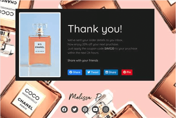
One example of a thank you page is the purchase confirmation page, where customers are directed right after their purchase is successful. But thank you pages are not exclusive to sales. Rather, they could pop up after other specific actions, like when someone signs up for your newsletter, your email list, a PDF download, or after a variety of other lead magnets. Don’t worry, you’ll see a few thank you page examples later on that showcase these types of conversions.
Now that we’re in the same headspace, let’s discuss why you should optimize this page.
Optimizing a thank you page for conversions
Right after a purchase is made or another specified action is taken, prospects and clients are primed and likely willing to take the next step.
A thank you page is a great opportunity to show your lead or customer what to do next. Do you want them to share on social media, or refer a friend to your business? They won’t know unless you make this an obvious next action.
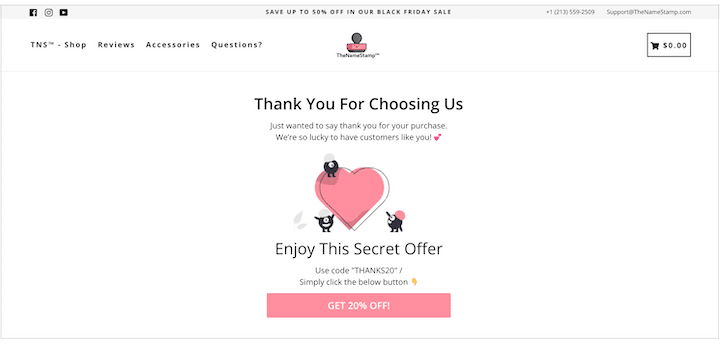
By using this page to your advantage you can achieve two things.
- Increase the time people spend engaging with your brand. You’ll add even more value at a time when your brand is still top of mind.
- Increase future conversions. You will make the next step clear by using an enticing CTA.
However, this can only be achieved with a properly optimized thank you page. It’s important to remember that how you’ll optimize your page will depend on your business goals and needs.
Some easy suggestions to start with are:
- Pick only one or two ways to optimize. You do not want to clutter this page. Clutter, and asking too many things at once, can deter people from taking your proposed action.
- Consider A/B testing two versions. By testing two page templates, you can see which one brings the most conversions. You can always reoptimize after gaining some initial data and move forward with a super solid page.
We have officially scratched the surface of optimizing your thank you page. Now it’s time to expand on all the ways you can do this. These are all things you’ll see in action later on when we cover thank you page examples.
The best way to optimize a thank you page: Promote your referral program
Let’s. Generate. More. Business. One of the easiest ways to do this is to focus on referrals. Referral programs encourage existing customers to share you with their peers. Because of this, many people use thank you pages as a way to promote their referral programs as it chronologically makes sense in the buyer’s journey.
If someone is reaching a thank you page after their purchase, a good next action step would be to refer or make another purchase. By advertising your referral program at this point, you can knock those out practically simultaneously (especially, if you are offering a discount as a referral incentive).
Why promote your referral program on a thank you page?
Rather than having people dig around to find your referral program, the thank you page makes it known at the right time. Think back to the last few thank you pages you have ended up on. You have probably experienced a referral ask yourself at some point after a purchase.
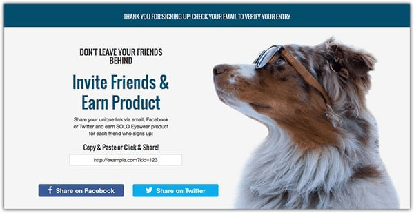
Here’s more on why a thank you page is ideal for promoting a referral program:
- There is a level of trust. Your customer’s friends trust what they have to say about your brand, and are more likely to purchase if referred – getting your customers to make those referrals is key. Using the correct spaces (like a thank you page) to promote your referral program can help turn this key.
- Your brand is top of mind. People are more likely to take action and share at this time because they are already engaged. If you ask when you are fresh in their mind, they may know of someone that may want or need the product or services they have just purchased.
- People respond well to deals. If you offer a discount coupon, or credits, for referring, the customer will be more likely to purchase again and share – people are always looking for a deal.
- Referral programs are cost-effective. Asking your existing customers to promote you costs less than ads. You may offer a discount or a freebie, but in the long run, the cost of these can be much less than more traditional digital marketing campaigns.
- Software can make the process simple. If you’re using referral program software, you can utilize things like single sign-on. This way, the customer can refer immediately after purchasing (without entering their info again) because they’re already logged in.
If you think about it, thank you pages tend to have a 100% open rate. So if you’re promoting your referral program there, it’s bound to be seen. Which means you have a ton of potential for growing your customer base.
Best practices for promoting your referral program with a thank you page
There are many places to promote a referral program. But, the best place to start is a thank you page, because it has a very high chance of being seen.
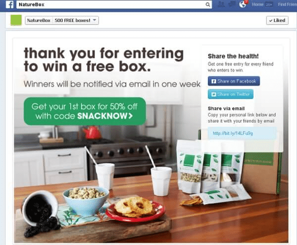
There are certain things you can do to maximize your referral program promotion via your thank you page. Here are some of our top best practices.
- Use referral software: If you have a formal referral system (run by referral software), it’s easy to embed the program on your thank you page, encourage referrals, and track your customers’ sharing. Why wouldn’t you use a system that makes repetitive processes easier and that does most of the work for you?
- Stay above the fold. Make sure the referral call to action is easy to find. Though people may see this page, you may only have a few seconds to grab someone’s attention.
- Be specific. Make it clear that you want customers to share, and don’t beat around the bush.
- Make referring easy. Customers should be able to enter a friend’s information and click to send. It should be that simple!
- You can provide multiple options for sharing (email, social media, direct referral link). That way, half the process is already taken care of, and people can complete your requested action effortlessly.
- Advertise any reward you’re offering. If you are offering a referral incentive, be sure to mention it. In just a few words you can ask and mention what people will get in return. Give $20, Get $20, for example, gives all the information needed.
- Don’t forget to say thanks! This should be evident, but don’t forget to show appreciation for their purchase or the initial desired action (it is a thank you page, after all).
It’s important to remember that, even though thank you pages are seen, customers may not leave them open very long. So, you must keep things simple, yet attractive. And if you’re going to ask or invite them to participate in something else (i.e. a referral program), make the process simple and fast.
Other ways to optimize a thank you page
Though referral programs are our favorite, they are not the only way to optimize your thank you page for conversions. Think about what makes sense for where your customers are at in their journey.
If you have a longer sales process, you may not offer a lead the same thing as a paying customer. If someone has only signed up for your newsletter or an email list, it might make more sense for you to say thanks and then prompt them to buy something or sign up for a trial over referring a friend.
Here are a few other examples of how to utilize a thank you page.
Add social sharing buttons
Creating a stream of word of mouth is always a good idea. Even if you’re not hosting a referral program, or if customers can’t think of specific friends to refer, they might be willing to still share you on social. 71% of people are more likely to purchase when referred by social media. So, you might as well get people talking about you in any way you can.
If you happen to have a social media referral program, you can incorporate social sharing options into your program. This way, customers can easily share with many friends at once while still participating in the program.
Choose the social platforms that customers frequent most. You may not need to have buttons for every single platform. If you’re a fashion brand, you may skip LinkedIn, but if you’re a B2B, you may use LinkedIn and skip Instagram instead.
Advertise relevant content
Blog promotion is very important. You can gain new subscribers and MQLs, and eventually, convert people into paying customers. By sharing a relevant piece of content, you can further establish your authority in the field.
Here are some things to consider when promoting your content on your thank you page.
- New customer ideas: If the customer just purchased, share content that helps them out after their purchase. Share an explainer or getting started video to give a brief overview. You can even get very specific with your content marketing. For example, if you sell kitchen appliances, maybe you could share an article on how to properly clean your new appliance. Or, be a little more light-hearted and share a recipe for the best foods to cook in your new stove, slow cooker, or pressure cooker.
- New lead ideas: Alternatively, if they became a lead, feed them content that will encourage them to purchase. If you are a SaaS business, perhaps you can share some interesting facts, use cases, or statistics showing them why they should use your service.
- Good for all. Use enticing images to encourage the click – or feed them video content. Visuals can be more captivating than blocks of text – Conversions can increase by 86% with video involved.
If you put in the effort to create useful content, you might as well share it when it makes sense! Being helpful from the start is a great way to increase sales in the long run.
Offer a demo or trial
A free trial will get the lead to try your product, and a demonstration can also give a sneak peek at your product. Both are great ways to get new leads to take the next step. So, it definitely makes sense to offer these options on your thank you pages.
These options will have to be presented to very specific people, however: those who are not yet customers, but have shown interest in your product. This has to be done in a strategic way so that it makes sense for the lead to actually move forward with a trial.
A good idea in this instance would be to reduce the urgency for a lead to leave the page. Your thank you page could mention that their free ebook download or white paper will be sent after a set amount of time.
Following your thank you message, you can offer your trial or demo.Then below the fold you can provide social proof and product benefits to further seal the deal and encourage signups.
Thanks for signing up! Your guide/webinar link will arrive in your inbox in about 10 minutes. But, in the meantime…play around with the platform.
Offer a course or webinar
Thank you pages are really good opportunities to move or encourage leads through the sales funnel. You can even offer a webinar or training course that can fit everyone, both leads and existing customers. Webinars are great options for B2Bs and SaaS businesses!
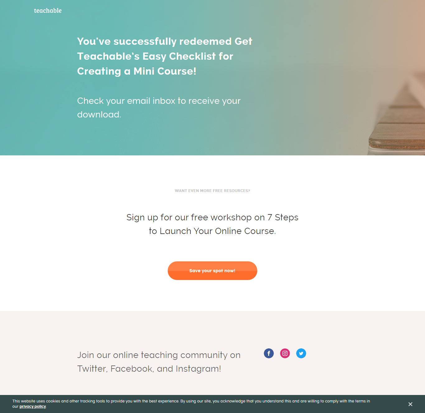
Don’t forget to also utilize your post-registration thank you pages too! You can keep funneling webinar guests to complete other actions – like signing up for a trial if they are still in the awareness stage, or referring if they are further along.
Share social proof
The thank you page can accomplish so much. You don’t always have to add a CTA or ask for anything else. But, this page can be the perfect spot to showcase some social proof. By using social proof, you are letting your customers do the talking for you. Customers who view user-generated content have a 133% higher conversion rate.
This could be showcasing customer reviews, testimonials, or sharing UGC. These are all very authentic forms of social proof that pack a big punch. Alternatively, you can use this as an opportunity to place logos of prominent customers you have served.
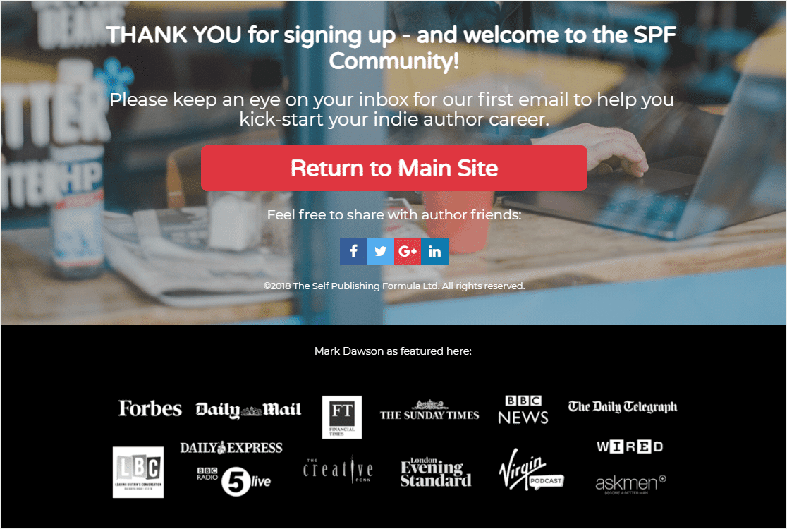
Showcasing social proof is great for thank you pages, especially after someone fills out a lead form. Why? It builds confidence in your product.
Survey your customers
Your customers are the best resource for getting the inside scoop on your own product. Do they like what you offer? Is there anything you could improve on? Is there a feature missing? Gaining this type of information about their purchase experience and product experience can be crucial for building yourself up.
If you do plan on adding a survey to your thank you page, you should make sure it is short and sweet. So pick just a few questions so you don’t scare anyone off. If you do throw in an open text box at the end, perhaps make this one optional. It would be a shame for someone to answer everything up until they see a text box.

The good news is that if someone is going to answer a question they are highly likely to answer any subsequent questions. If you do manage to get someone to answer a second question, the retention rate will go upwards of 97% for that customer. So, not only can you use a thank you page to gain valuable insight, but you can use it to get customers to stick around.
Additionally, you can use this page for an NPS survey. You can ask the NPS question to see how likely they are to refer friends. So, if you are still deciding whether or not a referral program would be fitting for you, this may be beneficial.
17 thank you page examples
We love a good example. Here are some thank you pages that can help you spark an idea or two. The intention, other than being a thank you page, is quite evident in each. Which, as we discussed, is key!
Here are some examples of how thank you pages can be used to engage customers or nurture leads who are further down the funnel.
Warby Parker
Type: referral ask
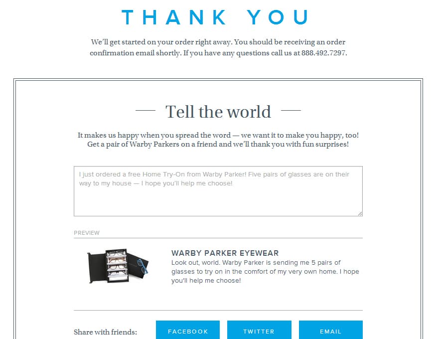
This thank you page is simple, yet effective. The two bold text areas give the viewer all the information they need to understand they are appreciated and what they should do next.
The thank you message informs them of what to expect with their order and how to reach them if something should arise. Then the remainder of the page is an open invitation to refer. They offer some easy social media buttons and a prefilled (optional) message for easy sharing.
Suggestion: Though the colors are nice and neat, there isn’t much of anything to help draw the attention of the viewer. Making the image of the glasses a little larger may help pique more interest, or at least make someone view the page a little longer.
Monk Manual
Type: referral ask
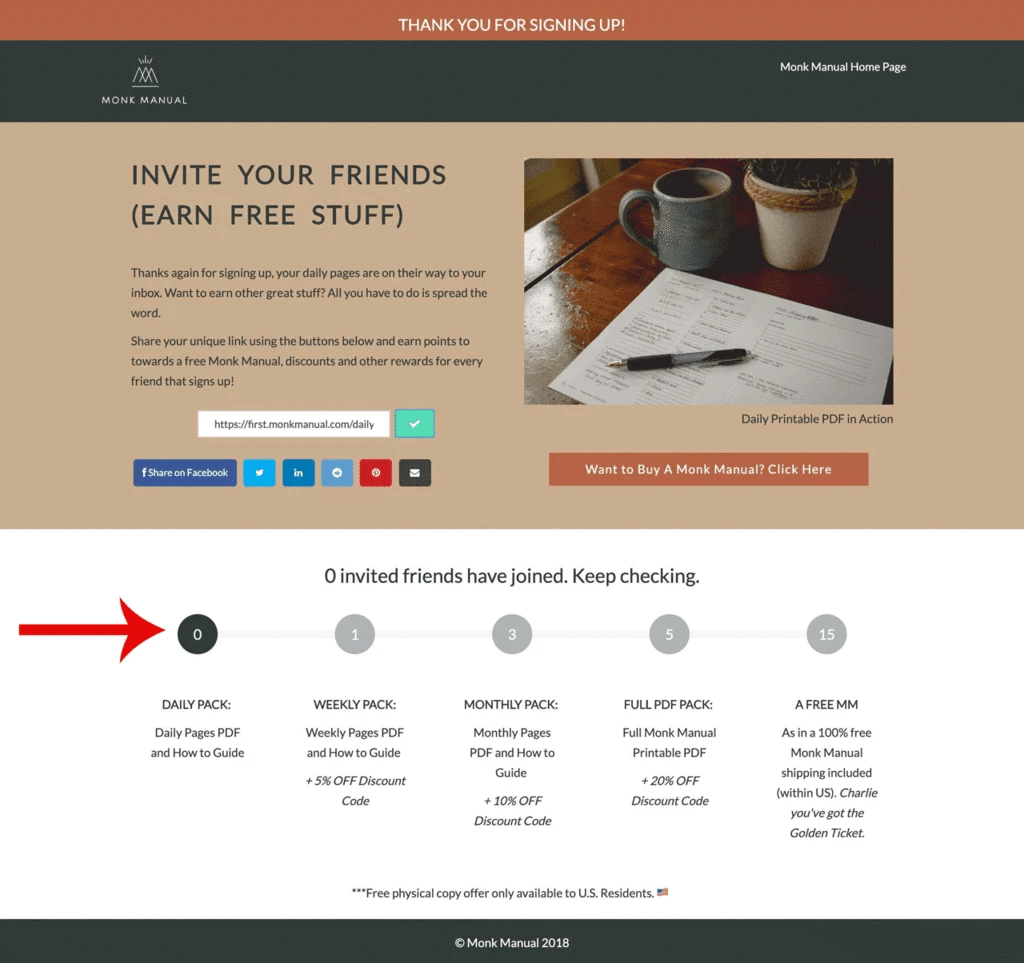
The thank you message is short and sweet, ‘Thank you for signing up’. The main focus of this thank you page is getting someone to refer. Above the fold, you’ll see a bold image of their product in action along with easy sharing options. They take it a bit further and offer a second CTA for buying that product ‘now’.
They keep the interest going below the fold showcasing a visual chart for keeping track of the referrers status towards earning the grand prize.
Suggestion: The idea is on point, but someone may see the number of referrals needed (15) for the grand prize and stop before they even start. The progress bar could be sent by email after sharing with the first referral so that it doesn’t seem so daunting. After making one referral, and seeing how simple it is – they may be inclined to proceed further.
ThreadBetter
Type: referral ask
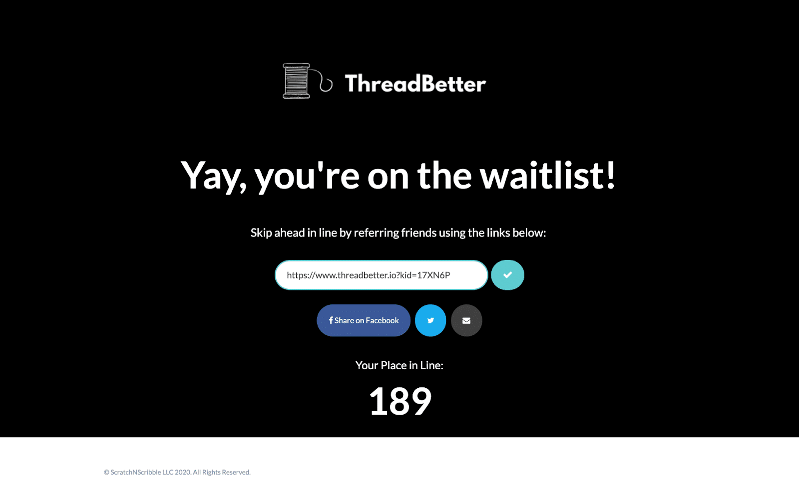
A bold page that is not overly complicated, but manages to get the point across is a score in our book. It’s obvious that this person wants what ThreadBetter is offering. So, by offering a better spot on the waitlist by simply referring, both you and ThreadBetter get exactly what you want.
This is such a great example of when to take advantage of a thank you page. This is also a super relaxed way to also run a referral program. The offer is free to give, but worthwhile for the customer.
Suggestion: The ‘Yay’ keeps this thank you page super casual, but it nevers hurts to actually say thanks. Overall, this is a very cool way to utilize a thank you page while also growing your exposure and client list (for free).
Australian Ethical
Type: referral ask
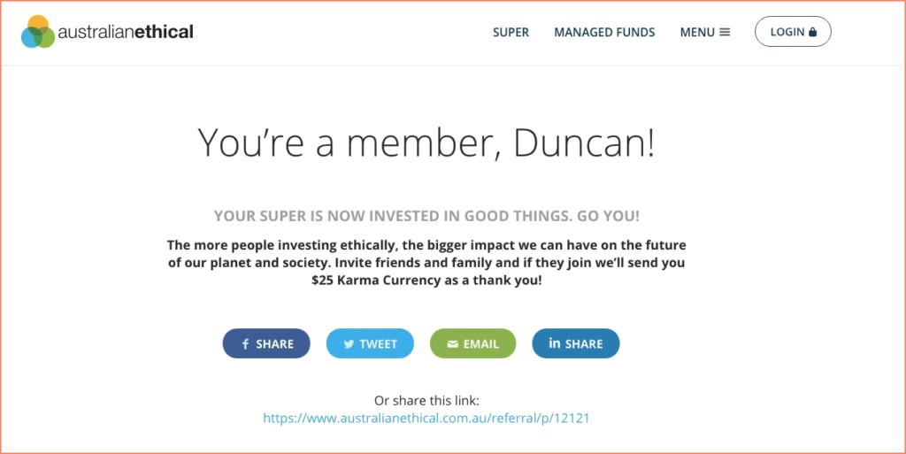
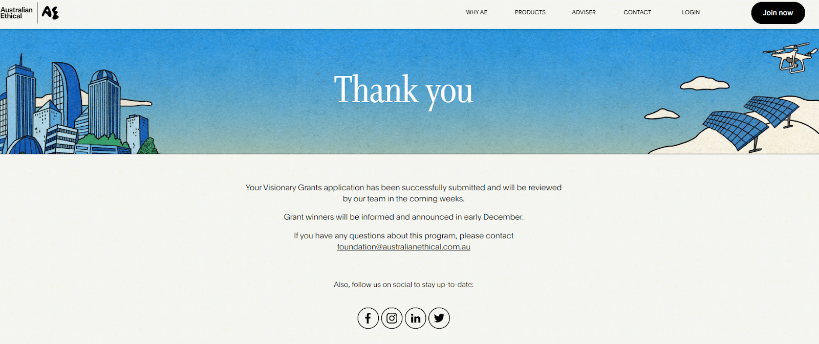
This one really celebrates the customer becoming a new member. It’s a simple thank you page and gets the message of appreciation across.
Suggestion: Thank you pages don’t always say thank you. This one is easily implied, so we can’t complain. While reading the fine print, it’s learned that there is a potential to earn some Karma currency. However, it doesn’t catch the eye, so people may see the big text and then close out because they don’t notice there is an added benefit to referring.
Marshall Fridge
Type: social sharing
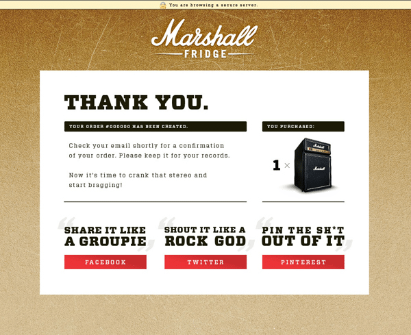
Say it loud. This one really says thank you and then shows you exactly why you are getting thanked. This page showcases a photo of what was ordered and then plays on that purchase and asks for social shares. Sayings like, “Shout it like a rock god”, really capture the intent of what should be done, but in a fun way.
Suggestion: Social shares like this do not offer much of an incentive for sharing. So this can be a hard one to make use of. So it’s all about wording. “Crank that stereo and start bragging”, may spark a little fire and get someone to share for their building their own social proof. If you want someone to share without offering a referral incentive, you have to use a little FOMO or instill a sense of social proof as to why they should do it.
Good Financial Cents
Type: social sharing
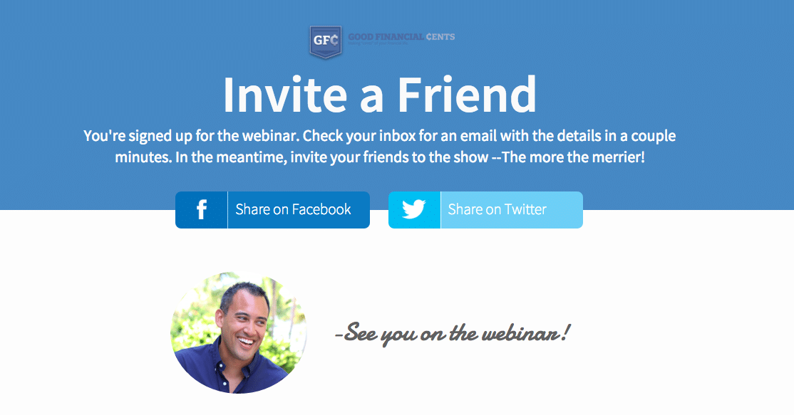
There is a clear message on this one – invite friends. They are using referral marketing as a means to spread the word about the upcoming webinar. On top of spreading the word, an expectation is given on when information regarding the webinar will be available.
Suggestion: The term, ‘Invite a friend’ seems personal – but there are only Facebook and Twitter share options. Meaning it’s easiest to broadcast to everyone, not just one friend. The terminology can be changed a little so that it matches the expectation. Just as easily, there could be an email button added.
Pardot
Type: demo signup
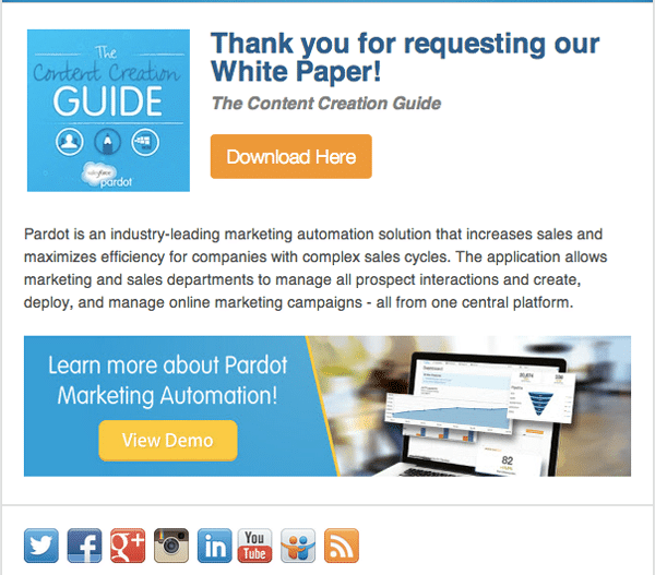
The thank you seems very sincere, and it definitely draws the eye. Pardot then uses the rest of the page to explain and upsell their product to encourage some demo signups. This is definitely a great space to build demand for their product.
Suggestion: There are two CTAs here. The one people are expecting ‘download here’, and an option for a demo. The problem here is that the first button could be clicked, and then the user will likely drop off the page without considering the other option because they got what they need. It may lead to more conversions to email the download and then only offer the CTA for the demo.
James Grandstaff
Type: demo signup
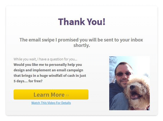
Again, we love seeing what will happen next. In a few moments you should check your inbox. But wait, what is that? An opportunity to learn about bringing in more cash with a crash course on email marketing campaigns. That offer can be strong enough to get someone to click ‘learn more’. Because this is an individual, it makes sense to use a personal photo – it gives a ‘look I am human too and not just a corporation’ vibe.
Suggestion: There are two options to choose from. ‘Learn more’ and ‘watch this video’ – do they lead to the same thing? Or are they for two separate options. We’d prefer to stick with just one option, or perhaps have the video link after the main CTA is clicked to avoid possible confusion.
HubSpot
Type: free plan signup
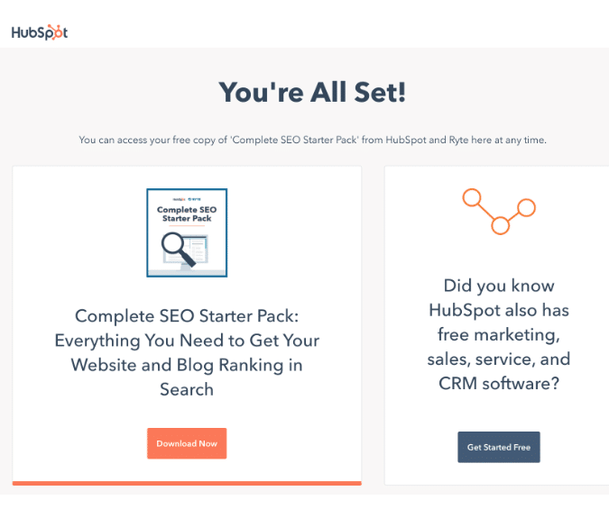
Inbound marketing powerhouse HubSpot uses their gated content thank you pages to promote the free versions of their software. Continuing to offer something for free after the visitor has shown interest is a great call, especially for a brand with an already trusted reputation. It also plays to their advantage that they offer free software plans (essentially unlimited trials), as “free software” sounds more compelling on the thank you page than “free trial” might. The page is very streamlined and uncluttered.
Suggestion: We wish HubSpot would have thanked the visitor more directly. “Thank you for downloading the Complete Seo Starter Pack; you can access your free copy at any time” is an easy wording change to make. And unfortunately, having two CTAs (the download and the free plan signup) might also cause visitors to download their resource and leave, without checking out the free plans.
Uscreen
Type: trial signup
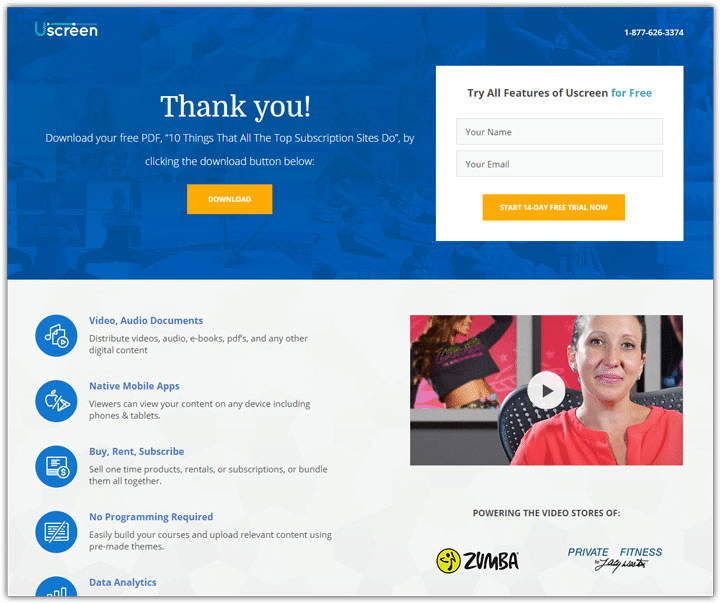
This thank you page has a little bit of it all. There is social proof displaying some well-known brands towards the bottom. Product information to pique your interest and hopefully drive you to start a trial, and the download button for the PDF you are expecting. Even with so many things to see, it doesn’t seem too overwhelming.
Suggestion: Keeping CTAs minimal can be key to making people take a specific action. Clicking the button to download can completely take away from the trial sign up. And once the download is complete, which could be a matter of seconds, the page will likely be closed. Making someone wait a few minutes before sending the PDF download can be a better use of the page. There is a lot of product information that might be missed otherwise.
Appleton Builders
Type: social proof
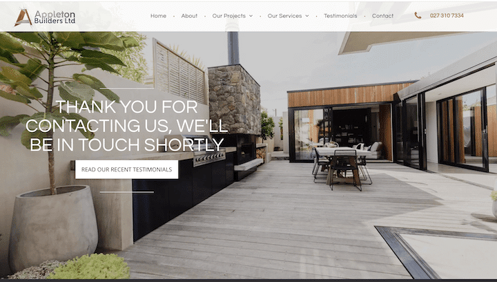
This is truly just a thank you page. Or is it? This thank you message is received after filling out the Appleton Builders contact form page. It gives a little detail on what the lead should expect, but also allows them to browse through customer testimonials. People love reading testimonials to gain insight on who they might be working with. By offering some social proof, you are really setting yourself up for success. Plus, the page is just beautiful to look at. It showcases what Appleton Builders does, and how well they do it.
Suggestion: Though the page is beautiful, how likely is someone going to click to go to another page to read some testimonials? Perhaps showcase one testimonial, and then have the button as an option to read more testimonials (or some case studies). That way the social proof is seen instantly on the page that is already open, but there is still the option to dive deeper if needed.
Charity: Water
Type: social proof
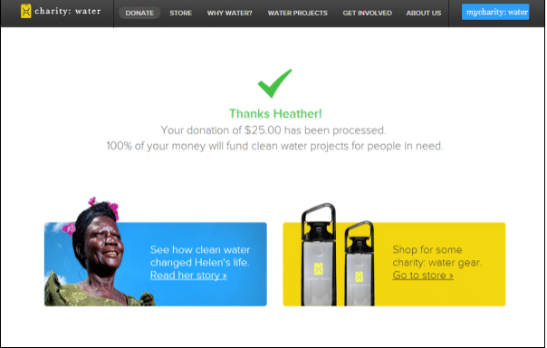
Charity is a big motivator for many. When someone donates, a thank you is obviously recommended. This thank you page does that and more. The donation amount is present, and where that donation will be going is mentioned as well.
There are two CTA options, one leading to shop, while the other is a feel good story. Where the feel good story is displayed, you get a glimpse of how donations are used to benefit others. Raising emotions with a real story is a great way to get people to share and have a reaction towards your brand. And, who knows, this may intrigue someone to check out the store again.
Suggestion: We love to see a good use case. Putting a face to a satisfied customer (or benefiter) is a great visual motivator. To make this story even more fulfilling, the wording could have been tweaked to include “donations like yours…” A story like this could also spark some feel-good referrals and shares, so we hope there are some social share options upon clicking to the story.
Wemod
Type: social proof
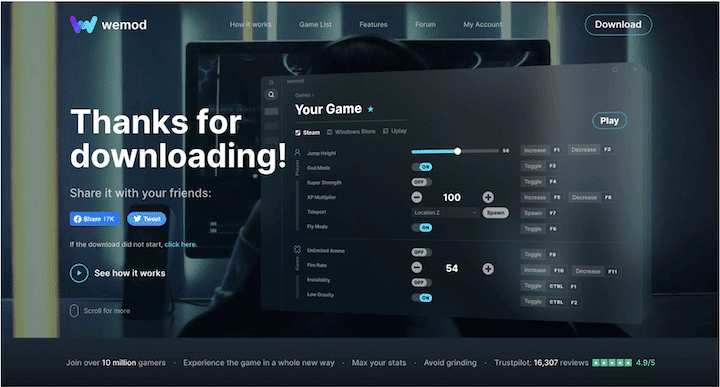
This thank you page example from Wemod covers a few of the types we have discussed. Social sharing, and watching a video are most evident. But, along the bottom they offer some stats. Having a rating of 4.9 from over 16,000 reviews is awesome social proof, and proves they know what they’re doing and that they are well liked.
Suggestion: Adding social proof like this to the bottom of the page is a great visual that helps build trust in the product. Plus, it does not detract from the CTAs present. Neither the social shares or the video are too overpowering, so in this instance – we’re all for it. If there is already a lot of imagery, adding a photo clip from the video might be overkill. Remember to keep it balanced like in this instance.
[x]cube LABS
Type: social proof
Suggestion: Though we like the purple logos, the page almost looks too monotone. There could be a little more contrast. Perhaps the blog titles could just be black bolded text to add just a bit more definition. But, visually speaking, this can be a great look.
Harry’s Razors
Type: customer survey
The approach for this thank you page is to gain insight. The survey is based on customers’ usage, and not necessarily their service or website. They are taking this opportunity to get to know what their customers need, and they will probably use that information to create an even better product (one would hope).
Suggestion: This thank you page is very simple. We like how the survey isn’t necessarily a pop up, but rather embedded on the page. With that being said, using a border around the survey can help it stand out from the rest.
Macy’s
Type: customer survey
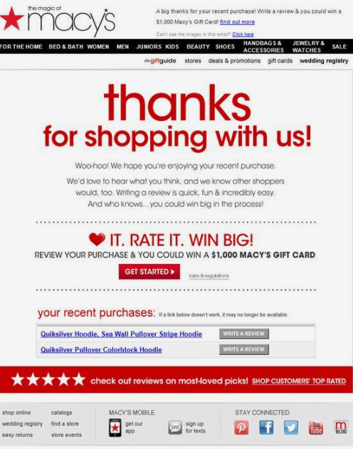
Macy’s thank you page doubles down and asks for feedback. They have decided to amp up their survey by offering an entry towards a grand prize. Just as a referral reward works at attracting people to refer, a drawing has the same effect for collecting more responses. Even though it’s not a guarantee, the thank you page drops a big dollar amount to draw people in. It could also prompt more purchases for more possible entries.
Suggestion: Visually speaking, this page seems a little congested. They do a great job at catching the eye in the two places that matter most – the thanks and the rate it sections (letting the customer know what to do next). But it seems like the links for the products, the ‘write a review’ buttons, and the ‘get started’ button may all lead to the same thing – which seems like overkill.
Pink Salt Riot
Type: cross-selling and social sharing
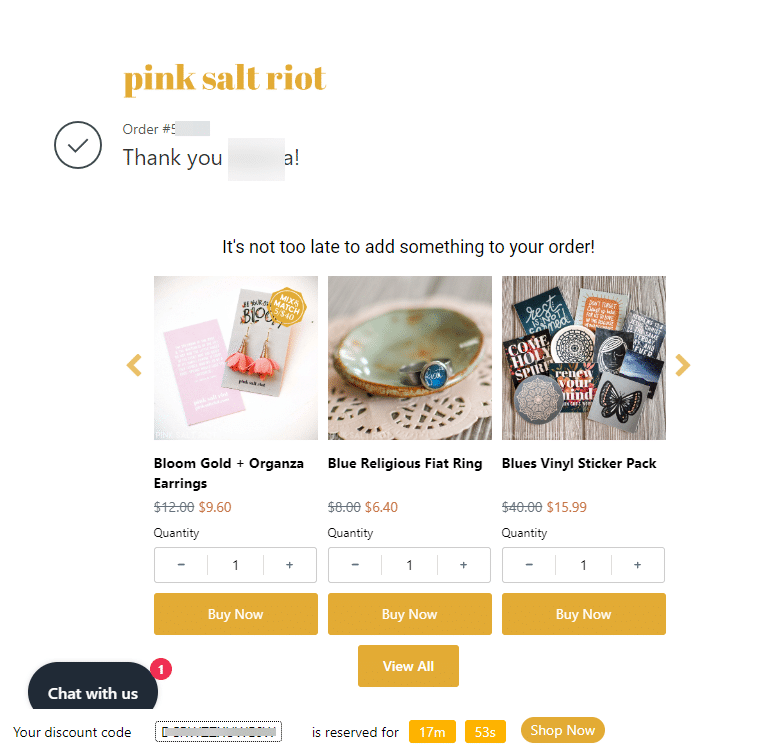
Cross-selling, or getting a customer to buy more when they’ve already committed to the purchase, is an interesting way to use an ecommerce thank you page. So is offering a time-based discount for any products bought directly after the completed order. But as a small business focused on creating Christian jewelry and accessories, Pink Salt Riot’s mission is at the heart of everything they create. And customers sharing that mission is an effective way to grow their customer base. That’s why Pink Salt Riot includes several social sharing options for their customers on their thank you page.
Suggestion: The focus is largely on the cross-sell: to get the customer to buy more products at a discount within the countdown time. The social share buttons are pretty far down on the page, under the order information (which was removed for this post). We’d suggest putting those share buttons higher up and above the fold, as someone’s probably more likely to share than make another purchase. And we’d include a call to action for these sharing buttons that ties into their brand mission.
Wrapping up
If you want to utilize your thank you pages to their full potential, you have to decide on what action you desire to motivate. Keep interactions and CTAs to a minimum when you create your page. Remember, don’t overstuff a thank you page so much that it deflects interaction.
But, if you are wanting leads to take action, you’re going to have to make it very clear. With that being said, thank you pages should not seem overly pushy. You want to optimize in a way that can actually make a referral, share, download, or other desired next step happen.
