Whether it’s fair or not, most people are going to judge your business by the quality of its website. This begins with its design, which has a lot to with the ultimate performance of your site and its ability to produce results.
Why website performance and design matters
If you’re wondering why the performance of your website matters so much, you can reference what Google has to say on the matter. According to the search engine giant, your site’s performance is essential because it will help you:
- Retain users: BBC found that it was losing 10% of its users for every additional second that it took its site to load.
- Increase conversions: DoubleClick determined that publishers whose sites loaded in five seconds or less earned twice as much revenue as sites that took up to 19 seconds to load.
- Improve the customer experience: Consumers expect a seamless and engaging experience when they click on a link
5 tips for offering seamless website experiences
Many statistics regarding website performance relate to speed, which is vital. While this should be a priority, there are several other things you should also address to create the best online experience possible for your visitors and increase conversions.
1. Pay attention to downtime and site load speed
You obviously need to take a look at your website’s performance and page load speed first. Google has made it a ranking factor, so this should be at the top of your list. After all, if your website isn’t showing up in organic search results, you won’t be visible to your target audience.
Here are some alarming facts and statistics about performance and page load time:
- Each 100-millisecond delay in page load time can hurt conversion rates by 7%.
- Downtime costs per minute for a small business can range from $137 to $427 on average.
- The average eCommerce page loads in 2.67 seconds, and the fastest loads in just 0.324 seconds.
- By 2021, cybercrime will cost $6 trillion each year worldwide.
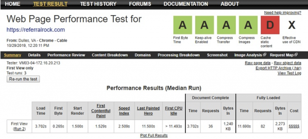
WebPageTest is the common tool you can use to simulate a visit to your website. From the result, you will know how your website performs in front of the visitors’ eyes.
If you want to improve your website experience, one of the solutions is to host your website on a secure and reliable web host to prevent downtime and ensure faster loading. But, you need to understand what is web hosting first. Once you choose the right web host, you can measure your website’s performance and take action to improve your page load speed. Some of the ways that you can improve your page speed include:
- Check your web hosting plan: If the time to first byte (TTFB) is an issue, this could be an issue with your web host.
- Get rid of bloated themes, widgets, and plugins: Some of the programming in these isn’t efficient. Use testing tools to find out what is slowing down your site.
- Using caching and a CDN: A caching plugin and CDN service can speed up your site significantly.
- Address issues with large images: Optimize your images with a plugin and disable hotlinking.
A great way to ensure your website has a low amount of downtime is by leveraging cloud hosting. Even if your server goes down, if your website is hosted in the cloud, other servers can pick up the load and ensure your website remains online.
While cloud hosting is not cheap, there are many good cloud hosting providers that offer free trials.
2. Personalize the customer experience
Today’s consumers want to be treated as individuals instead of just another number on the web. Specifically, you’ll get better results if you build a website that can customize the experience for each visitor, which isn’t as difficult as it sounds.
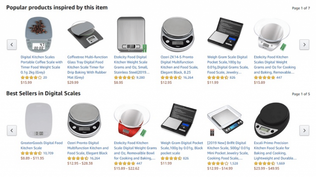
Tech giant, Amazon, has included seamless personalization on the website by recommending products to customers based on the data collected. The effort is paying off and Amazon claims that 35% of their sales come from these recommendations.
Also, in one study, 94% of marketers saw personalization as the best way to achieve success on the web. Through personalization, you can make a stronger connection with visitors and increase conversions. According to Smart Insights, some of the ways you can do this include:
- Segment your audience: As a business, you should have a clear understanding of your audience. Since it may include several types of buyers, you can use different tools (Google Analytics, Kissmetrics, Facebook Audience Insight) to collect data about your audience and create personalized experiences for them.
- Enhance website personalization: There are many ways to personalize your visitor’s experience. You can recommend products (just like how Amazon does this) based on customer search behavior, change your site’s language to match a visitor’s location, deliver personalized content based on the referral source, change the content based on the time of visit, and even personalize based on the type of device being used.
- Use personalized CTAs: According to one study, CTAs receive a 78.5% increase in conversions when they are personalized.
3. Offer a responsive design
If you’ve ever tried to view a shrunken version of a website on a mobile device, you know how frustrating this can be with all the pinching and zooming required. As far back as 2015, Google made responsive design a ranking signal, but it’s also the right thing to do if you want to optimize the user experience.
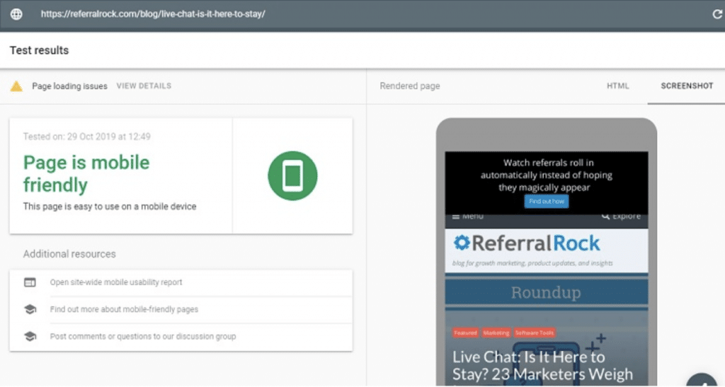
To test your webpage responsiveness, you can make use of Google Mobile-Friendly Test. This free tool from Google will show you if the given URL appears to be mobile responsive or otherwise.
A responsive website is one that will “adjust” according to the device that accesses the site. So, the website will be different if it is loaded from a desktop vs. a smartphone. Now that more than 60% of online searches come from mobile devices, having a responsive design is a must. Many web design companies specialize in creating great designs to improve the conversion and experience.
4. Make your navigation intuitive
An intuitive website will give your visitors the most seamless experience because they won’t have to work to find what they need. Instead, they can enjoy their visit, get the information they’re looking for quickly, and move further down the sales funnel, which will ultimately bring you more revenue.
So, how do you make your website’s navigation intuitive? First, understand your visitor’s wants and desires. Then, give them what they want and do it fast. One study by Microsoft determined that the average attention span of most people was eight seconds (shorter than a goldfish).
Most visitors are looking on your site’s menu bar for information or specific products. There’s a fine line between having too many and too few categories on an eCommerce site. This may be something you’ll need to test to find the optimum result.
Your site should also have a strong search function so that visitors can quickly find what they need. Also, don’t get cute with your web design. Most web users expect to find the search bar in the top right corner of the page, creative logos in the top left corner, and contact information in the footer.
5. Keep user onboarding simple
Part of making the website experience seamless for your visitors is onboarding. This refers to the simplicity with which they can sign up for any services, fill out forms, comment, get registered, etc.
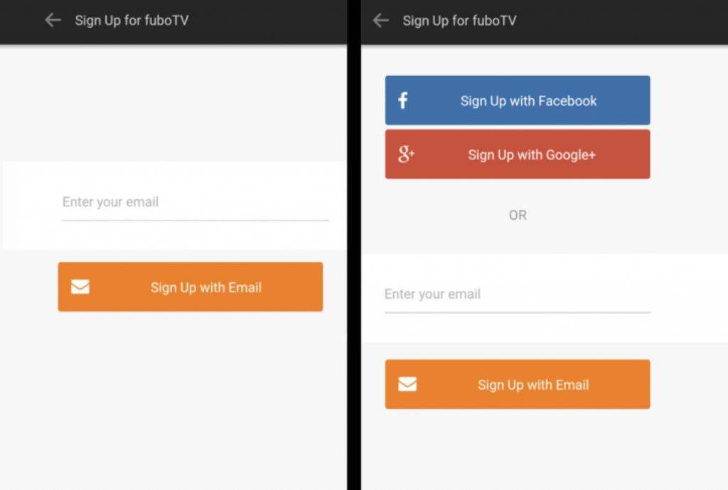
The example above shows the traditional sign up with email vs the sign up using social accounts. The chance is the conversion will increase when integrating the onboarding process with social accounts. If you want to increase conversions, your website needs to offer convenience for visitors.
As a consumer and online shopper, your visitors don’t have a lot of patience for multiple screens and a ton of requirements. Some of the ways that you can keep onboarding simple include:
- Enable a single sign-on: This is a feature that allows visitors to sign onto your site using an existing account such as Facebook or Google. One company increased conversion rates by 60% with this simple tool.
- Reduce options: Consumers like to have options, but not too many. An endless amount of options can lead to indecision and fewer conversions. When onboarding, offer just a few options.
- Show progress: Setting expectations is important online. Let users know what lies ahead if you need them to fill out some forms and provide a progress bar to show them how much further they have to go.
- Consolidate steps: Do you really need four screens for your checkout process, or can you bring it down to three, or even two? Make your registration and checkout procedures as clear and streamlined as possible.
Conclusion
Consumers are going to find your business online and often judge it by its website’s speed and performance. By following these five tips, you can not only create a better customer experience but also increase your conversion rates and boost your bottom-line results. It’s also important to consider that the easiest way is to contact a top website design agency that can provide a comprehensive solution for your business to be sure your website is always up and running smoothly.
 Jason Chow is an internet marketer who loves to blog about internet marketing tips, website building tips, online business ideas and many more. He manages website administrative and outreaching tasks for WebRevenue. He keeps himself updated with the latest technology especially related to the web hosting industry. He can be reached via Twitter and LinkedIn.