Most businesses acknowledge that an optimized website is essential to staying competitive in today’s digital marketplace. It’s not only important to have a well-designed site that attracts visitors, you should also focus on generating leads online, whether it’s through asking for referrals or using a lead management software.
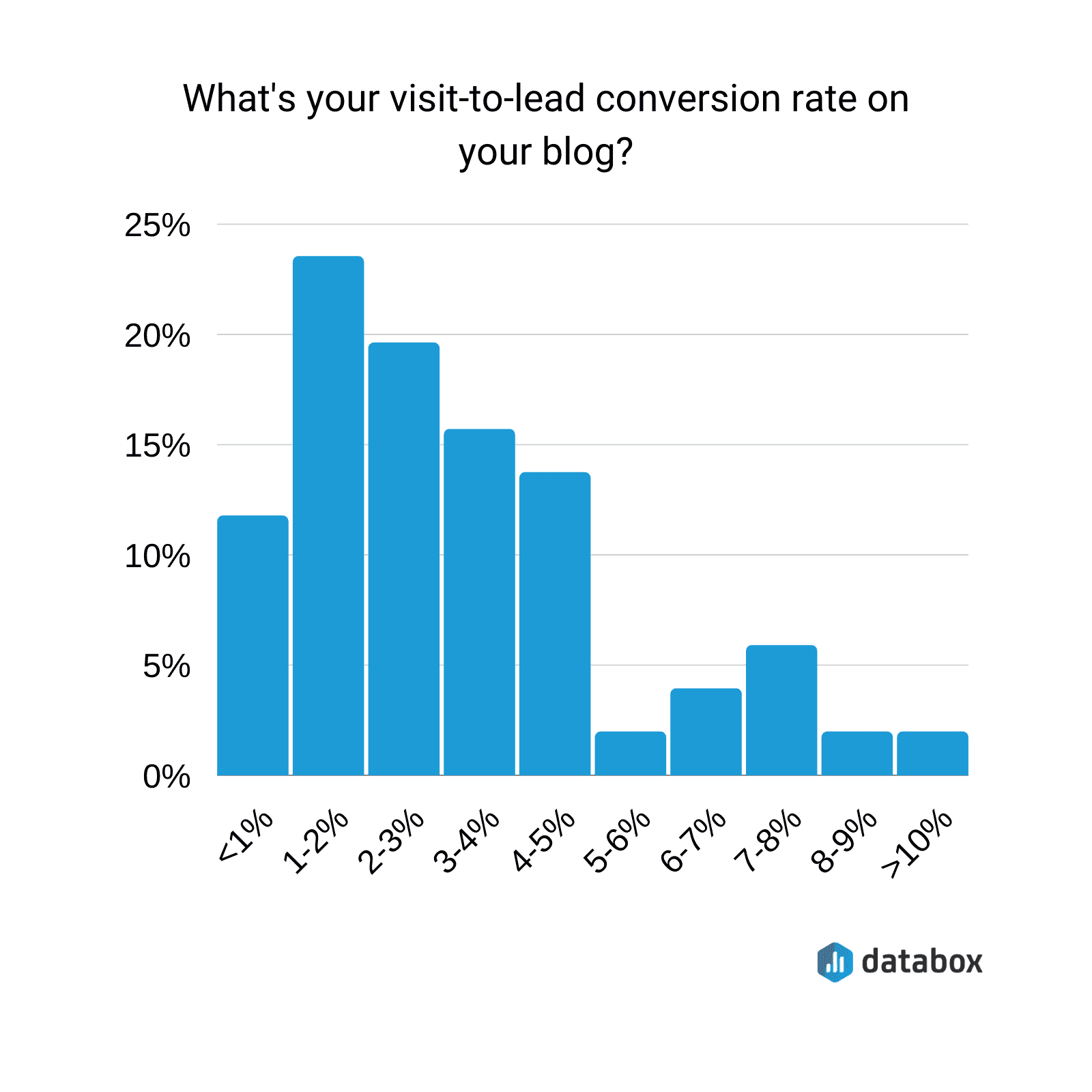
However, many businesses still overlook the importance of turning visitors into customers. The fact of the matter is that, for many businesses, the visitor-to-lead conversion on their blog is very small. According to a Databox survey, out of 23 marketers, 25% stated their lead-to-visit conversion rate was between 1-2%. The desired percentage is from 2-5%.
At the end of the day, every page of a website should guide visitors to some sort of interaction. This can be a directive to purchase, an invitation to sign up for an e-Learning course, or allowing visitors to reach out through a simple contact form.
Most home pages and product pages already include at least one of these elements. But what about your other website pages? To ensure that no lead opportunity goes to waste, even your “About” and “Help” pages should ideally include one of these lead generation elements.
Below, we discuss a few of the most under-utilized web pages for lead generation. We also take a look at some real-life examples of companies that have truly made the most of their visitor’s web experience.
About pages
Most visitors who explore your website will check out the About Us page to learn more about your business and its goals. This page introduces your business to your visitors, tells them your story, and helps build a successful rapport.
Think of your About Us page like a chance to speed-date with potential customers. If they like what they learn, make sure they can continue the relationship by including a call-to-action or contact form on that page. It’s possible to increase conversions by up to 300% by including a call-to-action or contact form on the about page.
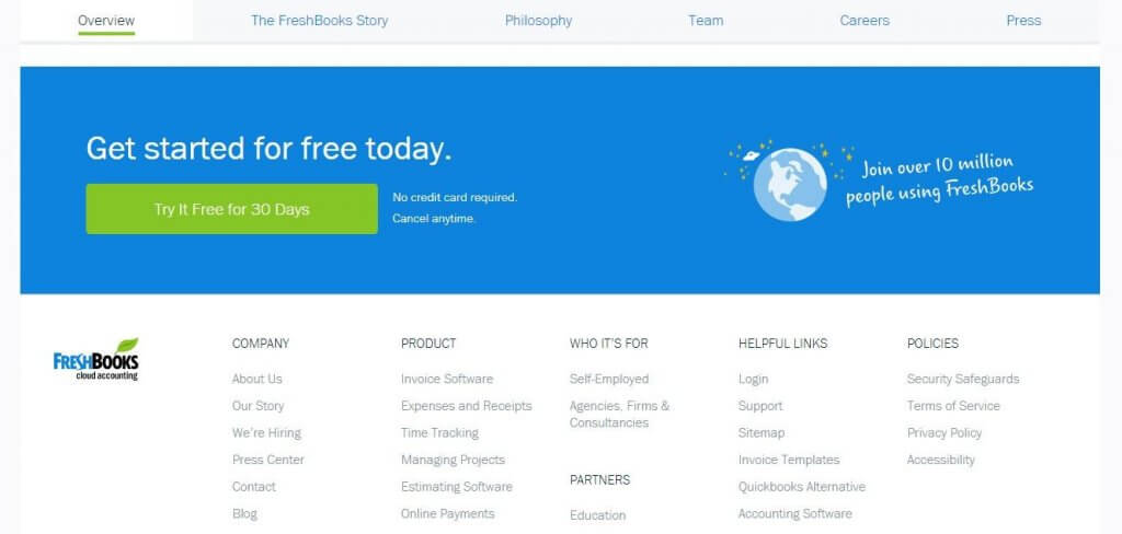
Take a look at this example from Freshbooks, which has a simple offer to try the product at the end of their about page.
Another approach is to set up a contact form. Or provide an email address as an invitation to visitors to introduce themselves. This works well for businesses that need to provide quotes. Plus, it can help assess a potential customer’s needs before entering into a business agreement with them.
Help pages
Every help page should maintain the loyalty of existing customers by offering them the assistance they need, but a truly excellent help page should also address visitor’s purchasing anxieties. Include how-tos and frequently asked questions for both those who have already purchased your product and those who are still considering your product.
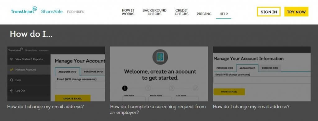
TransUnion’s ShareAble for Hires is a great example of a help page that accomplishes both of these goals. By combining frequently asked questions with how-to videos, those who have already purchased their service can get the assistance they need while visitors who are still considering the purchase can get a more in-depth look at how it works.
Also, note that this site has a call to action (“Try Now”) at the top of this page. Visitors who have decided to buy this product based on information on this page can now easily take action.
Under construction and 404 Pages
When building a website or rebuilding a business website, ensure continuous lead generation by capturing emails on an under construction page. This demonstrates a level of investment for potential customers. You recognize the inconvenience to them and will notify them of when they can access the information they were seeking.
Of course, this also helps establish an email list and builds hype before the new site launches.
Email captures on under construction pages should be as simple as possible – preferably just an email address. Asking for a first name is also acceptable in order to personalize emails, but anything beyond that at this stage is too much.
A visitor who provides their email address via an under construction page is placing great trust in that business. They know very little about the business and so may be hesitant to provide much more than an email address until they have more confidence in what the business is offering.
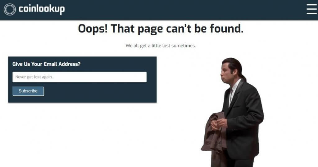
Similarly, 404 pages can use a simple email capture as a prompt for visitors to gather more specific information, like in this example from Coinlookup.
Calls to action
Calls to action (CTAs) are absolutely essential in directing visitors to purchase your product or service. However, using them effectively requires achieving a perfect balance between having them immediately and easily accessible at the very moment a visitor decides to answer the call while not overusing them to the point where visitors are annoyed and distracted by them.
One of the best ways to incorporate CTAs in an unobtrusive manner is by including one in the header or footer throughout the site. This way, the CTA follows the visitor and they know they can always access it.
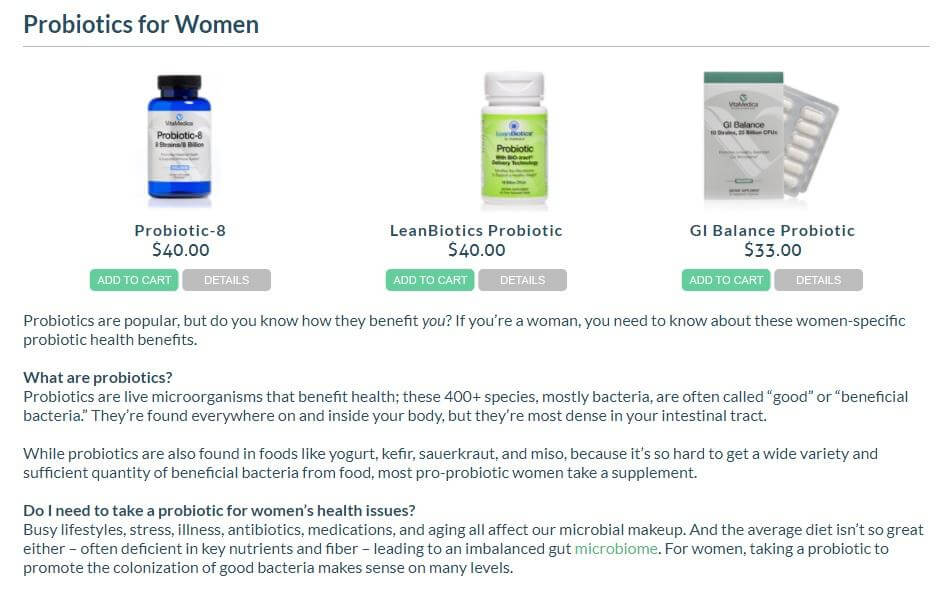
CTAs can also be incorporated on informational pages. In this example below from VitaMedica, visitors can read general information about probiotics for women. Then, if that information entices them to make a purchase, they can easily follow the CTAs for different products included at the top of the page.
Key takeaways
While it is important to stand apart from your competitors, you should choose a website design that is simple and easily navigable by your visitors. Complex forms and difficult jargon might seem like they make a business appear more legitimate and professional.
But they can also be a turn-off for visitors looking for immediate help. Keep things simple and offer the most relevant information.
Most importantly, any method of email capture or lead generation should have as few fields as possible, as many visitors will simply leave a page rather than fill out a long form. Make sure that every field has a distinct purpose. Don’t ask for a full address if you really only need a zip code. Or skip that entirely if you have no use for it.
Visitors may land on your site seeking solely information, but to increase leads and conversions you must gently but purposefully draw them into a conversation and relationship with your business. By fitting lead generators, visitors can engage with you according to what they need. Whether through email captures, call-to-action buttons, or contact forms – to the page they reside on.

