A call to action (CTA for short) is a phrase or expression placed strategically on marketing content that calls on the reader to perform a specific activity, such as purchasing, signing up for a newsletter, or downloading a resource.
It’s essential to use CTAs because they move your potential customer into your sales funnel or move them forward closer to the purchasing stage.
Coming up next, we will cover what call to actions are in more detail, including how to make them work. We will also look at 30 stellar call to action examples and break down the strategy behind them.
What is a call to action (CTA)?
Call to actions are phrases or statements used by businesses on marketing content to get customers to take a desired action. Typically, a call to action tells customers what to do next if they would like to engage with your offer, become part of your email list, or purchase from you.
It could be located in any number of places. Inside an email or as part of email campaigns, a landing page, a pop-up, on social media in the form of Instagram or Facebook ads, and a referral page are some of the most common locations for a CTA.
Features of a call to action
Here are some of the typical features of a call to action:
- It’s usually designed to be a prompt that lets viewers know what action they should take next.
- It’s often seen in the form of a clickable button, but it could just as well be a text that leads to a button or form as well.
- It can sometimes be just the headline, if it’s action-focused.
- It encourages immediate conversions and further movement down the sales funnel.
A business should consider using call to actions to encourage readers and visitors to:
- Shop now
- Subscribe to a service
- Sign up for an email newsletter
- Fill out a form for the purpose of lead generation
- Start a free trial
- Refer friends to your business
Why are call to actions so important?
Call to actions turn a prospect into a potential customer. An effective call to action (CTA) performs the following important functions for your business:
- Clarifies what you want a viewer, lead, or customer to do next
- Persuades customers to move down the sales funnel and convert
Digital marketing campaigns without call to actions don’t serve any purpose. After all, you want measurable results. If your customers aren’t being added to the start of your buyer journey, aren’t moving along in your sales funnel, or aren’t buying anything, all your best marketing efforts are going to waste.
Done well, call to actions can increase your reach, build your email lists, and help you sell more products and services. If your call to actions are not getting results, it’s time to figure out what went wrong.
It could be that your copy isn’t working, the CTA could be improved further, or even just the visual aesthetics and placement of it should be changed. Marketers usually do several different A/B split tests before scaling a high-performing ad and CTA.
Essentials for an effective call to action
While call to actions don’t necessarily always have to follow a set-in-stone strategy, making use of the following optimization formulas has been proven to increase conversions:
- Focus your copy on what you want the customer to do.
- Use action verbs such as “sign up,” “join,” “share,” “subscribe,” or “learn more.” They encourage and boost participation.
- Clearly present the benefits of taking the action. Package them so that they’re hard to resist.
- Keeping the CTA concise forces you to stick to the essentials, which is what time-pressed readers always prefer.
- Use a headline to lead to a button CTA.
- Make the CTA stand out – use bold button colors or contrasting colors, or even different fonts and styles.
- Place the CTA above the fold, so people can find it without scrolling.
- Create urgency, without which the reader won’t be compelled to take action quickly.
- Remove barriers to action. Make it easy for people to sign up. Don’t create too many steps to follow or create so much content that it’s a turn-off.
- A/B test different CTAs against each other. Test different types of content and even different types of CTAs. Experiment with colors. A/B testing can help you optimize the best possible CTA for conversions.
All of the most successful call to actions invariably have most, if not all, of the above attributes.
30 effective call-to-action examples to learn from
We found 30 fantastic call to action examples that you can learn from. We’ve also broken down how the companies lead into their CTAs.
Here’s the list without further ado!
1. BOMBAS Mother’s Day CTA
Location of CTA: In an email
Text of CTA: Shop Gifts, Shop Gift Box
Type of CTA: CTA button
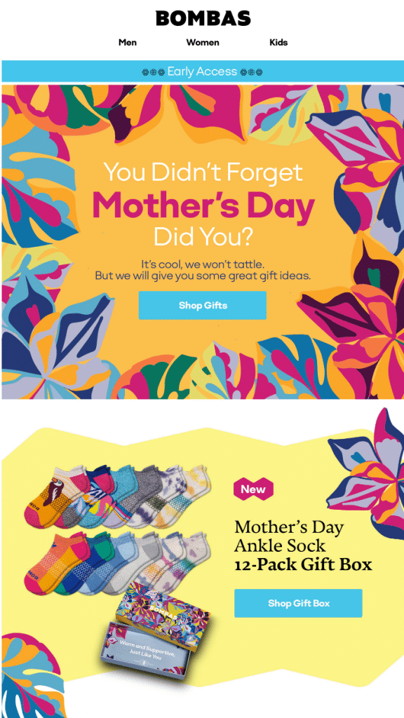
This call to action by comfort-focused sock and apparel brand BOMBAS makes fantastic use of a commonly celebrated holiday to remind readers of the urgency of making a gift purchase.
It starts off with a question, segues into a tongue-in-cheek comment about how the business wouldn’t tell on the reader, and then draws them in with the promise of great gift ideas.
The call to action works so well because it’s short, simple, and yet effective. It grabs attention with a question that, let’s face it, a lot of people can relate to. Then, it offers the solution of shopping for a gift straightaway by simply clicking a button.
2. Beautiful.ai new features CTA
Location of CTA: In an email
Text of CTA: Learn More
Type of CTA: CTA button
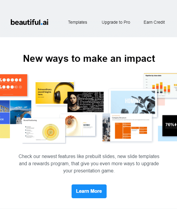
When Beautiful.ai, an online slide and presentation maker solution, wanted to promote its newest features on its email creative, it chose to focus on a reader benefit: “new ways to make an impact” as its opening headline.
Consumers consistently choose benefits over features, and the success of this email lies in it focusing the reader’s attention on a single but solid benefit – innovative ways of creating presentations that are powerfully impactful. It then lists a few features but doesn’t overload the reader with too much information. A simple and elegant button prompts the reader to learn more.
3. Casper referral program CTA
Location of CTA: Embedded in a landing page
Text of CTA: Start Sharing
Type of CTA: CTA button that encourages sharing
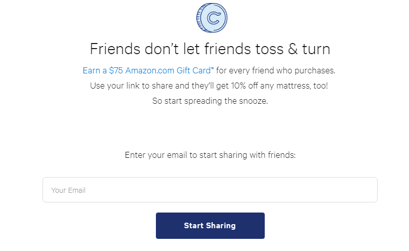
Casper’s landing page for its referral program works spectacularly well because it leverages the emotion behind friendships in its headline. It then straightaway gets down to what you need to do and what you will get in return: “Refer a friend – give 20% off a mattress, and get $75.”
There’s a lot going on with this creative. The referral program essentially encourages social sharing by offering your friend 20% off their first Casper mattress purchase using your link. You also get a $75 Amazon gift card as an added incentive.
Casper is also being very marketing savvy by grabbing email addresses in the process. Finally, the call to action encourages a sense of urgency through the use of an action verb: “start sharing.”
4. Treehouse free trial CTA
Location of CTA: CTA button on the Treehouse homepage
Text of CTA: Join now
Type of CTA: Headlines leading to a CTA button
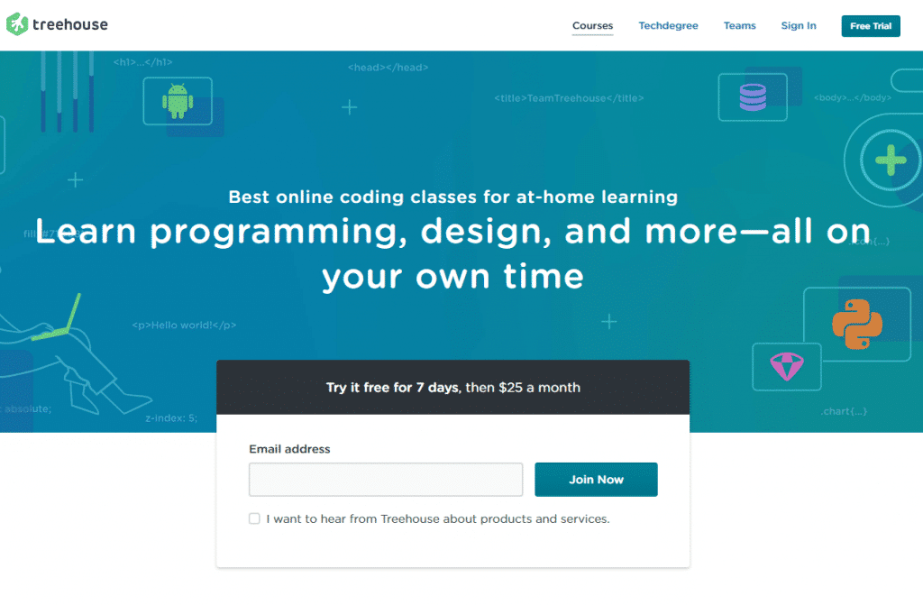
Treehouse’s homepage CTA copy focuses the attention of website visitors on learning, and being able to learn in your own time. Even though this looks like a simple CTA, it has zeroed in on what potential customers are looking for when they land on the website: learning new skills and being able to learn at their preferred pace.
The landing page also highlights that they offer the best coding classes online. While this is important, they’ve chosen to keep it secondary so that the benefits get the most attention.
Another great aspect of this page is that the company is transparent about pricing so that price-conscious visitors can make a decision easily. There’s a free trial for seven days, and the pricing switches to $25/month after that.
This CTA works well because everything a potential customer needs to make an initial purchasing decision is available as soon as they land on the page.
5. BOMBAS referral program
Location of CTA: In an email
Text of CTA: Get Free Socks; Refer a Friend Here
Type of CTA: Headline leading to two CTA buttons
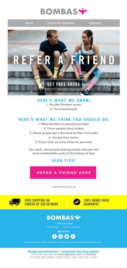
This BOMBAS email is an example of a great call to action specific to the referral marketing genre. The first thing you notice is that BOMBAS gets straight to the point in the very beginning. Not only does it tell you what you need to do (refer a friend) but also what you get for all that work (free socks!).
Another interesting aspect of this ad is that it provides a step-by-step sequence that the reader can follow to complete the referral activity. This way, readers won’t lose the plot while navigating the detailed referral scheme.
Keeping it simple and fuss-free will help you get the maximum conversions, and that’s one great reason why this email CTA works so well.
6. Goby shop button
Location of CTA: Goby’s homepage
Text of CTA: Get Your Goby
Type of CTA: CTA button
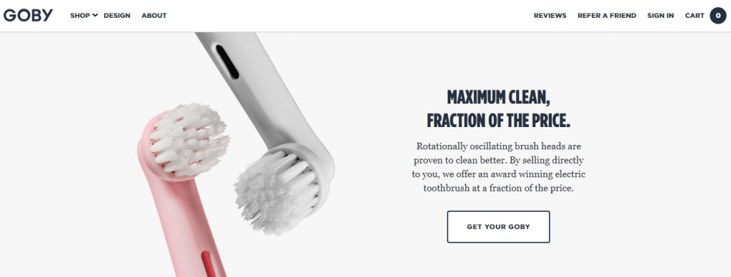
Goby’s landing page follows all the good practices of a winning call to action sequence. To start with, you have an arresting headline that showcases the benefit in a manner that you just can’t ignore: “Maximum clean, fraction of the price.” Who doesn’t want great functionality at an affordable price?
The text that follows provides a selling feature without being overtly salesy, and also explains how they can sell you an award-winning toothbrush at such a great price.
Then, we have the CTA button which reads “get your Goby,” inviting the reader with an action phrase while providing a great alternative to a boring “buy now” CTA.
7. Colourpop referral program CTA
Location of CTA: Landing page
Text of CTA: Share by link, Share via Facebook, Share via email
Type of CTA: Headline leading to a CTA button
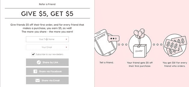
This landing page call to action by Colourpop offers an unobtrusive design with simple navigation and easy-to-understand text. You can see, from the visual representation of the referral scheme in pink, that the marketing team have put more emphasis on the website visitor understanding how the scheme works.
Colourpop’s winning formula here is the focus on user navigation while covering all the standard bases – scroll-stopping headline, brief explanation of the program, and easy to follow call to action buttons (“share by link, share via Facebook, share via email”) to start participating in the referral scheme.
8. Klientboost blog CTA pop-up
Location of CTA: Embedded inside a pop-up
Text of CTA: Subscribe to the blog
Type of CTA: Headline leading to a CTA button
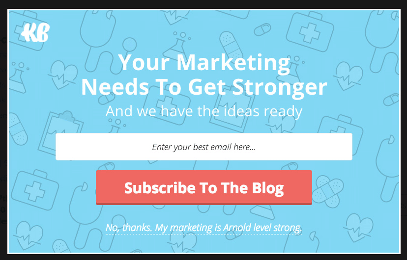
Klientboost is a performance marketing agency so it makes sense that its pop-up would be pure marketing gold. The best feature about this pop-up is how layman-appropriate the language is.
Even someone who doesn’t know the first thing about performance marketing will easily understand what the company is trying to say with its CTA copy: “Your marketing needs to get stronger and we have the ideas ready.”
You’re also given two choices – one to subscribe to the blog, and the other, not to, but only if your marketing is already “Arnold-level strong!” This is a compelling call to action that is simple and yet effective.
9. Owala homepage promotion
Location of CTA: Landing page
Text of CTA: Shop bottles
Type of CTA : Headline leading to a CTA button
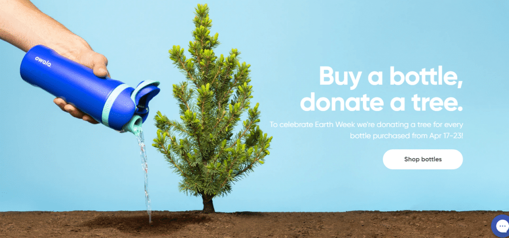
Owala’s CTA copy and ad is a great example of how to leverage theme days to attract socially aware consumers to purchase products while at the same time contributing to their cause of choice.
For this call to action, the water bottle company chose to focus the marketing on Earth Week. This strategy works because potential customers have a way to feel good about doing something for the environment while buying the company’s water bottle.
10. Spotify homepage promotion
Location of CTA: Homepage
Text of CTA: Get Spotify Free
Type of CTA: CTA button
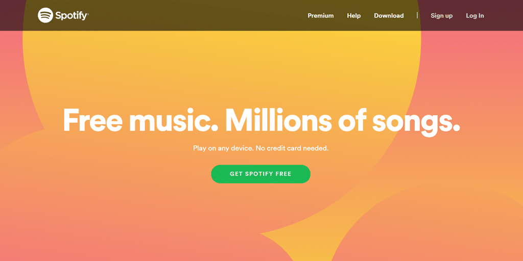
Spotify gets straight into the meat and potatoes by showcasing its benefit right on top so it’s the first thing readers see: “Free Music. Millions of Songs”. It’s simple, effective, and yet powerful. A music lover would definitely scroll down to see more.
The brand goes on further to showcase other attractive USPs – play on any device, and, “no credit card required” before moving in for the kill with the “Get Spotify Free” call to action. Notice the emphasis on an action word “get” and the usage of another powerful USP “free” for added incentive.
11. OptinMonster pop-up
Location of CTA: Pop-up on the blog
Text of CTA: Increase My Conversions
Type of CTA: Headline leading to a CTA button
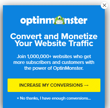
You can’t expect anything less than a high-converting call to action from the masters of the opt-in form, OptinMonster. And this pop-up certainly doesn’t disappoint. One of the best call to action examples on our list, this one succeeds brilliantly because it leverages the power of understanding what your audience really wants.
While the form in itself is brief and concise, it uses the available space to highlight USPs:
- There’s the headline which grabs attention: “Convert and monetize your website traffic.”
- There’s the social proof: “Join 1,000,000+ websites who get more subscribers…with the power of OptinMonster.”
- And, then there’s the sucker punch call to action: “Increase my conversions,” plus an option that practically makes saying no a laughable idea: “No thanks, I have enough conversions…”
In short, there is absolutely no reason why this pop-up wouldn’t convert.
12. Starbucks Instagram story ad
Location of CTA: Instagram story ad
Text of CTA: Swipe up to try, Learn more
Type of CTA : Headline CTA encouraging a swipe, featuring an arrow icon
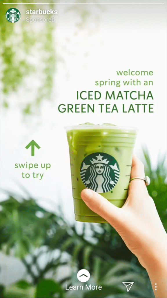
The Starbucks call to action is a great idea to try if you have an established business and already have a solid fan following. While the color and the entire concept around this ad give you a feeling of freshness, nature, and wholesomeness, the CTA keeps things tight and focused.
The CTA is also innovative in the sense that it evokes curiosity and invites the viewer to swipe to see what happens next. It also does so without making it overly complicated to complete the action –a winning, battle-tested formula.
13. Netflix CTA
Location of CTA: Homepage
Text of CTA: Get started
Type of CTA: CTA button
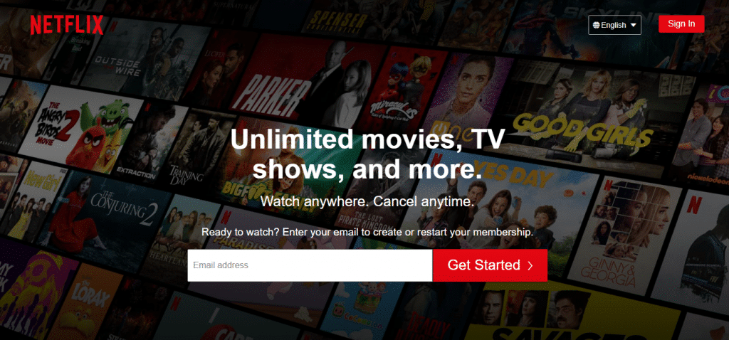
Netflix has always been a great example of marketing to the masses. Their homepage call to action is benefits-driven, concise, and gives you multiple compelling reasons why you want to sign up without beating around the bush.
The CTA copy, “unlimited movies, TV shows, and more. Watch anywhere. Cancel anytime,” is an example that you can easily apply to your business when you know what your customers really want.
14. Dollar Shave Club Instagram ad
Location of CTA: Instagram sponsored post
Text of CTA: Learn More
Type of CTA : Headline leading to a CTA button
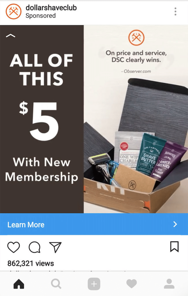
DSC chose a few different elements for their super effective CTA, including a review from Observer.com, a visual showcase of the items the target audience would be getting free, and highlighting the membership price which is a very attractive $5 – all of which lead down to a ‘Learn More’ CTA in a bright blue button at the bottom.
There is nothing complicated in the copywriting of this ad. It’s the benefits, and the usage of a visual representation of the items you’re getting for a steal, that shine out in this ad campaign.
15. Heifer International donation image
Location of CTA: Landing page
Text of CTA: Donate now
Type of CTA: CTA button

Heifer International’s ad is an example of how to evoke powerful emotions with very little text. Notice the usage of vivid descriptive words – stronger, determined, innovative, challenges. The opening statement speaks volumes without going overboard or not saying enough.
The website visitor is immediately prompted to “donate now,” quickly moving the prospect straight to the action the organization wants them to take. It’s a case study on how to strike and move for the kill, without giving your target audience too much time to think.
If your copywriting is as solid as this is, there’s no reason why your prospects wouldn’t sign up.
16. Omsom homepage CTA
Location of CTA: Homepage
Text of CTA: Shop now
Type of CTA: Headline leading to a CTA button
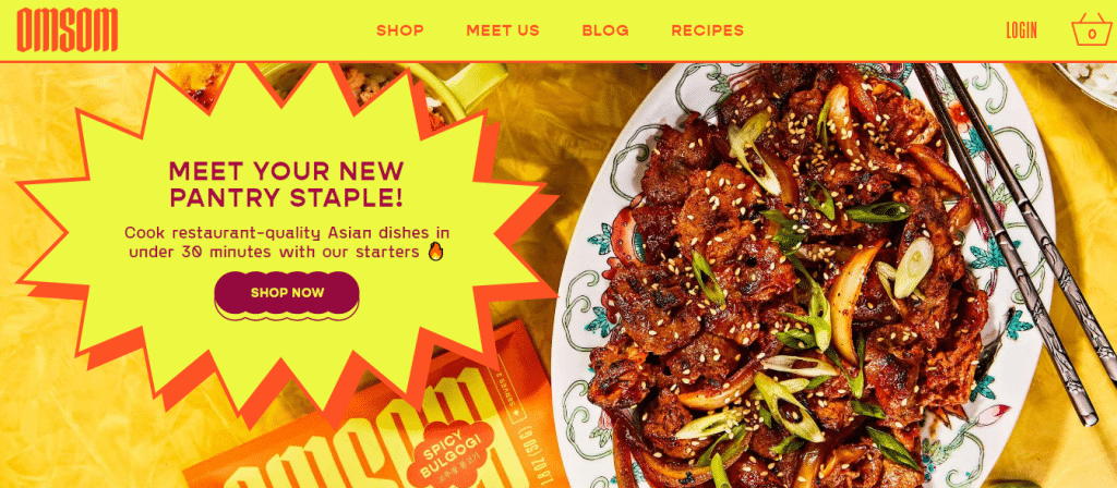
OMSOM’s landing page emphasizes convenience as the primary USP. It introduces website visitors to a potentially new pantry staple that customers can make use of to create high-quality Asian meals in under 30 minutes.
This fiery promotion speaks to anyone who wants to save time, which is most of us when you think about it. The fresh, invigorating colors, the emoji, the delicious image, and the burst shape in the ad creative make the idea that much more exciting.
Once you have finished reading the text you are prompted to immediately shop for the products with the ‘shop now’ CTA
17. Vrbo email CTA
Location of CTA: In an email
Text of CTA: Find Dream Vacations
Type of CTA: CTA button
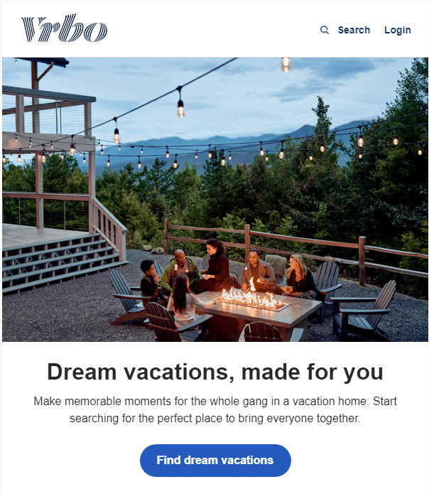
The principles behind the best call to action examples are the same regardless of the platform you use, whether it’s the homepage of a website, an Instagram/Facebook ad, or a campaign that you send out to your email list.
Keep it simple. Keep it short. Make it work.
This Vrbo email entices readers with made-for-you dream vacations. A little bit of text builds imagery around terms like memorable moments and bringing everyone together, before finally leading the reader into the CTA “Find dream vacations.”
The usage of the words “dream vacation” twice – once in the main body and the second time in the CTA – makes the idea of a dream vacation sound that much more compelling and magnetic.
18. TOMS pop-up CTA
Location of CTA: Pop-up for email signups
Text of CTA: Sign Up
Type of CTA: Headline leading to a CTA button
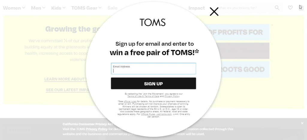
TOMS’ pop-up CTA is an example of how to leverage possibilities to entice consumers to sign up for a newsletter. In this ad, there is a simple, easy-peasy reason to sign up – a chance to win a pair of TOMS shoes. On the outset this looks very basic. But the conscious ecommerce brand’s ad is super-effective because it’s direct and appeals to the emotions.
The TOMS ad is an example of how to create a CTA when you have limited resources to offer, but you still need to get people on your email list.
19. Treehouse refer a friend email CTA
Location of CTA: In an email
Text of CTA: Tell Your Friends
Type of CTA : Headline leading to a button
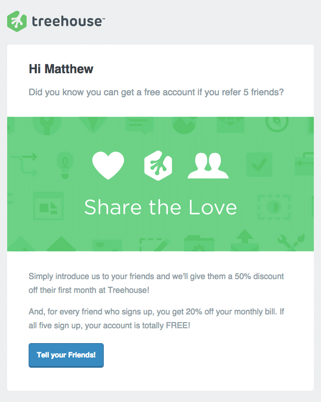
Treehouse uses a friendly, chatty approach for this call to action. The CTA copy starts off by asking the subscriber whether they know about the referral program, then goes on to explain the program details, and then closes with the killer benefit of getting a free account.
The ad works very well because it builds anticipation one line at a time, and then brings the CTA in at the point where anticipation is at the highest.
This is a trick to keep in mind to maximize your conversion rates. Always position the CTA after you’ve heightened expectations to the fullest, where buyer emotions are at their peak.
20. Beautiful.ai free trial CTA
Location of CTA:In an email
Text of CTA: Start a Trial, Contact Sales
Type of CTA: CTA button

Beautiful.ai’s free trial CTA is one of those call-to-action examples that works well because it places the focus on a single core benefit. In this case, it’s all about how the client team can appear brilliant through using Beautiful’s software tool.
The reader is given two options after clicking the first button in the email – start your trial, or contact sales to cover both consumers who are ready to buy and consumers who need to discuss their options further.
This call to action covers all the bases of a winning CTA – attractive headline, brevity, action phrases, and the showcasing of benefits.
21. WPEngine CTA
Location of CTA: Landing page
Text of CTA: See Our Plans
Type of CTA: Headline leading to a CTA button
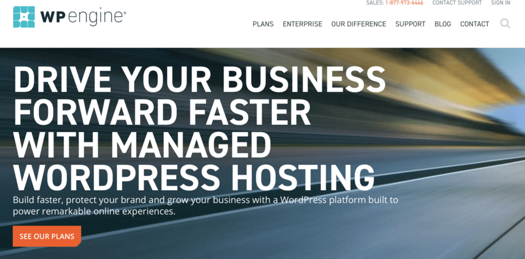
It’s easy to see why this call to action works at the very first glance. The entire page has been optimized for marketing. There’s a very large headline which is impossible to miss, highlighting how you can “drive your business forward faster with managed WordPress hosting.”
Then, there’s brief text driving home the core benefit once again before a CTA comes up encouraging the website visitor to see the plans. Having the customer see the plans is a great way to get them to explore and linger on the site, and not feel pressured to purchase straight away.
This call to action is a winner because of compelling copywriting, great placement, and core benefit positioning.
22. VoiceNation CTA
Location of CTA: Landing page
Text of CTA: See plans and pricing
Type of CTA: CTA button
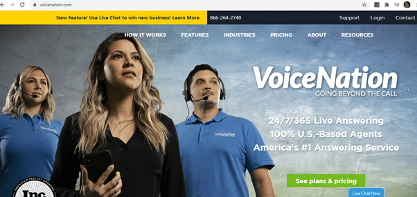
VoiceNation has a feature-packed landing page that gives you a sense of confidence and assurance the moment you land on it. Whether it’s the brilliant tagline “VoiceNation – going beyond the call” or the highlights of what sets the business apart, VoiceNation is onto a winner with this CTA.
This ad, once again, encourages website visitors to see plans and pricing so they can explore the site, and check out the plans without being pressured to make a purchase straight away. The CTA here is on a great example of a high-converting landing page that’s brief, arresting, and compelling.
23. FreshBooks CTA
Location of CTA: Landing page
Text of CTA: Try it Free
Type of CTA: Headline leading to a CTA button
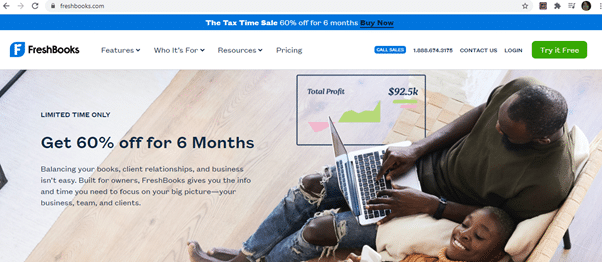
The FreshBooks CTA example shows you how to use a sense of urgency to increase the rates at which your prospects convert. The specific words used here are “limited time only” without any time specification, which means the offer can be revoked at any time.
The CTA headline then goes on to provide a core value benefit in the form of “get 60% off for 6 months,” followed by additional text on how this software helps your business. To top it all, the CTA button text encourages viewers to try the software for free.
It’s the sequencing of the CTA that makes it an irresistible and compelling offer.
24. Backlinko CTA
Location of CTA: Landing page
Text of CTA: Try it
Type of CTA: Headline leading to a CTA button
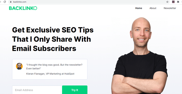
Backlinko is a master at creating high-converting landing pages and call to actions. The opening headline promises exclusivity that is over and beyond the value provided on the blog. We then see a testimonial which provides the necessary social proof and finally the CTA asking for an email address with the simple text “try it.”
Call to actions like this work when the site or business has built up a reputation where “exclusive” tips can be seen as a tremendous value. The simply-styled page where the text stands out is another reason why this CTA works.
25. Trello homepage CTA
Location of CTA: Trello Homepage
Text of CTA: Sign up – it’s free!
Type of CTA: CTA button
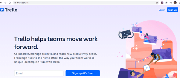
Trello’s CTA is simple, clean, and effective. It showcases benefits and provides an option to sign up for free in its CTA button. The ad and the CTA also take up the entire portion of the top half of the website, so it’s really hard to miss.
This is an example of a CTA that you can create that’s minimalistic and fuss-free, but that can still get prospects to convert phenomenally well.
26. Dropbox CTA
Location of CTA: Homepage
Text of CTA: Get started, Sign Up
Type of CTA: Headline leading to a CTA button
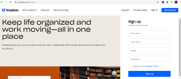
The Dropbox CTA is conceptually similar to that of Trello’s, for the most part. But Dropbox has made its ad more visually compelling by using up a good amount of space above the fold for its large and eye-catching text.
Dropbox is also slightly more aggressive about getting the sale, because aside from the “get started” CTA on the top of the page, you also get a complete sign up form placed strategically to the right where the website visitor just can’t miss it.
27. OkCupid homepage CTA
Location of CTA: Landing page
Text of CTA: Join OkCupid
Type of CTA: Headline and brief text leading to a CTA within a button
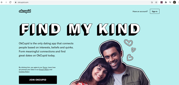
OkCupid’s call to action is an example of how to get it right by being simple and yet effective. Here, they have a compelling headline “find my kind,” which is fantastic for a dating site, some text talking about what OkCupid is and how it benefits users, and then finally the CTA “Join OkCupid” in a button of a contrasting color.
The entire ad creative and CTA comes off as sweet in keeping with the headline “find my kind.”
28. TeuxDeux homepage CTA
Location of CTA: Landing page
Text of CTA: Join now for free
Type of CTA: CTA button
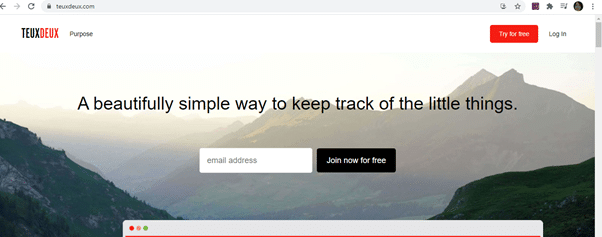
There’s simple, and then there’s real simple. TeuxDeux is of the real simple variety. Its ad creative uses just the one headline to sell its product, and it still works amazingly well because the fundamental USP here is simplicity.
A great headline followed immediately by a call to action to “join now for free” makes this CTA a no-brainer for prospective sign-ups.
29. Slack homepage CTA
Location of CTA: Homepage
Text of CTA: Try for Free
Type of CTA: CTA button
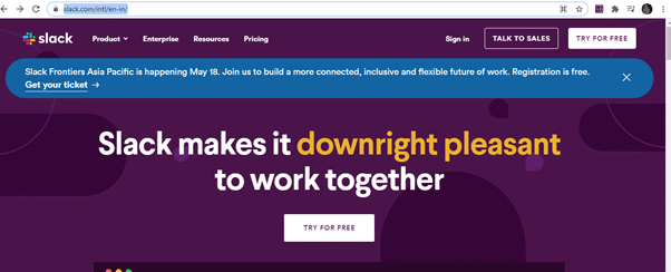
Slack has chosen bold color schemes for the text and background elements which makes for a very attractive and engaging ad/CTA. Slack doesn’t make it pleasant, but ‘downright’ pleasant for people to work together. Just adding that extra emphasis on the word downright makes the text that much more arresting.
Slack’s CTA works because it’s simple, visually engaging, and highly effective.
30. DailyLook
Location of CTA: Pop-up on the landing page
Text of CTA: Join now
Type of CTA: Headline leading to a CTA button
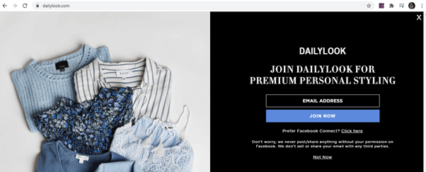
The DailyLook pop-up CTA is attractively styled in keeping with the theme of the brand and website. A simple offer, “join DailyLook for premium personal styling,” is followed immediately by the CTA.
There’s also an option for the subscriber to sign up via Facebook Connect instead. The creative closes with an assurance that personal data would not be compromised. The ad is another example of why simplicity and clarity work super-effectively for CTAs.
Wrapping it up
So there you have it, our 30 best CTA examples that show you how you can craft your own winning call to actions. Use these examples to nail your next marketing campaign and see those conversion rates skyrocket.
