Published on March 20, 2022
How to Create an Excellent Referral Landing Page
Often, a referral landing page is one of the most overlooked aspects of a referral program.
But this landing page is essential, as it’s the hub where your customers enroll in the referral program and start sharing your brand.
Your referral landing page determines whether customers will sign up and refer their friends – or exit without giving a second thought.
For that reason, you need to give your referral landing page the rightful attention that it deserves, from how you want it to look to what information it should contain.
Today, we will show you how to create an effective referral landing page, why you need one, and tips drawn from the most successful referral landing pages.
What is a referral landing page?
Sometimes called a “refer a friend landing page,” a referral landing page is a dedicated page that encourages customers to recommend you to friends and family. It’s also the place customers share from, using your referral program.
It convinces customers to share your brand by highlighting the program’s value, as well as what they stand to gain whenever they refer their friends (the referral rewards).
How are referral landing pages similar to other landing pages?
Just like a traditional landing page sells a product, a referral landing page sells your referral program.
This means that, like all landing pages, a referral landing page needs to be appealing and convenient.
It must also communicate relevant information concisely, so your customers are ready to take action quickly (in this case, share your brand).
Why do you need a referral landing page?
A referral program landing page acts as the central place to direct customers to when asking them to share your business with their network.
This page helps manage your customer referral program and streamline sharing for a seamless process.
It is the driving force of a referral program, as it contains all the program information the customer needs and is the page where your customers will do the actual referring from.
Having a separate landing page for your customer referral program shows your commitment to the program. When customers see that you take the program seriously, it encourages more referral program signups, which leads to more new customers through referrals.
Even though there are existing a wide range of customer acquisition strategies, having a referral program with a dedicated landing page remains a basis, especially for fledgling companies.
And when built with the right referral software, a referral landing page makes it easy to track referrals, thanks to the referral links it distributes to customers.
How to create a referral landing page: The essential parts
Now that you understand what a referral program landing page is and why you should have one, let’s shift focus and take a look at how to create an excellent referral landing page for your program. Below are the essentials for creating a perfect landing page:
1. Navigation that easily gets customers there
While this is not technically a part of the landing page, making your landing page easy to locate is paramount. Customers must easily be able to find the page before they can use it to do any sharing. Consequently, you should place links to your referral landing page in your navigation menus, so customers can access the landing page from all other pages of your site (including from your homepage).
The program link needs to be a simple but visible part of the navigation bar(s). The text of the link could read “share [brand name],” “refer a friend,” or “get [the reward].”
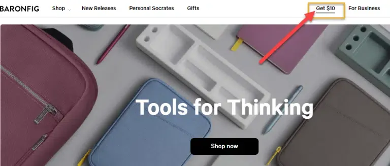
Baronfig makes navigation to its referral landing page easy and enticing, with a “get $10” button in the navigation menu that teases the reward.
2. Eye-catching headline
The headline or title is your landing page’s opener – it is the first thing customers will see and read, in the biggest font.
There’s no excuse for not making the headline as catchy and enticing as possible. It needs visual appeal to grab customers’ attention right away, and it should be intriguing enough to convince them to stick around for more.
Your headline must be easy to understand, so keep it short and sweet. And ultimately, it should communicate what customers should do (share) and what is in it for them (the rewards).
After all, it’s all about motivating your customers to share your brand, so you owe it to yourself to make referring irresistible as early as you can.
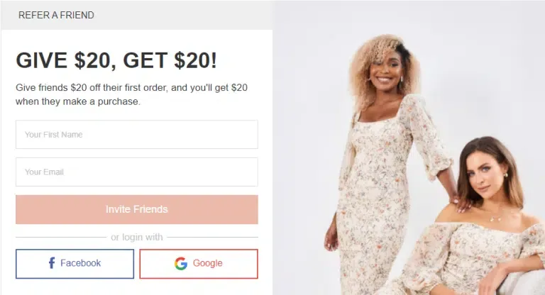
With its simple and effective “Give $20, Get $20” headline, Esther & Co tells customers exactly what they need to know by teasing the rewards on offer.
3. Hero image
Tap into the power of a hero image to better engage your visitors and make your referral landing page more welcoming.
This image needs to catch the customer’s attention so they stay on the page.
- It’s called a hero image for a reason – it should be central, not secondary.
- It should also be relevant, and tell the story of the referral program.
- It needs to impress visitors and encourage them to learn more about the referral program.
Your hero image could illustrate:
- The reward on offer
- Friends hanging out
- Friends helping each other, or
- Customers enjoying your products
A fascinating image that resonates with your referral program is an excellent opportunity to convey emotions and whet customers’ appetites.
The image also helps to express what cannot be told in words.
And remember, our brains process visual data like images faster and better than other forms of data such as text. Take full advantage!
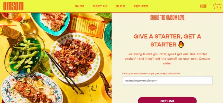
In the Omsom referral program hero image, the brand shows off some of the dishes customers can create using the starters they get for free. That’s sure to whet customers’ appetites. Yum!
4. Rewards and benefits
Customers want to know what’s in it for them – the referral reward. This incentive will motivate them to enroll in the referral program and share your brand more often. So, display it prominently.
Your referral landing page should clearly communicate the exact reward customers will get for a successful referral. If you didn’t capture this info in the headline, mention it right below the title so customers can instantly get what they want to hear.
If the referred friend can also earn a reward, include that info as well. You may also talk about intrinsic rewards the customer will receive, like the satisfaction of helping a friend benefit from a product or service they need.
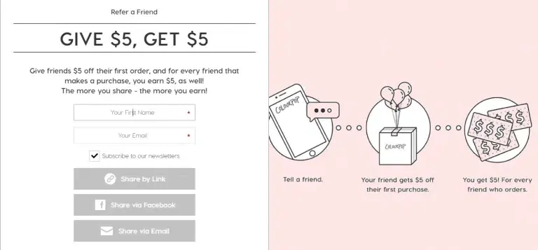
Colourpop offers an enticing reward and makes it simple to understand: both the referrer and friend will receive a $5 credit when the friend makes their first purchase.
5. How the program works
Besides mentioning the rewards, let customers know what needs to happen for them to receive the reward. Ordinarily, the new customer they refer will have to make their first purchase. Explain this in a concise manner, but capture all the necessary details.
Essentials to cover on the landing page include:
- The how (what needs to be done)
- The when (the time they’ll receive the reward)
- The who (who gets rewards, whether that’s the existing customer and their friend or just the existing customer)
Consider using a step-by-step format to communicate how your program works – and just how simple it is.
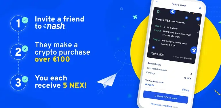
Crypto banking brand Nash’s referral program landing page shows one example of the step-by-step format.
6. Call-to-action button (CTA)
Similar to the CTA buttons found on most landing pages, this is the button that customers need to click and start sharing with their friends.Once they click this button, your customers become your brand ambassadors!
The CTA button must be highlighted, easy to find on the page, and simple to use. Without a CTA, visitors may not realize what exactly they need to do to move forward, and are likely to exit for another page before sharing.
- Your CTA needs to have a distinct color from the background. That way, it will stand out and be easily noticeable
- It would also be best if you placed the CTA above the fold, so customers won’t have to scroll to find it.
- The CTA should explain what you want customers to do, using short yet informative text of one to three words. For example, the button could read “Share now,” “Start sharing,” “Invite friends,” “Refer friends,” or “Get [reward].” The goal is to convince the readers and increase your conversion rate.
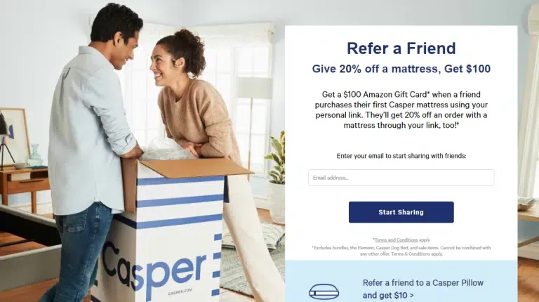
Casper highlights their CTA button in blue, so it stands out from the rest of the referral landing page. The text they use is simple but effective – “start sharing.”
7. Multiple sharing options
Make sharing easy by providing different sharing options. This encourages referrals as it allows customers to share with friends and peers in all the ways they usually share other exciting things.
Include various sharing channels, including email, SMS, and social media. A social media sharing option is critical, since a social share will reach many of the customer’s friends at once.
On top of that, you should let customers directly copy their unique referral link to easily paste and share with anyone, anywhere.
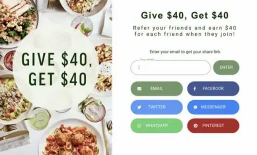
Freshly’s referral program landing page shines with seven referral options, including email, multiple social media platforms, two messaging apps, and a click-to-copy referral link.
Referral landing page tips
As we promised, here are some great tips used by the best referral landing pages to steal and promote your referral program for more new customers:
- Let customers know exactly what you want them to do and what’s in it for them: As concisely as possible, make sure customers know what they need to do (share) and what they stand to gain if they make a successful referral (the reward).
- A/B test out different messaging and layouts on your landing page: When it comes to your referral landing page design, it’s never a bad idea to A/B test various aspects of the page, including the wording, colors, visuals, and layouts.
- Utilize the white space: Like with any other landing page, your referral landing page layout needs to be uncluttered. Include only the essentials and leave plenty of white space.
- Consider including testimonials: Do you have customers who have had a great experience with your referral program? If so, consider incorporating a few of their testimonials for a better impact.
- Add a referral FAQ: Do you have other terms and conditions you need to cover, but that could make your landing page too cluttered? Create a separate referral FAQ section, and link to that from your landing page.
- Promote your referral program: Tell customers about your referral program via email, social media, and other marketing campaigns. Be sure to attach links to your referral landing page within every promotion.
- Use referral software: Using referral marketing software streamlines all aspects of running a referral program – including making your referral landing page extremely easy to build. The software will automatically incorporate all the referral link tracking elements for you.
Wrap up
A lot goes into creating a successful referral program landing page. But keep all these points at the back of your mind, and you will be on your way to creating a high-converting page.
Only a compelling referral landing page will motivate customers to share you with their friends. So, keep an eye on your navigation, headlines, images, CTAs, sharing options, and rewards.