Optimizing your referral program for mobile is a natural – and necessary – step for achieving growth with your incoming leads. In order to reach more potential customers, on their time, optimizing your platforms can lead to a better customer experience, and therefore, more leads. But more importantly, leads that turn into paying customers.
Here’s why mobile is so important: the average person spends nearly three hours per day on their smartphone. And multiply that by the 5 billion people worldwide who own a mobile device. Allowing your platform to adjust to a smaller screen, such as a smartphone, means users can access your content and sign up without issue, wherever they are.
Failing to become mobile-friendly can mean links that won’t work, content that can’t be read, and frustrated viewers who would rather leave than try to finagle on a non-mobile-optimized site – and end up never referring a friend. Yikes!
Why you need a mobile referral program
A referral program specifically geared for mobile meets existing customers where they are – on their phones. More people have experiences with brands on their mobile phones than on desktop computers or laptops. It’s a reality that more and more marketers are taking into account.
Since users are on their phones so often, using a mobile referral program allows current customers to share directly from their phone, via mobile app or otherwise. This ease of use means customers will be more likely to share your links. Also, it is important to choose from flutter vs. native for mobile app development because referral programs work differently in the two cases.
Likewise, receiving customers will be more likely to open and follow your links when they are sent directly via smartphone. This can be done through text, a platform app, email, VoIP services or social media platforms. . By remaining optimized, websites can remain in scale with the size of screen without losing the function or quality of display for new users.
Mobile referral programs make sharing easier, encourage intuitive sharing on social platforms, and generate powerful word-of-mouth marketing. These are all imperative for growing your brand, generating more revenue, and creating a successful referral program.
Preparing your app-based referral program for success
Take a look at these key steps for creating a mobile-friendly referral program.
Get familiar with overall referral program best practices
One of the first steps you should take is familiarizing yourself with referral program best practices, including those for app referral programs. What types of steps create the most success? What do customers best respond to? How can you set yourself up for the highest level of growth with your referral program?
Take a look at what others are doing, and read expert tips on how to get the most out of your referral efforts, including this ultimate guide.
You can also check out this epic list of customer referral marketing software programs for options that help streamline and manage refer-a-friend programs, creating more success with less work.
Plan how you’ll add your referral program to your app
Next it’s time to look at how you can add the program to your app. In most cases, referral programs aren’t stand-alone entities, but built into a company’s existing app. This creates ease of sending out referrals, with one, single location that’s accessible by the user from a single program. This allows them to easily send a referral message to a friend via SMS or via social media.
Figure out when you’ll ask for referrals
You can increase your success rate for activation by asking customers for a referral at the right time. Asking at the wrong time (like 1 day after your customer made their purchase) means you’re more likely to be overlooked or ignored, while asking customers when they’re most satisfied increases the chance that your referral will be shared.
Some of the best times to ask customers for a referral are when they’re at their happiest: for instance, shortly after receiving their purchase, after they’ve left a positive review or comment, or after having a good experience with your customer service team. Approaching customers at these moments gives you a higher likelihood of getting a quality referral.
Decide who to ask for referrals
It’s also a good idea to learn who you should ask for referrals. Find out your best loyal customers and learn key characteristics about your customer base. Understanding these going forward will lead you to higher success rates within your marketing strategy.
Using referral software can help you learn these key stats about your customers, helping you understand who to target with your referral program.
Prepare your customer service team
Referral programs undoubtedly come with some more demand on your support team. Taking the time to think through how to minimize those requests, while also arming your support team with what they need to handle the extra load.
Your referral program should have an FAQs page where users can find info to the questions that are commonly emailed to your support team. Meanwhile, prep your customer service team on how your mobile app referral program works and common technical issues users may come up against before you actually launch. This will lead to a smoother, more successful referral program, which means more referrals for your product.
Best practices for mobile referral program design
Now it’s time to consider your design and how the layout can add to better customer experiences.
Make the program easy to find
Don’t make the mistake of burying your referral program too deep in your app. The easier users can find the referral program, the easier they can refer to others.
Add a header, clickable button, etc. to your app, where users can find and navigate to your referral program and invite friends with ease. Promoting your referral program in ways like these is essential!
Offer valuable rewards
Rewards are the bread and butter of any successful referral program. The referral incentive is what encourages users to talk you up in the first place. Consider what type of rewards might most motivate your customers, such as credits towards the product, a discount, or even free products.
Keep your messaging concise
Don’t overwhelm customers with excessive text. Make your messaging short and to the point so they know what they are getting for a referral, and what they need to do in order to get it. Catchy headlines and simple one-liners that explain are essential here.
Place share buttons where users can easily tap
Simple navigation can make or break your referral program. Create share buttons that go to social, text messaging, email, etc. The buttons should be easy to click, easy to read, and use colors and placement that are eye-catching. Bold designs can catch users’ attention.
And easy tapping is vital for the friend’s experience as well. Good mobile experiences for referred users include pricing push notifications, or pop-ups with buttons, visible before someone needs to scroll down.
Make referring seamless
Keeping it simple and functional can mean ease of use by your customers. The simpler you can make it for them, the fewer steps they have to take, and therefore, the easier the referral system will work. Create a seamless, easy process for your customers so they can share on your behalf.
Optimize for social media sharing
Each customer will want to ask for referrals on their own preferred platform. This includes various social media channels, especially since most people access social on mobile. Making your posts easy to share on social means they can post directly to many of their friends and family members, all at once.
You can add text, and allow them to create their own message. Personalized content is more likely to get the attention of peers, so this is an important step in referring new customers.
Make email sharing mobile-friendly
Email sharing should also be mobile responsive. Your user base should be able to auto-open email accounts, adjust screen size, and more. If your referral program app is set up to be mobile-friendly, you can ensure a great experience for those trying to advance your cause via email.
Encourage sharing via text message
Another common sharing channel on mobile is through text message. Try tap-to-copy referral links to make this as easy and as fast as possible. This can also ensure that users will reach their friends or family members on their smartphones – a direct line to those they are trying to reach.
12 best mobile referral program examples (and why they work so well)
Take a look at these 12 proven examples of mobile referral programs, the best practices they follow, and why we think they’re so successful.
Uber
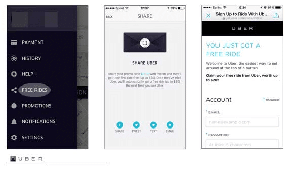
Uber makes it easy for their customers to find and track their own rewards in their existing app.
Why It’s Successful: With a headline that grabs attention, customers are excited about how to earn their free ride. They can also see how many rewards they’ve earned, or share to any number of platforms with a quick icon link.
UberEats
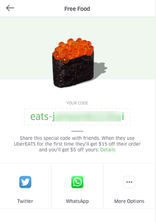
With a large image and quick, yet informative text, UberEats users can learn quickly how the referral program works. They also use a single, yet powerful image of food to reach and entice hungry customers. In addition, they announce from the get-go how users can earn their reward.
Why It’s Successful: Huge clickable links, including a giant tap-to-copy code, also allow them to share to multiple platforms from a single screen. This platform makes it easy to share, and easy to earn, within UberEats’ mobile referral program.
Airbnb
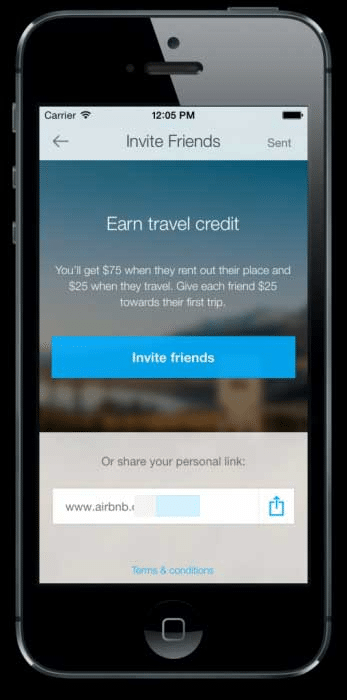
Who doesn’t want to earn free travel credit? With a headline like that (and an eye-catching blue “invite friends” button), Airbnb gets their users’ attention straight from the get-go.
Why It’s Successful: Customers can click to earn, including a choice of multiple platforms, or to copy and share their direct link for customer referrals. All from the same app they can use to book their next stay. As for an appealing reward, users can earn up to $75 in free travel credits for each friend!
Rover
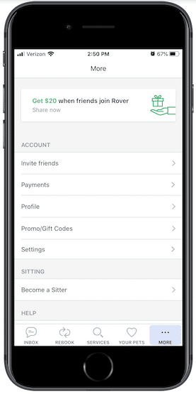
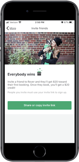
For their app, Rover reaches customers with a banner. A simple graphic keeps it appealing to the eye, with a headline that announces what users can earn (“Get $20 when friends join Rover”). This allows for easy accessibility straight from the app where users can share with potential customers. Another link below can also be clicked on for users to share.
Why It’s Successful: This combination leads to ease of use for customers who are new to the referral program, as well as those who are well acquainted with the app’s navigation. Clicking on the link provides an image of a happy customer, and text showing what the user can get – app credit, which is what users want!
HelloFresh
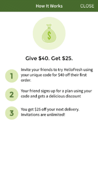
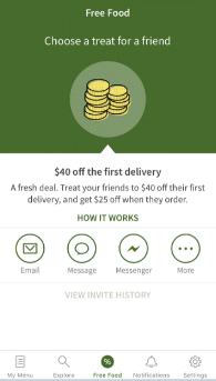
With a smart, engaging design, HelloFresh users can easily navigate to the rewards portion of their app. The language also explains that you’re giving a gift to a friend. This can be a great way to reach users, letting them know they’re providing something to a loved one.
Why It’s Successful: The numbered display easily explains the reward program – here’s what they get, here’s what you get, here’s how to earn both. Links to various platforms are also available from a single screen. This simple, yet informative design creates an easier referral program for all, including customers who are new to using the app.
Robinhood
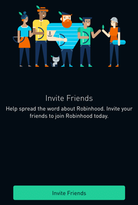
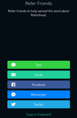
This is branding at its finest — Robinhood takes a play on their own name by illustrating everyday people wearing a Robinhood-esque hat, along with a bow and arrow in hand. It’s showing customers that they too, can earn funds.
Why It’s Successful: A simple link to send invites accompanies the image for a straightforward and effective referral program. A second page offers direct platform links, with complimentary branding colors for a look that’s easy to use and aesthetically pleasing. We also love the mystery element – with just a tap to share, you could earn any type of stock, and possibly one from a big-name company.
TabbedOut
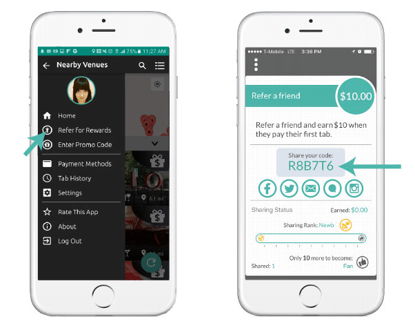
The TabbedOut app makes it easy for mobile users to pay through their app. In the menu bar, there’s also a quick navigation to find the rewards section of the program. Users can click to find, then copy and share their unique code that earns rewards for referred customers.
Why It’s Successful: Graphic bars show how much a user can earn, as well as how many dollars they’ve earned at the bottom of the screen, and their “sharing rank.” This can be motivation in itself just for users to see the bar and rank advance, earning them more dollars to spend through the app.
Tropical Smoothie Cafe
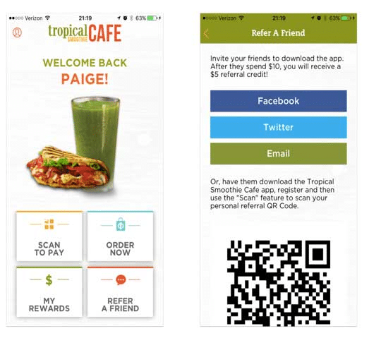
We love how this app is personalized by displaying the owner’s name right from the home screen. Then, four equal boxes allow users to order, pay, and refer/check their rewards. Easy to find, easy to use.
Why It’s Successful: Tropical Smoothie Cafe allows people to use various sharing platforms. However, we love the addition of a scannable QR code most. If the user has already downloaded the app – or wants to – the referrer can still earn points by allowing the new customer to scan their code. Easy and a better chance of the app being downloaded, as the referrer can still get credit for their lead.
TaskRabbit
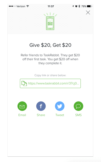
Refer, give, and get – it’s easy to use, easy to follow in TaskRabbit’s referral section of their app.
Why It’s Successful: Users can share via platforms, or copy and paste the link. This mobile referral program is simple and to the point, yet still effective in how it can help bring in new customers.
Upthere
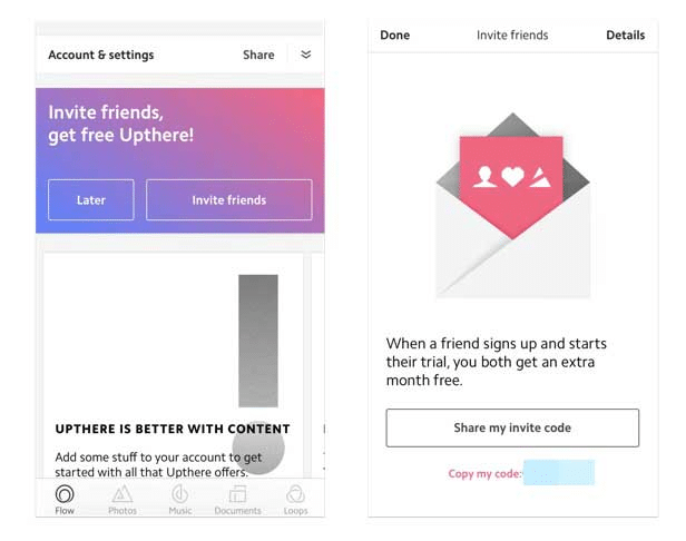
Upthere uses free credit as a reward incentive, a quick way to attract customers. In addition, they grab attention with a colorful banner at the top of the app. This outfits whatever custom content the user adds themselves.
Why It’s Successful: Users can earn simply by having others sign up for a trial – the referee have to stick with the brand. We love that this is explained simply, but effectively, in the text to avoid confusion and entice users to refer.
Wish
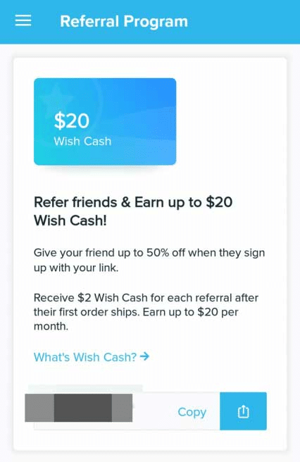
One more point for store credit with Wish. Since their referral program has different levels and limitations, Wish outlines all of this on the referral page. It includes 50% off for the new customer, $2 per referral, and a limit of $20 a month that can be earned.
Why It’s Successful: Wish keeps it simple and explains everything on the app page so there’s no confusion. Users can also copy and send their referral code straight from the app.
Instacart
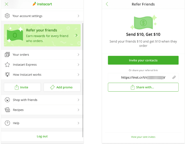
Never lose track of how to refer others with Instacart’s eye-catching banner. At the top of the app home screen, users can click and straight to the referral section.
Why It’s Successful: Users are clearly told what they get – $10 for them, $10 for the new customer – and a link they can send straight to their friends and family members. Easy peasy.
Wrapping up
When creating your referral program, it’s important to look for ways to keep the program mobile-friendly. From a website that’s mobile-responsive, to a section of your brand app that includes referral rewards, the easier you can make the platform for users, the more likely they are to use it. This also includes reaching customers – new and existing alike – straight from their smartphones. Consider these key best practices going forward for better ways to implement your mobile reward program.
